Menu
- 3 minutes to read
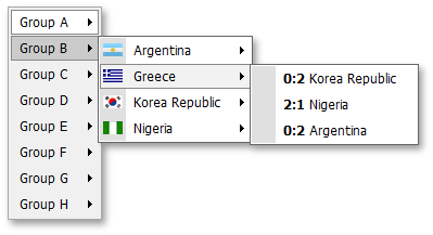
The DevExpress ASP.NET Menu offers you an elegant way in which to provide website navigation options to your end-users. Use the ASPxMenu and ASPxPopupMenu controls to enrich your sites with both static navigation capabilities and context-sensitive action lists. Like other DevExpress web controls, building standard menus for your web application is not the only thing you can deliver with these components. With integrated template technology, you can easily transform menu items into anything you can imagine. For instance, you can transform a single-item context menu into a popup entry form.
This topic lists the features that are unique to menu controls.
Control Features
- You can bind a menu to a data source so that your menu structure is retrieved from an XML file or a database table.
- Several themes are available so you can apply an attractive design to your menu with just a couple of mouse clicks.
- You can change the appearance of any element in each state directly, via properties, or by assigning a CSS class.
- Templates can be specified for root-level items, sub-menu items or for each item individually.
- A menu control allows you to visually indicate selected items.
- Popup menus can be invoked by clicking, right-clicking or hovering over the target element with the mouse pointer.
Client-Side Features
- You can use client-side events to perform custom actions when a sub-menu is being invoked or hidden, and when end-users click a menu item.
- The client-side API allows you to traverse through the entire menu structure and obtain each and every item’s settings.
Root-level Menu Features
- Horizontal or vertical layout can be used for the root level. This means you can build menus that open sideways as well as main menus.
- ASPxMenu provides separate appearance settings for root-level items.
Sub-menus
- A menu control displays shadows under sub-menus by default. You can easily disable them by toggling the ASPxMenuBase.ShowSubMenuShadow property. The same is true for popup menus.
- You can customize how fast a sub-menu appears or closes after end-user selection.
- A menu control automatically adjusts sub-menu position so that sub-menus are completely visible within the browser window, when possible.
- Parent menu items can display small glyphs that indicate the presence of sub-menus. By default, such glyphs are displayed in all parent items except for those at the root level. You can enable sub-menu glyphs at the root level or make them invisible in all items. You can also supply your own images to be used as parent item indicators.
- Sub menus can display a side strip (gutter) with customizable size and appearance.
Separators
You may wish to display separators between each neighboring menu item pair in the entire menu, or only between items at the root level. Both these tasks can be accomplished using the same ASPxMenuBase.AutoSeparators property. You can also manually specify where to show item separators. Note that the menu control offers you numerous settings allowing you to control the appearance and layout of item separators - from margins to background image.
Item Features
- Menu items can display images. You can specify an image to be used everywhere in the menu, in a particular sub-menu or in a particular item.
- You can specify where end-users can click to invoke item functionality. The available options are: item text, item image and both text and image.
- Tooltips can be specified for each menu item.