Panel
- 2 minutes to read
The ASPxPanel control represents a container area for other controls. It is useful when you wish to generate controls programmatically, hide/show a group of controls, etc.
Main Features
- ASPxPanel allows you to specify a default panel button.
- Horizontal and vertical scroll bars are supported.
- A panel can be rendered as a table or as a div element.
- Right-to-left representation support.
- The client-side API allows you to manage panel visibility.
- ASPxPanel allows you to get and set panel html content on the client side.
- ASPxPanel allows you to dock its content to any side of the browser screen.
- ASPxPanel can collapse and expand its content both on demand and when the browser screen is resized (adaptivity feature).
Collapsible Panel
The ASPxPanel control can hide its content and expose it only when a user clicks the expand button.
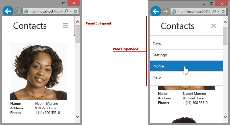
To enable this behavior, set the ASPxCollapsiblePanel.Collapsible property to true.
Adaptivity Settings
You can specify the panel control’s adaptive behavior using the ASPxCollapsiblePanel.SettingsAdaptivity property. It provides the following settings:
| Property | Description |
|---|---|
| PanelAdaptivitySettings.CollapseAtWindowInnerHeight | Specifies the maximum browser window’s inner height when the panel collapses its content. |
| PanelAdaptivitySettings.CollapseAtWindowInnerWidth | Specifies a the maximum browser window’s inner width when the panel collapses its content. |
| PanelAdaptivitySettings.HideAtWindowInnerHeight | Specifies the maximum browser window’s inner height when the panel hides its content. |
| PanelAdaptivitySettings.HideAtWindowInnerWidth | Specifies the maximum browser window’s inner width when the panel hides its content. |