Grouping Overview
- 2 minutes to read
The DevExpress ASP.NET Card View (ASPxCardView) allows you to group cards by one or more columns. When cards are grouped by a specific column, cards with matching values in that column are placed in a group - displayed as a group row. You can expand the group to display the cards within it.
Note
ASPxCardView does not allow end users to group cards if the control is in table layout mode (ASPxCardView1.Settings.LayoutMode=LayoutMode.Table).
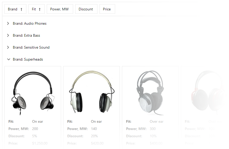
The ASPxCardViewBehaviorSettings.AllowGroup property specifies whether end users can group cards within the card view. To display a popup menu with the “Group By” label, set the ShowGroupSelector property to true.
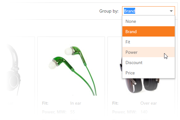
Use the CardViewColumn.AllowGroup property to allow users to group cards by this column. The ASPxCardView.GroupCount property gets the number of columns by which the card view is grouped.
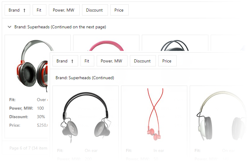
The card view can display cards that belong to a single group that spans multiple pages. This occurs when the number of cards in a group exceeds the maximum number of cards that the control can display on a page. In this instance, the card view displays the ‘Continued’ and ‘Continued on the next page’ labels within the group row.
The card view automatically sorts grouped cards by the grouping column. If the column is not sorted, ASPxCardView automatically sorts the grouped cards in ascending order.
Use the CardViewStyles.GroupRow property to access style settings to customize group row appearance.
The card view allows you to provide a custom appearance for the group row (CardViewTemplates.GroupRow) and its content (CardViewTemplates.GroupRowContent). Refer to the following help topic for more information: Templates.