Linear Gauge
- 5 minutes to read
Linear Scale
A Scale is the main element of a Linear Gauge because it defines the axis along which other elements (for example, the level bar, background layer, and marker) are arranged.
A Linear Gauge can have one or more scales that display tickmarks and labels. It allows you to read measured data (for instance, a thermometer scale).
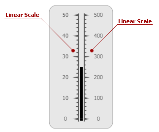
A scale is an instance of the LinearScale class.
The table below lists the main properties that affect element behavior and appearance.
Level Bar
A Level Bar indicates the current scale value (for example, the current temperature).
Typically, there is only one level bar on a linear gauge, but you can place as many elements as you want on a scale.

A level bar is an instance of the LinearScaleLevel class.
The table below lists the main properties that affect element behavior and appearance.
| Characteristics | Members |
|---|---|
| Data | ValueIndicatorComponent<TProvider>.Value |
| Layout | BaseLeafPrimitive.ZOrder |
| Appearance | LinearScaleLevel.ShapeType,BaseLeafPrimitive.Shader |
Marker
A Marker is a small thumb that indicates the current value along a scale. The Linear Gauge control includes many different marker shapes, each of which can be placed on a scale (see the image below).
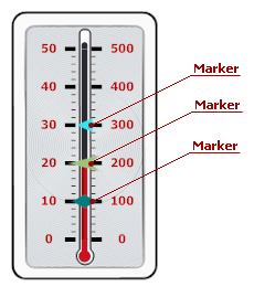
A marker is an instance of the LinearScaleMarker class.
The table below lists the main properties that affect element behavior and appearance.
| Characteristics | Members |
|---|---|
| Data | ValueIndicatorComponent<TProvider>.Value |
| Layout | LinearScaleMarker.ShapeOffset,LinearScaleMarker.ShapeScale,BaseLeafPrimitive.ZOrder |
| Appearance | LinearScaleMarker.ShapeType,LinearScaleMarker.Shape |
Range Bar
A Range Bar is the filled portion of a linear gauge that always starts at a fixed value along a scale and extends to another value (the scale’s current value or another fixed value).
The range bar extends to the scale’s current value, so when the scale’s value changes, the range bar’s boundaries change as well.
The image below demonstrates two range bars with different start values (0 and 40) that extend to their corresponding end values (40 and 100).

A range bar is an instance of the LinearScaleRangeBar class.
The table below lists the main properties that affect element behavior and appearance.
| Characteristics | Members |
|---|---|
| Data | BaseRangeBar.AnchorValue,BaseRangeBar.Value,BaseRangeBar.ActualValue |
| Layout | BaseRangeBar.StartOffset,BaseRangeBar.EndOffset,BaseLeafPrimitive.ZOrder |
| Appearance | BaseRangeBar.Appearance,BaseLeafPrimitive.Shader |
Range
A Range is an interval on a linear gauge. A gauge can contain multiple ranges, displayed as bars along a scale.

A range is an instance of the LinearScaleRange class.
The table below lists the main properties that affect element behavior and appearance.
| Characteristics | Members |
|---|---|
| Data | BaseRange.StartValue,ScaleRange.StartPercent,BaseRange.EndValue,ScaleRange.EndPercent |
| Layout | BaseRange.ShapeOffset |
| Appearance | BaseRange.AppearanceRange,BaseRange.StartThickness,BaseRange.EndThickness |
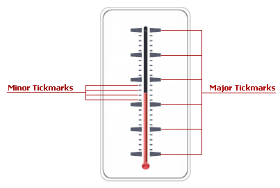
Tickmarks
Tickmarks display points on an axis scale. In a linear gauge, two types of tickmarks are available depending on what steps of an axis scale they indicate: Major or Minor.
Tickmarks are objects that implement the IMajorTickmark or IMinorTickmark interface.
The table below lists the main properties that affect element behavior and appearance.
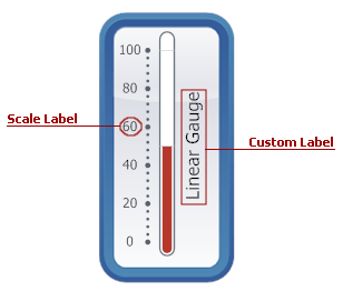
Labels
Two kinds of Labels are available for a Linear Scale:
- Scale Labels that show the current values of a linear scale;
- Custom Labels that you can place at any location along a scale.
Scale labels are objects that implement the ILabel interface. The control saves these label objects in the LinearScale.Labels collection.
Custom labels are instances of the Label class that are stored within the BaseGaugeWin.Labels collection.
The table below lists the main properties that affect element behavior and appearance.
| Characteristics | Members |
|---|---|
| Data | Label.Name,Label.Text,Label.FormatString,Label.AllowHTMLString |
| Layout | Label.Position,Label.Size,Label.TextOrientation,Label.TextShape |
| Appearance | LinearScale.Appearance,Label.AppearanceText,Label.AppearanceBackground |
Background Layer
A Background Layer defines the background of the linear gauge.
A new background layer is painted behind all other gauge elements because its BaseLeafPrimitive.ZOrder property is set to 1000 (the default setting). To bring this layer to the front of other gauge elements (or paint it above other layers, if there are any), set the ZOrder property to a lower value.
For example, the following picture illustrates a background layer that is overlapped by the scale whose ZOrder is set to 0 (the default setting).
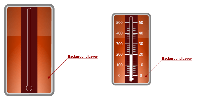
A Background Layer is an instance of the LinearScaleBackgroundLayer class.
The table below lists the main properties that affect element behavior and appearance.
| Characteristics | Members |
|---|---|
| Appearance | LinearScaleBackgroundLayer.ShapeType,BaseLeafPrimitive.Shader |
| Geometry | LinearScaleBackgroundLayer.ScaleStartPos,LinearScaleBackgroundLayer.ScaleEndPos,BaseLeafPrimitive.ZOrder |
Effect Layer
An Effect Layer adds a style effect (for instance, a glare effect) to the linear gauge.
When you add a new effect layer to the gauge, it is painted in the foreground above other elements because its BaseLeafPrimitive.ZOrder property is set to -1000 (the default setting).
Set the ZOrder property to a higher value to move this layer behind other gauge elements.
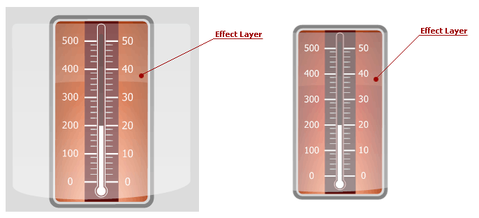
An effect layer is an instance of the LinearScaleEffectLayer class.
The table below lists the main properties that affect element behavior and appearance.
| Characteristics | Members |
|---|---|
| Appearance | LinearScaleEffectLayer.ShapeType,BaseLeafPrimitive.Shader |
| Geometry | LinearScaleEffectLayer.ScaleStartPos,LinearScaleEffectLayer.ScaleEndPos,BaseLeafPrimitive.ZOrder |
State Indicator
A State Indicator is a small object that shows a static image according to a set of predefined states specified in the StateIndicator.States property.
The image below shows a state indicator that changes when a level bar enters a new range on the linear gauge.
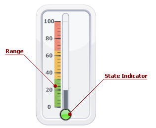
A state indicator is an instance of the StateIndicator class.
The table below lists the main properties that affect element behavior and appearance.
| Characteristics | Members |
|---|---|
| Behavior | StateIndicator.States,StateIndicator.StateIndex,StateIndicator.State |
| Appearance | BaseLeafPrimitive.Shader |
| Geometry | StateIndicator.Size,BaseLeafPrimitive.ZOrder,StateIndicator.Center |