Date Edit
- 3 minutes to read
IMPORTANT
Bootstrap Controls for ASP.NET Core are in maintenance mode. We don’t add new controls or develop new functionality for this product line. Our recommendation is to use the ASP.NET Core Controls suite.
The Bootstrap Date Edit control is a date editor control that combines the functionality of a single-line text editor, button editor and dropdown calendar.
Bootstrap Date Edit offers the following features.
Null Prompt Text
The prompt text can be displayed if the editor’s value is null and the editor is not focused. The prompt text disappears when the editor receives focus. You can define the prompt text using the BootstrapDateEditBuilder.NullText method.
Edit Formatting
You can specify how an editor value is represented within the edit boxes. For display and edit purposes, the edited value can be displayed in the following formats.
View
Affected Properties

EditFormat=”Time”

EditFormat= “Date”

EditFormat=”DateTime”

EditFormat=”Custom”
EditFormatString:=”MMMM dd, yyyy hh:mm tt”
Display Formatting
The editor display value can be formatted for display purposes when the editor is not focused using the BootstrapDateEditBuilder.DisplayFormatString method.
Masked Input
If the BootstrapDateEditBuilder.UseMaskBehavior method has been called with the true parameter, the Date Edit supports masked input. In this mode, the pattern defined using the BootstrapDateEditBuilder.EditFormatString method serves as a mask.
Customizable Minimum and Maximum Dates
You can define the minimum and maximum allowed dates by the BootstrapDateEditBuilder.MinDate and BootstrapDateEditBuilder.MaxDate methods; this enables end-user input to be limited by the specified range.
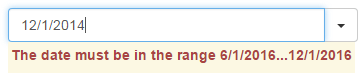
Out of Range Warning
If the BootstrapDateEditBuilder.ShowOutOfRangeWarning method has been called with the true parameter, the Date Edit displays a warning message when an end-user types a date that is out of the range specified by the BootstrapDateEditBuilder.MinDate and BootstrapDateEditBuilder.MaxDate methods.
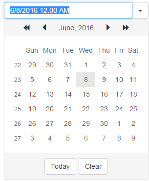
Easy Date Selection
The DateEdit control allows end-users to edit a date value by selecting it within a drop-down calendar, or by typing a date directly into the editor’s text box, or by using the mouse wheel or keyboard.
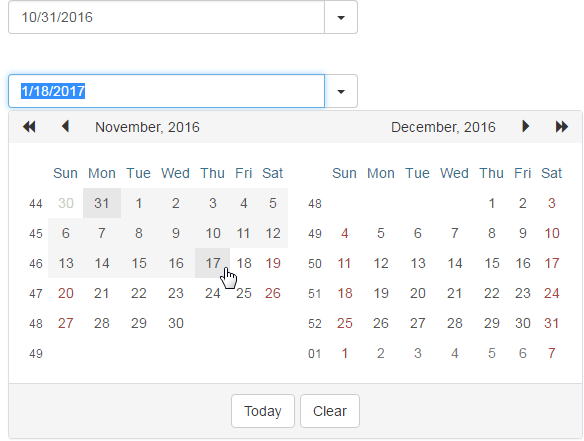
Date Range Picker
Two Date Edit controls can be combined to implement a date range picker functionality.
Customizable Button Collection
The Date Edit control provides a collection to maintain its custom edit buttons. Each button exposes a set of properties allowing the button’s appearance and behavior to be defined. The settings of the default button, which invokes the dropdown calendar when clicked, can be customized as well.
Built-in Validation
The Date Edit control allows you to perform data validation both on the client and server side. See the Unobtrusive Validation demo for more information.
Full-Featured Client-Side API
The Date Edit control provides you with a comprehensive client-side API. This API is implemented using JavaScript and is exposed using the BootstrapDateEdit object. The BootstrapDateEdit object serves as a client-side equivalent of the Bootstrap Date Edit control.
You can modify the editor behavior using the following methods.