Combo Box
- 3 minutes to read
IMPORTANT
Bootstrap Controls for ASP.NET Core are in maintenance mode. We don’t add new controls or develop new functionality for this product line. Our recommendation is to use the ASP.NET Core Controls suite.
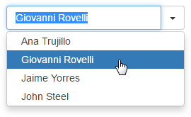
The Bootstrap Combo Box editor combines the functionality of a single-line text editor, button editor, and dropdown list editor. The editor’s dropdown displays a list of items that can be selected by end-users.
Bootstrap Combo Box offers the following features.
Data-Bound and Unbound Modes Support
Editor content can be generated dynamically by binding the editor to a data source, as well as manually populating the control’s item collection. When retrieving items from the data source, item characteristics such as the text, value, and image are obtained from specific data fields. These data fields can be either defined manually using an item’s FieldName property or are obtained automatically, provided that the data fields in the data source are named like the item’s characteristics (Text, ImageURL, Value).
Incremental Filtering
You can enable your end-users to filter list items dynamically, based upon the text typed into the editor’s input box on the client side (find-as-you-type filtering). The following filter modes are available.
Loading Mode Description StartsWith The editor is filtered for list items that begin with the search string. Contains The editor is filtered for list items that contain the search string. The found search string is highlighted within items for clarity. You can enable the required filter mode using the BootstrapComboBoxBuilder.IncrementalFilteringMode method.
Delayed Filtering
You can define the time interval between the time a user starts typing within the editor’s edit box (the BootstrapComboBoxBuilder.IncrementalFilteringDelay method) and the time filtering is applied. Moreover, when the Bootstrap Combo Box editor is in incremental filtering mode, it has the capability to start filtering only after an end-user has typed a specific number of symbols in the editor’s text box (call the BootstrapComboBoxBuilder.FilterMinLength method).
Display Formatting
Editor display values can be formatted using the standard formatting mechanism. The BootstrapComboBoxBuilder.TextFormatString method allows you to define the pattern used to format the selected item’s text displayed within the editor’s edit box.
Item Images
You can define images for individual items (see the BootstrapListEditItemBuilder.IconCssClass method). Images associated with list items are displayed within the editor’s dropdown list. The selected item image can be displayed within the editor’s edit box in addition to the text.
Customizable Button Collection
The Bootstrap Combo Box control provides a collection to maintain its custom edit buttons. Each button exposes a set of properties allowing the button’s appearance and behavior to be defined. The settings of the default button, which invokes the dropdown window when clicked, can be customized as well.
Built-in Validation
The Bootstrap Combo Box control allows you to perform data validation both on the client and server side.
Full-Featured Client-Side API
Bootstrap Combo Box provides you with a comprehensive client-side API. This API is implemented using JavaScript and is exposed using the BootstrapComboBox object. The BootstrapComboBox object serves as a client-side equivalent of the Bootstrap Combo Box control.
You can modify the editor behavior using the following methods.