Boolean Properties
- 2 minutes to read
In XAF, the following controls can display Boolean and Nullable Boolean properties:
- A checkbox control (default).
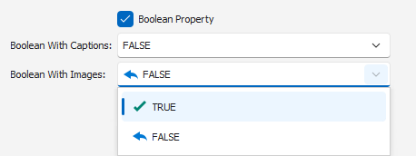
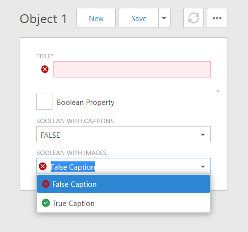
- A drop-down control that displays Boolean values as custom text strings. You can use the IModelCommonMemberViewItem.CaptionForTrue and IModelCommonMemberViewItem.CaptionForFalse properties to specify these strings in the Application Model.
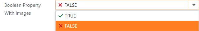
- A drop-down control can display Boolean values as custom text strings accompanied by images. You can define these strings in the same manner as for a drop-down control. Use the IModelCommonMemberViewItem.ImageForTrue and IModelCommonMemberViewItem.ImageForFalse properties to assign images for the
trueandfalsevalues. This option is available in WinForms and ASP.NET Web Forms applications only.
Refer to the following topics for more ORM-specific information on Boolean properties:
ASP.NET Core Blazor
In ASP.NET Core Blazor, BlazorPropertyEditorBase.ComponentModel returns an IComponentModel descendant that wraps properties and events of a corresponding ASP.NET Core Blazor Editor.


The table below lists the corresponding descendants for BooleanPropertyEditor:
IComponentContentHolder descendant | Component | Description |
|---|---|---|
| The default control. | |
| This component is used when one of the following property pairs is specified: |
WinForms
Each Windows Forms Property Editor is available in two forms:
- A standalone control (displays property value in a Detail View)
- A repository item (displays property value in a List Editor that supports in-place editing)
The following table shows available controls and repository items for BooleanPropertyEditor:
Control | Repository item | Description |
|---|---|---|
BooleanEdit (a CheckEdit descendant). | RepositoryItemBooleanEdit (a RepositoryItemCheckEdit descendant). | A CheckEdit control (default). |
BoolComboBoxEdit (an ImageComboBoxEdit descendant). | RepositoryItemBoolComboBoxEdit (a RepositoryItemImageComboBox descendant). | A drop-down control with custom text. An optional image is displayed next to the text when one of the following property pairs is specified: |
ASP.NET Web Forms
Each ASP.NET Web Forms Property Editor includes controls that display a property in a Detail View in View and Edit mode.
The following table shows available controls and repository items for ASPxBooleanPropertyEditor:
View mode control | Edit mode controls | Description |
|---|---|---|
The default control. | ||
| These controls are used when one of the following property pairs is specified: |