Check Box
- 2 minutes to read
This document describes the XRCheckBox control and explains its main features.
Check Box Overview
The XRCheckBox control displays True/False or Checked/Unchecked/Indeterminate values in a report.
You can add this control by dragging the XRCheckBox item from the DX:18.2: Report Controls Toolbox tab onto the report.

Use one of the following properties to set the checkbox’s state:
- XRCheckBox.Checked - indicates whether the check box is selected (displays a check mark) or not (is empty).
XRCheckBox.CheckState - specifies one of the following checkbox states:
 Unchecked
 Checked
 Indeterminate
The XRControl.Text property specifies the checkbox’s caption. You can double-click the checkbox to invoke its in-place editor and type the desired text.

Use the XRCheckBox.GlyphAlignment and XRCheckBox.TextAlignment properties to define the glyph and text alignment within the checkbox.
The XRCheckBox.RightToLeft option allows you to align the control content for right-to-left writing systems.
Data Binding
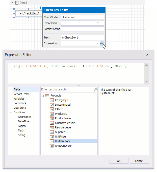
You can bind the XRCheckBox.CheckState property to a data field obtained from a report’s data source. Click the control’s smart tag, expand the Expression drop-down list for the CheckState property and select the required data field.

The data field value determines the checkbox state in the following manner:
- True or 1 activates the Checked state;
- False or 0 activates the Unchecked state;
- Any other value activates the Indeterminate state.
In the same way, expand the Expression drop-down list for the Text property and bind it to the desired data field.
Clicking the Expression option’s ellipsis button invokes the Expression Editor, in which you can construct a complex binding expression involving two or more data fields.
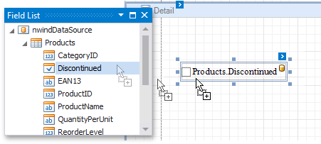
You can also drag and drop a Boolean type data field from the Field List to create a new checkbox bound to this field.
See the Bind Report Controls to Data topic to learn more about available data binding modes and creating data-aware controls.
Interactivity
You can enable changing the checkbox state in Print Preview by setting the EditOptions.Enabled option to true.
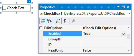
The CheckEditOptions.GroupID setting defines the checkbox’s behavior in Print Preview:
When you set this property to null or an empty string value, a checkbox can be switched to either the “checked” and “unchecked” state independently on other available checkboxes.
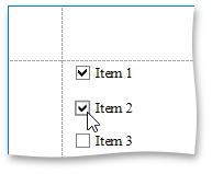
- Otherwise, the field editor behaves like a radio button, and editors that have the same ID belong to a single logical group (that is, only one option can be selected in a group at a time).