How to: Create an In-Ribbon Gallery
- 4 minutes to read
This example demonstrates how to create an In-Ribbon Gallery at design time and runtime.
Prerequisites
It is assumed that the form already contains a RibbonControl, and ImageCollection objects (imageCollection1 and imageCollection2) that will provide images for gallery items. imageCollection1 contains regular images for gallery items, while imageCollection2 contains enlarged versions of these images, which will be displayed when a specific gallery item is hovered over.
Design-Time Example
Create and Customize a Gallery
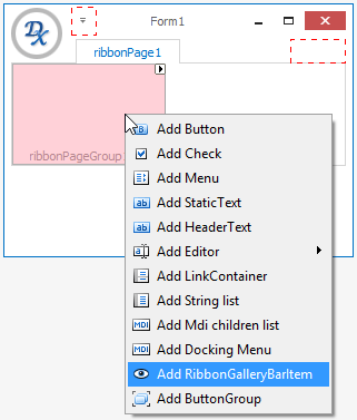
Open the Design view in Visual Studio. Right-click the RibbonPageGroup‘s client area and select Add RibbonGalleryBarItem.
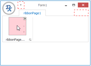
This creates a RibbonGalleryBarItem object designed to display an In-Ribbon Gallery. To access and customize the gallery settings using the Properties window, ensure that the created RibbonGalleryBarItem object is selected in the Design view.
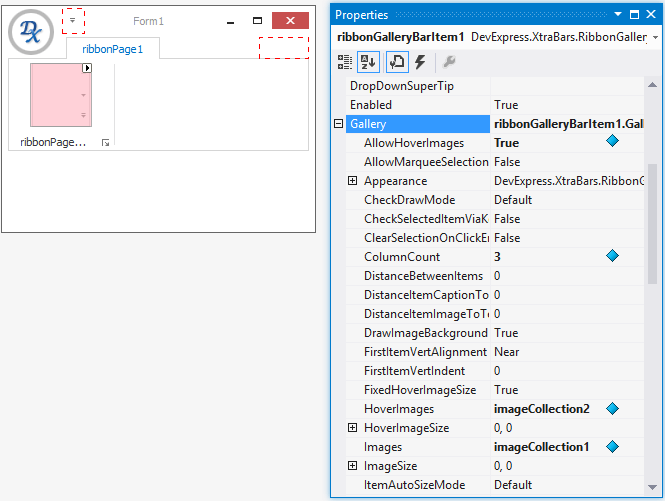
Once the RibbonGalleryBarItem is selected, expand the RibbonGalleryBarItem.Gallery property in the Properties window, and set the gallery settings as follows.
- Set BaseGallery.AllowHoverImages to true. This property enables the hover images mode, in which special hover images pop up when you move the mouse cursor over gallery items. Hover images are stored in imageCollection2 and they will be assigned to items in the following step.
- Set BaseGallery.ColumnCount to 3. This property specifies the number of gallery items horizontally displayed within the gallery.
- Set BaseGallery.Images to imageCollection1. This property specifies the collection of regular images for gallery items that will be displayed when gallery items are in their normal state.
- Set BaseGallery.HoverImages to imageCollection2. This property specifies the collection of hover images for gallery items. Hover images automatically appear over gallery items when the mouse cursor moves over them.
The modified properties are marked in the following image.
Add Gallery Items
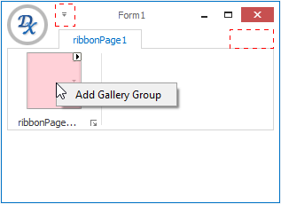
Before adding individual gallery items, first create a gallery item group, which is an immediate container of gallery items within the gallery. The gallery can contain multiple gallery item groups. In this tutorial, only one titleless group is created.
Right-click the RibbonGalleryItem‘s client area and select Add Gallery Group.
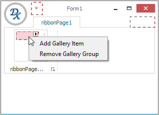
To create a gallery item, right-click the created group and choose Add Gallery Item.
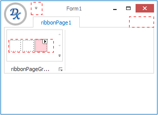
Add two more items in the same way.
For each gallery item, regular and hover images need to be specified. In this tutorial, gallery item images are stored in ImageCollection objects. Thus, to assign individual images from these collections to items, the GalleryItem.ImageIndex and GalleryItem.HoverImageIndex properties are used.
Select the first gallery item and click the item’s smart tag, to open the Tasks pane.
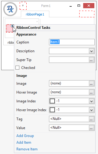
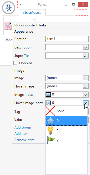
Set the ImageIndex and HoverImageIndex properties by selecting the proper images from the dropdown lists.
Note
If you are observing empty dropdown lists in your case, this means that the image collections assigned to the BaseGallery.Images and BaseGallery.HoverImages properties do not contain any images.
Assign images to the other two gallery items in the same way.
Run the project
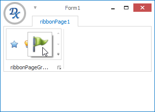
Run the project and move the mouse over the gallery items to see the hover images feature in action.
Runtime Example
The following code is equivalent to the design-time example above.
using DevExpress.XtraBars;
using DevExpress.XtraBars.Ribbon;

// Create a bar item that represents an In-Ribbon gallery.
RibbonGalleryBarItem galleryBarItem = new RibbonGalleryBarItem(RibbonControl1.Manager);
// Bind the image collections, which contain regular and hover images, to the gallery.
galleryBarItem.Gallery.Images = imageCollection1;
galleryBarItem.Gallery.HoverImages = imageCollection2;
// Enable the hover images feature.
galleryBarItem.Gallery.AllowHoverImages = true;

// Create a gallery item group and add it to the gallery.
GalleryItemGroup itemGroup1 = new GalleryItemGroup();
galleryBarItem.Gallery.Groups.Add(itemGroup1);
// Create gallery items and add them to the group.
GalleryItem item1 = new GalleryItem();
item1.ImageIndex = item1.HoverImageIndex = 0;
GalleryItem item2 = new GalleryItem();
item2.ImageIndex = item2.HoverImageIndex = 1;
GalleryItem item3 = new GalleryItem();
item3.ImageIndex = item3.HoverImageIndex = 2;
itemGroup1.Items.AddRange(new GalleryItem[] { item1, item2, item3 });
// Specify the number of items to display horizontally.
galleryBarItem.Gallery.ColumnCount = 3;

// Display the created In-Ribbon gallery within the first RibbonControl's page group.
RibbonControl1.Pages[0].Groups[0].ItemLinks.Add(galleryBarItem);