Image Gallery and Context-Dependent Images
- 6 minutes to read
DevExpress WinForms controls support both raster and vector (SVG) images. Raster images become blurry on high DPI screens. Vector images can be resized with no quality loss.
Images of both types are generally set from the ImageOptions properties group:
// Assign vector and raster icons contained in application resources.
simpleButton1.ImageOptions.SvgImage = SampleApp.Properties.Resources.security_high;
simpleButton2.ImageOptions.Image = SampleApp.Properties.Resources.Apple;

/* Assign vector and raster icons contained in image collections.
 * Image collections are created and populated with icons at design time.
 */
simpleButton3.ImageOptions.Image = imageCollection1.Images["technology_32x32"];
simpleButton4.ImageOptions.SvgImage = svgImageCollection1["security_security"];
simpleButton4.ImageOptions.SvgImageSize = new Size(16, 16);
At design time, use DevExpress tools like Image Picker or Image Gallery to quickly assign images to controls.
SVG Image Gallery
The SVG Image Gallery is opened when you specify vector icons at design time.
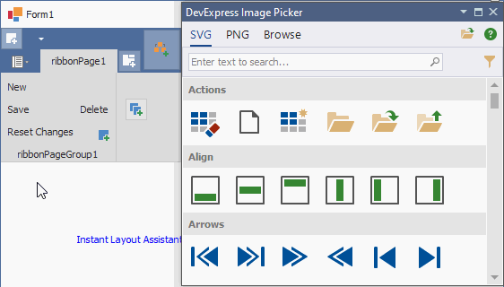
For example, click the ellipsis button within the BarItem.ImageOptions or BarItem.ImageOptions.SvgImage property in the Properties window to open the Image Picker dialog:
SVG icons are scaled according to the ~.ImageOptions.SvgImageSize setting or other control settings, and automatically change their colors based on the active skin/palette. Read the following help topic for additional information: How To: Draw and Use SVG Images.
You can also switch to the Font Icons tab and choose from hundreds of icons included in Windows 10 and 11 icon fonts. Read the following help topic for additional information: Font Icon Images.
PNG Image Gallery
When you specify an icon for a DevExpress UI element at design time, the “Image Picker” dialog appears. Switch to the “DX Raster Images” tab to browse raster icons from DevExpress.
- Categories
- Icons in the Image Gallery are grouped by category: arrows, mail, navigation, zoom, etc. Check boxes allow you to filter icons by category.
- Size
- Raster icons are available in two sizes - 16x16 and 32x32 pixels.
- Collection
- Check boxes in this group allow you to choose icons by a color scheme.
- Colored - Contains volumetric multi-color images (default).
- Grayscale - flat dark-gray icons that match monochrome UIs.
- DevAV - flat Hybrid UI icons.
- Office 2013 - Office 2013-inspired icons.
- Add to project/form resources
- You can add selected icons to the form or project resources. If you add a DevExpress icon to project resources, you can assign this icon to non-DevExpress controls in a standard Visual Studio “Select Resource” dialog.
- Search Panel
- Allows you to find icons by their names (for example, “Save”, “Open”).
Image Picker
The Image Picker streamlines icon access, management, and assignment to DevExpress controls and their UI elements directly within Visual Studio. The Image Picker allows you to assign vector (SVG), raster (PNG), and font icon images.
Open a form’s smart-tag menu and select the “Image Picker” option to invoke the Image Picker. You can drag icons directly onto controls, or assign them with a double-click. The Image Picker tracks selections in the designer, analyzes element captions, and displays the most relevant icons in the “Suggestions” category:
Load Icons from Disk
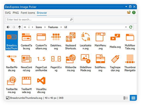
Switch to the “Browse” tab to load images from a disk:
Add Selected Icons to Project Resources
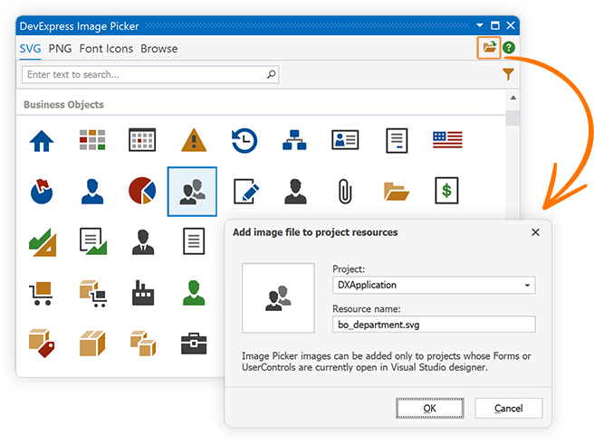
Click the button displayed in the upper right corner of the Image Picker to add the selected icon to project resources:
The following code displays an icon from project resources on a button:
Image Uri (Context-Dependent Raster Images)
Note
You should deploy DevExpress.Images.v26.1.dll when assigning icons to UI elements using Uri names.
The Image Uri feature allows you to use traditional raster images that automatically adjust in size and color scheme based on the applied skin and the control’s size.
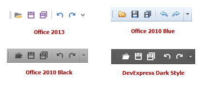
The following screenshot demonstrates how context-dependent toolbar item images appear in various skins. The ImageUri.Uri property of toolbar items is set to “Open”, “Save”, “SaveAll”, “Undo”, and “Redo”:
DevExpress WinForms UI controls and components that support context-dependent images expose the ImageUri property of the DxImageUri type. Use the DxImageUri.Uri property to access icons in the DevExpress Icon Gallery by name. Once you specify an icon name, the control or UI element automatically displays the icon that corresponds to the current skin.
Invoke the Image Picker and right-click an icon to copy its Uri to the clipboard:

Note
You should deploy DevExpress.Images.v26.1.dll when assigning icons to UI elements using Uri names.
Image Collections
Important
The DevExpress Icon Library does not expose public API to access icons. You cannot access icons directly from the Icon Library. To display DevExpress icons on UI elements at runtime, create an image collection and add the required icons from the DevExpress Icon Library at design time. Use this image collection to access icons in code.
Use the following image collections based on your preference:
- SvgImageCollection – A collection of SVG and Font icons.
- ImageCollection – A collection of PNG icons.
The following example displays PNG and SVG icons on buttons. You can specify an icon by name or index within the collection:
myButton1.ImageOptions.SvgImageSize = new Size(16, 16);
myButton1.ImageOptions.SvgImage = svgImageCollection1["security_security"];
// myButton1.ImageOptions.SvgImage = svgImageCollection1[0];

myButton2.ImageOptions.Image = imageCollection1.Images["technology_32x32"];
// myButton2.ImageOptions.Image = imageCollection1.Images[0];
Use the ImageCollection.Add method to add an image to the collection from the specified resource assembly:
Access and Use DevExpress Icons in Code
To access and use DevExpress icons in code, you should create a ‘source’ image collection and populate it with all required icons at design time. At runtime, you can create other image collections and fill them with the required icons from the source image collection:
using System;
using System.Drawing;
using DevExpress.Utils;
using DevExpress.XtraBars.Ribbon;

namespace DXApplication1 {
    public partial class Form1 : RibbonForm {
        SvgImageCollection secondarySvgImageCollection;
        public Form1() {
            InitializeComponent();
            secondarySvgImageCollection = new SvgImageCollection();
            // The 'svgImageCollectionAllIcons' collection was created and filled with Gallery icons at design time.
            secondarySvgImageCollection.Add("copy", svgImageCollectionAllIcons["copy"]);
            secondarySvgImageCollection.Add("cut", svgImageCollectionAllIcons["cut"]);
            secondarySvgImageCollection.Add("pastespecial", svgImageCollectionAllIcons["pastespecial"]);
        }
        void Form1_Load(object sender, EventArgs e) {
            buttonCopy.ImageOptions.SvgImage = secondarySvgImageCollection["copy"];
            buttonCopy.ImageOptions.SvgImageSize = new Size(16, 16);
        }
    }
}