BaseColumn.HorizontalHeaderContentAlignment Property
Gets or sets the column header’s content alignment. This is a dependency property.
Namespace: DevExpress.Xpf.Grid
Assembly: DevExpress.Xpf.Grid.v18.2.Core.dll
Declaration
Property Value
| Type | Description |
|---|---|
| HorizontalAlignment | A HorizontalAlignment enumeration value that specifies the content’s horizontal alignment. |
Remarks
The main part of a header’s content is a caption. You can change this caption and add different elements to a header content.

Customize Header Caption
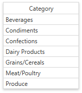
The image below shows a grid column with a changed header caption:

Specify the BaseColumn.Header property to change the column header’s caption. If the BaseColumn.Header property isn’t specified, a column header’s caption is specified by the ColumnBase.FieldName property. Camel-case field names are split with spaces, e.g., the header for the “CategoryName” field name is “Category Name”. The following code sample demonstrates how to use this property:
<dxg:GridColumn FieldName="CategoryName" Header="Category" HorizontalHeaderContentAlignment="Center"></dxg:GridColumn>
You can obtain the actual column header’s caption by using the BaseColumn.HeaderCaption property.
Tip
Use the HorizontalHeaderContentAlignment property to specify the column header’s content alignment.
Specify Custom Content
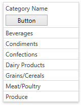
The image below shows a grid column whose header contains a button:

Specify the BaseColumn.HeaderTemplate property to customize header content for an individual column. You can specify a common template applied to all columns displayed in the current GridControl’s view by using the DataViewBase.ColumnHeaderTemplate. The data context (binding source) for these templates is the BaseColumn.HeaderCaption property.
The following code sample demonstrates how to change a column header’s content:
<dxg:GridColumn FieldName="CategoryName">
   <dxg:GridColumn.HeaderTemplate>
      <DataTemplate>
         <StackPanel>
            <TextBlock Text="{Binding}"></TextBlock>
            <Button Content="Button" Margin="0,5,0,0"></Button>
         </StackPanel>
      </DataTemplate>
   </dxg:GridColumn.HeaderTemplate>
</dxg:GridColumn>
See the How to: Display an Image within a Column Header example to learn how to add an image to column header content using BaseColumn.HeaderTemplate.
If you have more than one template that can be used to render header content, specify the BaseColumn.HeaderTemplateSelector property to implement custom logic for choosing the required template. Use the BaseColumn.ActualHeaderTemplateSelector property to obtain the actual template selector.
Specify Header Content Style
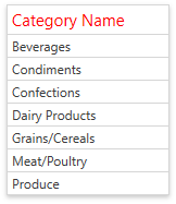
The image below shows a grid column whose header caption is red and has an increased font size:

Specify the ColumnBase.ColumnHeaderContentStyle property to change a column header content’s appearance. Use the DataViewBase.ColumnHeaderContentStyle property to specify a common column header content’s style applied to all columns displayed in the current GridControl’s view. The target element for these styles is ContentControl class.
The following code sample demonstrates how to change a header caption’s color and increase the font size:
<dxg:GridColumn FieldName="CategoryName">
   <dxg:GridColumn.ColumnHeaderContentStyle>
      <Style TargetType="{x:Type ContentControl}">
         <Setter Property="FontSize" Value="15" />
         <Setter Property="Foreground" Value="Red" />
      </Style>
   </dxg:GridColumn.ColumnHeaderContentStyle>
</dxg:GridColumn>
Use the ColumnBase.ActualColumnHeaderContentStyle property to obtain a column header content’s style which is currently used by a column.
Related GitHub Examples
The following code snippet (auto-collected from DevExpress Examples) contains a reference to the HorizontalHeaderContentAlignment property.
Note
The algorithm used to collect these code examples remains a work in progress. Accordingly, the links and snippets below may produce inaccurate results. If you encounter an issue with code examples below, please use the feedback form on this page to report the issue.