Lesson 1 - Create Layout
- 5 minutes to read
Download the basic solution from the DXEditorsTutorial example. It is a draft application connected to a database. Open the RegistrationForm.BaseProject project and follow the steps in this lesson.
The RegistrationForm.Lesson1 project contains the result of this lesson.
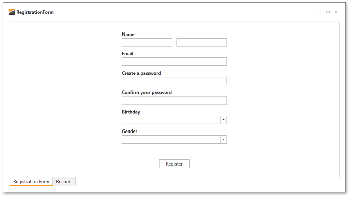
Review the Google registration form. There are several rows which consist of input boxes and corresponding descriptions (e.g., First Name and Last Name in the first row of editors).
Open the RegistrationView.xaml file and run the Visual Studio designer.
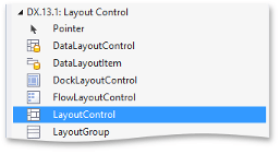
Use the LayoutControl component to arrange editors similarly. The DevExpress LayoutControl Suite is well-suited for quickly constructing micro layouts. The layout suite provides three major controls.
- LayoutControl – the root element of a compound or row/column layout.
- LayoutGroup – a control container for arranging its items side-by-side (either vertically or horizontally) or in tabs. A LayoutGroup can contain LayoutGroup children with independent arrangements. LayoutGroup nesting supports non-linear control layouts.
- LayoutItem - a control with label and content regions. The content region is a UIElement.
Drag and drop a LayoutControl from the Visual Studio toolbox onto the form.
Right-click the LayoutControl element in the designer and select the Reset Layout | All option. This will reset the position and size attributes on the LayoutControl element and fill the LayoutControl within its parent UserControl.
<UserControl x:Class="RegistrationForm.View.RegistrationView" ... >
    <Grid>
        <dxlc:LayoutControl/>
    </Grid>
</UserControl>
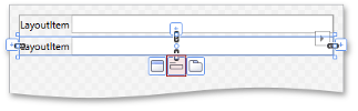
The LayoutControl supports the adding of layout items directly from its designer. Select the LayoutControl design surface and move the cursor over its center designer button to display three options: Add a new group  , Add a new item
  , and Add a new tabbed group
  . Click Add a new item to add a simple editor container to the layout.
It is necessary to add six layout items (one for each remaining editor). When a layout item is added to the LayoutControl, the central designer button for the layout item addition is replaced with buttons on the selected LayoutControl element. Adding a layout item from these options positions the new item with respect to the existing element.
Select the original LayoutItem. The “+“ buttons are shown at the left, top, right, and bottom edges of the LayoutItem. Hovering over these buttons invokes the familiar options for adding a layout item: Add a new group, Add a new item, and Add a new tabbed group. Add a new LayoutItem under the bottom edge of the existing item.
You can copy and paste existing items to speed up the process of adding the remaining LayoutItems to the design surface using the Ctrl+C and Ctrl+V hotkeys.
To edit the label region of a layout item, open the layout item Smart Tag and set the Label property.
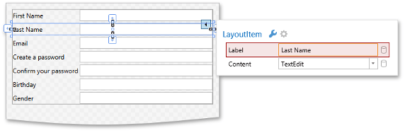
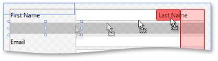
Drag and drop the Last Name item onto the first row, so that First Name and Last Name are displayed in the same row.
Return to the xaml code to add the Register button.
<UserControl x:Class="RegistrationForm.View.RegistrationView"  ... >
    <Grid>
        <dxlc:LayoutControl Orientation="Vertical" ItemStyle="{StaticResource itemStyle}">
            ...
            <Button Content="Register" HorizontalAlignment="Center" VerticalAlignment="Bottom" Width="80" />
        </dxlc:LayoutControl>
    </Grid>
</UserControl>
To improve the UI, it is necessary to set bold label text at the top edge of each LayoutItem. Set the LayoutItemLabelPosition.Left property to Top to set proper alignment. Create a style for the LayoutItem.LabelStyle property to manage the FontWeight of the labels. Assign this style to the LayoutGroup.ItemStyle property.
<UserControl x:Class="RegistrationForm.View.RegistrationView" ... >
    <UserControl.Resources>
        <Style x:Key="labelStyle" TargetType="dxlc:LayoutItemLabel">
            <Setter Property="FontWeight" Value="Bold"/>
        </Style>
        <Style x:Key="itemStyle" TargetType="dxlc:LayoutItem">
            <Setter Property="LabelPosition" Value="Top"/>
            <Setter Property="LabelStyle" Value="{StaticResource labelStyle}"/>
        </Style>
    </UserControl.Resources>
    <Grid>
        <dxlc:LayoutControl Orientation="Vertical" ItemStyle="{StaticResource itemStyle}">
            ...
        </dxlc:LayoutControl>
    </Grid>
</UserControl>
The LayoutItems are spaced too closely. To increase the distance between items, set the LayoutControlBase.ItemSpace property for the LayoutControl and for the first LayoutGroup.
<dxlc:LayoutControl Orientation="Vertical" ItemStyle="{StaticResource itemStyle}" ItemSpace="10">
    <dxlc:LayoutGroup ItemSpace="10">
         ...
     </dxlc:LayoutGroup>
     ...
</dxlc:LayoutControl>
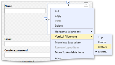
The First Name and Last Name fields share the label. You can remove the Last Name description text by selecting the Last Name LayoutItem and choosing Remove LayoutItem from its context menu. Notice that a LayoutItem would consist solely of a UIElement content region. Now, set the Label property of the First Name layout item to “Name”, and set the alignment of the Last Name editor.
You have built the basic layout of the RegistrationView. At the moment, however, each layout item contains the TextEdit control. It is necessary to have an appropriate editor for each data field. DXEditors for WPF provide several editor types to serve these needs.
- FirstName and Last Name - TextEdit: Both name fields are plain text.
- Email - TextEdit: Email addresses are formatted with an editor mask.
- Password and Confirm password - PasswordBoxEdit
- Birthday - DateEdit
- Gender - ComboBoxEdit: Supports predefined choices, Male or Female.
To learn more about supported editor types, review the Editor Types documentation topic.
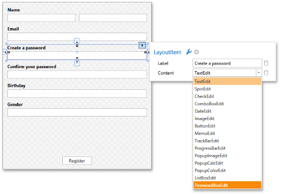
A LayoutItem provides design-time capabilities to easily switch editor types. Select the Create a password LayoutItem in the designer and open its smart tag to choose the PasswordBoxEdit editor type from the Content drop down.
Set the editor types of the remaining fields (Password, Confirm Password, and Gender).
The result is shown below.