LayoutGroup Class
Represents a container that arranges its items side by side (in a single row or column) or as tabs. The LayoutGroup cannot be used outside a LayoutControl or DataLayoutControl.
Namespace: DevExpress.Xpf.LayoutControl
Assembly: DevExpress.Xpf.LayoutControl.v19.1.dll
Declaration
public class LayoutGroup :
    LayoutControlBase,
    ILayoutGroup,
    ILayoutControlBase,
    IScrollControl,
    IPanel,
    IControl,
    ILayoutModelBase,
    ILayoutGroupModel,
    ILiveCustomizationAreasProvider,
ILayoutControlCustomizableItemRelated API Members
The following members return LayoutGroup objects:
Remarks
The LayoutGroup.View property specifies how the group’s items are displayed - side-by-side or as tabs.
If the property is set to LayoutGroupView.Group or LayoutGroupView.GroupBox, the group’s items are arranged in a single row or column, according to the LayoutGroup.Orientation property. The alignment of an item within a group can be adjusted via the item’s HorizontalAlignment and VerticalAlignment properties.
In default display mode (LayoutGroupView.Group), a group doesn’t display its header. To enable the header, set the LayoutGroup.View property to LayoutGroupView.GroupBox. To specify the object to display in the group’s header use the LayoutGroup.Header property.
A LayoutGroup supports the collapsing feature in the LayoutGroupView.GroupBox paint style. You can enable the collapsing feature by setting the LayoutGroup.IsCollapsible property. In this mode, the group displays the collapse/expand button, allowing an end-user to collapse/restore the group’s contents. To specify the expansion state in code, see LayoutGroup.IsCollapsed.
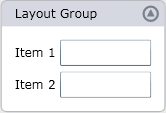
The following code creates a LayoutGroup with two items. The collapsing feature is enabled via the LayoutGroup.IsCollapsible option:
<lc:LayoutGroup Orientation="Vertical" View="GroupBox" Header="Layout Group"
                Width="150" IsCollapsible="True">
    <lc:LayoutItem Label="Item 1">
        <TextBox   Text=""/>
    </lc:LayoutItem>
    <lc:LayoutItem Label="Item 2">
        <TextBox   Text=""/>
    </lc:LayoutItem>
</lc:LayoutGroup>
The result is shown below:
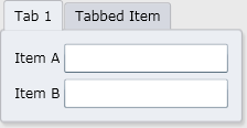
To enable the tabbed UI for a LayoutGroup, set LayoutGroup.View to LayoutGroupView.Tabs. Each child will be represented as a tab.
If another LayoutGroup object is a child of a tabbed group, the corresponding tab header displays the LayoutGroup’s LayoutGroup.Header object. For other layout items, you can specify tab headers via the LayoutControl.TabHeader attached property.
The following code creates a tabbed LayoutGroup:
<lc:LayoutControl x:Name="layoutControl1" Background="#FFEAEAEA">
    <lc:LayoutGroup View="Tabs" Width="200" >
        <lc:LayoutGroup Orientation="Vertical" Header="Tab 1">
            <lc:LayoutItem Label="Item A">
                <TextBox   Text=""/>
            </lc:LayoutItem>
            <lc:LayoutItem Label="Item B">
                <TextBox   Text=""/>
            </lc:LayoutItem>
        </lc:LayoutGroup>
        <lc:LayoutItem Label="Item 2" lc:LayoutControl.TabHeader="Tabbed Item">
            <TextBox   Text=""/>
        </lc:LayoutItem>
    </lc:LayoutGroup>
</lc:LayoutControl>
The result is shown below:
Note
In the LayoutGroupView.Tabs mode, the LayoutControl sets the IsEnabled property for elements located within an inactive tab in a tabbed group to False. After the previously inactive tab is selected, the IsEnabled property value is restored.
The most common scenario for using a LayoutGroup is in a LayoutControl. Using LayoutGroups, you can build compound layouts, as demonstrated in the Layout Control topic.
Examples
Related GitHub Examples
The following code snippets (auto-collected from DevExpress Examples) contain references to the LayoutGroup class.
Note
The algorithm used to collect these code examples remains a work in progress. Accordingly, the links and snippets below may produce inaccurate results. If you encounter an issue with code examples below, please use the feedback form on this page to report the issue.