LayoutItem Class
Represents a control that consists of a label and content regions. The LayoutItem cannot be used outside a LayoutControl.
Namespace: DevExpress.Xpf.LayoutControl
Assembly: DevExpress.Xpf.LayoutControl.v19.1.dll
Declaration
public class LayoutItem :
    ControlBase,
    ILayoutControlCustomizableItem,
    ISerializableItem,
ISerializableCollectionItemRemarks
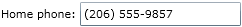
Visually a LayoutItem consists of a label and content regions. The following image shows a LayoutItem with a label set to “Home phone:” and content set to a TextBox:
You can provide a label via the LayoutItem.Label property. Typically, you assign a text string to this property. However, you can assign any object to the LayoutItem.Label property, and then specify a data template (via the LayoutItem.LabelTemplate property) that will define how the label is rendered on-screen. A label’s style can be customized via the LayoutItem.LabelStyle property. To change the label’s position, use the LayoutItem.LabelPosition property.
A layout item’s content can be specified via the LayoutItem.Content property. When declaring a LayoutItem object in XAML, any object defined between the LayoutItem start and end tags is used to initialize the LayoutItem.Content property.
Typically, LayoutItem objects are used as elements of a LayoutControl. When they are used within a LayoutControl, the content regions of the LayoutItems are automatically aligned:
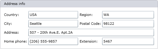
The following code snippet replicates the control layout shown on the image above.
<dx:ThemedWindow
    ...
    xmlns:dxlc="http://schemas.devexpress.com/winfx/2008/xaml/layoutcontrol"
    xmlns:dx="http://schemas.devexpress.com/winfx/2008/xaml/core">
    <Grid x:Name="LayoutRoot" Background="White">
        <dxlc:LayoutControl Orientation="Vertical" Background="#FFEAEAEA">
            <dxlc:LayoutGroup Orientation="Vertical">
                <dxlc:LayoutGroup Orientation="Horizontal">
                    <dxlc:LayoutGroup Orientation="Vertical">
                        <dxlc:LayoutItem Label="Country:">
                            <TextBox Text="USA"/>
                        </dxlc:LayoutItem>
                        <dxlc:LayoutItem Label="City:">
                            <TextBox Text="Seattle"/>
                        </dxlc:LayoutItem>
                    </dxlc:LayoutGroup>
                    <dxlc:LayoutGroup Orientation="Vertical">
                        <dxlc:LayoutItem Label="Region:">
                            <TextBox Text="WA"/>
                        </dxlc:LayoutItem>
                        <dxlc:LayoutItem Label="Postal Code:">
                            <TextBox Text="98122"/>
                        </dxlc:LayoutItem>
                    </dxlc:LayoutGroup>
                </dxlc:LayoutGroup>
                <dxlc:LayoutItem Label="Address:">
                    <TextBox Text="507 - 20th Ave.E. Apt.2A"/>
                </dxlc:LayoutItem>
            </dxlc:LayoutGroup>
            <dxlc:LayoutGroup Orientation="Horizontal">
                <dxlc:LayoutItem Label="Home Phone:">
                    <TextBox Text="(206) 555-9857"/>
                </dxlc:LayoutItem>
                <dxlc:LayoutItem Label="Extension:">
                    <TextBox Text="5467"/>
                </dxlc:LayoutItem>
            </dxlc:LayoutGroup>
        </dxlc:LayoutControl>
    </Grid>
</dx:ThemedWindow>
Refer to the Aligning contents of LayoutItems for more information.
Examples
- How to: Build Non-Linear Layout via LayoutControl
- How to: Change styles of labels for individual or all layout items
- How to: Specify DataTemplate used to render labels of LayoutItems
- How to: Save and restore layout of items in LayoutControl
Related GitHub Examples
The following code snippets (auto-collected from DevExpress Examples) contain references to the LayoutItem class.
Note
The algorithm used to collect these code examples remains a work in progress. Accordingly, the links and snippets below may produce inaccurate results. If you encounter an issue with code examples below, please use the feedback form on this page to report the issue.