Selection
- 2 minutes to read
End-users can select one accordion item at a time by default:
You can set the AccordionControl.SelectionMode property to SelectionMode.None to prohibit item selection.
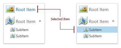
Use the AccordionControl.SelectedItem property to get or set the selected accordion item.
Selection Customization
You can specify accordion item types an end-user can select.
Set the AccordionControl.SelectionUnit property to:
- SelectionUnit.SubItem to allows selecting subitems only.
- SelectionUnit.SubItemOrRootItem to allow selecting both root items and subitems.
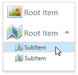
The following code sample demonstrates an AccordionControl that allows selecting subitems only:
<dxa:AccordionControl SelectionUnit="SubItem">
   <dxa:AccordionItem Header="Root Item" Glyph="{dx:DXImage Image=Image_32x32.png}"/>
   <dxa:AccordionItem Header="Root Item" Glyph="{dx:DXImage Image=Map_32x32.png}">
      <dxa:AccordionItem Header="SubItem" Glyph="{dx:DXImage Image=Map_16x16.png}"/>
      <dxa:AccordionItem Header="SubItem" Glyph="{dx:DXImage Image=Map_16x16.png}"/>
   </dxa:AccordionItem>
</dxa:AccordionControl>
The image below shows the result:
Highlighting Customization
Selectable and expandable accordion items are highlighted when you move the mouse cursor over them. Use the following properties to change this behavior:
| Property | Description |
|---|---|
| AccordionItem.HighlightOnHover | Gets or sets whether the current item is highlighted when an end-user moves the mouse cursor over it. |
| AccordionItem.HighlightOnPress | Gets or sets whether the current item is highlighted when an end-user clicks and holds the left mouse button. |
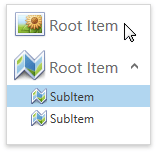
The following code sample shows an accordion item that you can highlight but not select:
<dxa:AccordionControl SelectionMode="None">
   <dxa:AccordionItem Header="Root Item" Glyph="{dx:DXImage Image=Image_32x32.png}"/>
   <dxa:AccordionItem Header="Root Item" Glyph="{dx:DXImage Image=Map_32x32.png}">
      <dxa:AccordionItem Header="SubItem" Glyph="{dx:DXImage Image=Map_16x16.png}" HighlightOnHover="True" />
      <dxa:AccordionItem Header="SubItem" Glyph="{dx:DXImage Image=Map_16x16.png}" />
   </dxa:AccordionItem>
</dxa:AccordionControl>
The image below shows the result: