Tip
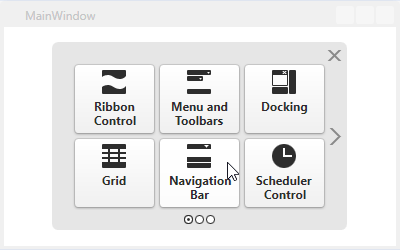
The NavBarControl was designed to replicate the layout of the navigation pane in Outlook 2003, Outlook 2007, and older versions of Microsoft Explorer.
If you start a new project, consider using the AccordionControl. The AccordionControl can also be used as a navigation pane, but it has a simpler API and provides more room for customization.
Overview
|
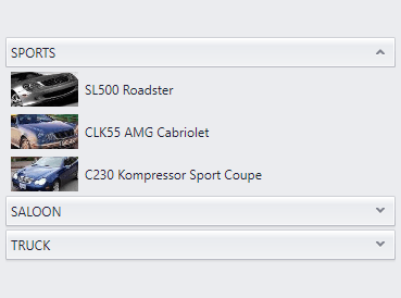
| The Navigation Bar is a well-known variation of the side navigation bar that features collapsible groups with items within it. Key features include:
- three available Views that affect NavBar Control behavior and appearance;
- layout flexibility and runtime customization options;
- the capability to embed any control to a NavBar item;
- provides a set of built-in commands that allow programming various actions in XAML markup;
- interaction with Office Navigation Bar.
|
Learn the Basics
|
This section contains topics that cover essential concepts of the Navigation Bar.
| 
|
Views
|
The Navigation Bar content is built using groups and their child items. The way these essential Navigation Bar elements look and behave depends on the currently applied View. This section is dedicated to Views and contains the overall information on applying, customizing and templating these Views.
Views
An overview document. Enumerates all Views provided by the Navigation Bar and outlines their main features.
View Layout Customization
This document contains information on customizing a View layout (e.g., changing item and group orientation or modifying the display mode for View content elements).
Styling View Content Elements
Demonstrates how to customize Navigation Bar appearance on View, group and item levels.
Templating View Elements
Templating View elements allow you to completely replace their look and feel, while keeping their existing behavior. These documents contain common approaches and ones specific to particular Views templating.
Scrolling
The Navigation Bar allows you to scroll its groups and items if they do not fit into the current client area. This document provides information on scrolling modes and settings.
| |
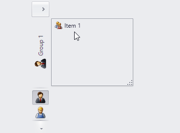
Groups
|
Groups are expandable elements that have header and content areas, and are designed to contain clickable items or any custom content. You can provide global group settings on the View level, as well as customize specific groups individually. Refer to the links below to learn more about Navigation Bar groups.
Groups
An overview document that explains crucial concepts of the Navigation Bar group.
Group Content Model
Each Navigation Bar group typically consists of two regions: the group header and the group client area. This document demonstrates how to define and customize both regions and how Navigation Bar groups are referred to within the visual tree.
Expand and Collapse Groups
Contains information on expanding and collapsing groups in different Views.
Expanded Group
An expanded group is an opened group, providing access to its contents, so that an end-user can work with them. Depending on the currently applied View, the significance of the ‘expanded group’ term may vary.
Active Group
In Side Bar and Navigation Pane Views, which allow only one group to be opened at a time, the active group is equal to the currently expanded group. In the Explorer View, the “active group” term is used for a group whose header was last clicked by an end-user.
| 
|
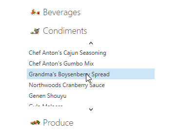
Items
|
Items are objects of the NavBarItem class hosted within Navigation Bar groups. These are clickable elements that can display content (a text string or any custom content) and an image.
Items
This document provides overview information on Navigation Bar items.
Item Content Model
This topic describes how item content can be defined using specific properties, and how an item (that is a content element) is referred to within the visual tree.
Clicking and Selecting Items
Learn how to respond to end-users clicking and/or selecting Navigation Bar items and apply the required item selection mode.
| 
|
Miscellaneous
|
This section contains documents dedicated to other Navigation Bar features.
Binding to Data
Demonstrates how to populate Navigation Bar groups and items from a data source.
Visual Elements
Enumerates all Navigation Bar’s visual elements and properties that affect them.
Commands
Using Navigation Bar commands you can bind most specific Navigation Bar actions to your UI elements in XAML markup.
Attached Properties
Contains a table that demonstrates all attached properties exposed by the Navigation Bar control.
Member Tables
Contains properties, methods and events grouped by task. For instance, you can find all members that affect Navigation Bar scrolling.
| 
|