List View Control
- 12 minutes to read
The List View control allows a user to display items vertically or horizontally and arrange them in groups and columns. Each item can show its caption, subitems, images, check box, and hint. The control supports look & feel settings common to all DevExpress VCL controls. These settings allow you to keep the application’s appearance consistent for all UI elements.
Manage Items in Standard Mode
If the List View’s OwnerData property is set to False, the control displays information in list items (standard mode).
Manage Items in Code
The control, its list item collection, and items allow you to add, delete, sort, select, and check items at runtime.
Add Items
The List View includes the following methods that allow you to add items:
The following code appends a new item with the specified caption to the control:
dxListViewControl1.AddItem('New Item', nil);
Delete Items
You can call the following procedures to delete items:
The control’s Clear and DeleteSelected procedures
An item’s Delete procedure
The following code deletes the first item in the control:
if dxListViewControl1.GetCount > 0 then
  dxListViewControl1.Items.Delete(0);
Sort Items
The AlphaSort and CustomSort functions allow you to sort items. These functions raise the OnCompare event you can handle to implement a custom item sorting algorithm.
The following code sorts items by their captions:
dxListViewControl1.AlphaSort;
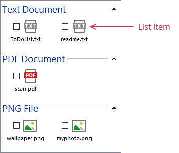
Select Items
You can also select items in code.
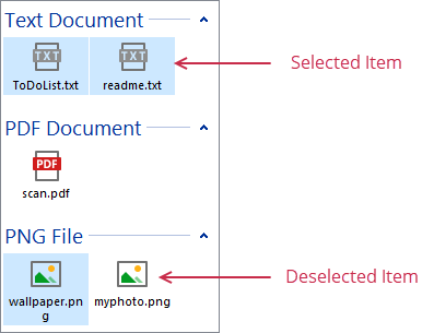
The List View allows a user to select only one item out-of-the-box. Set the control’s MultiSelect property to True to allow a user to select multiple items. To prohibit a user from selecting an item, set the item’s Enabled property to False. You can handle the control’s OnSelectItem event to perform specific actions when a user selects or deselects an item.
The SelectAll and ClearSelection procedures allow you to select and deselect all items, respectively. To select or deselect a specific item, set its Selected property to True or False.
The following code selects all items in the control:
dxListViewControl1.SelectAll;
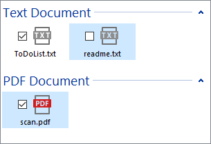
Check Items
Set the List View’s Checkboxes property to True to display item check boxes.
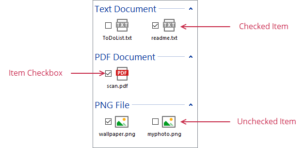
Use an item’s Checked property to check or uncheck the item. To prohibit a user from changing an item’s check box state, set the item’s Enabled property to False.
The following code checks all items in the control:
var
  AItem: TdxListItem;
begin
  dxListViewControl1.BeginUpdate;
  for AItem in dxListViewControl1.Items do
     AItem.Checked := True;
  dxListViewControl1.EndUpdate;
end;
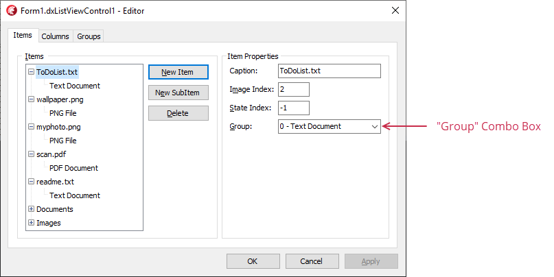
Manage Items at Design Time
You can create, customize, and delete items in the List View Editor. Double-click the control to invoke the editor.
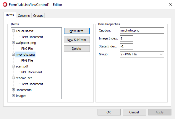
Use the following buttons in the Items tab to add and delete items:
Button | Description |
|---|---|
New Item | Appends a new item in the preview box on the left. |
New SubItem | Appends a new subitem to the focused item or focused subitem’s owner. Note Subitems specify content displayed in additional columns. Subsequent sections describe how to display list columns. |
Delete | Removes the focused item and all its subitems or the focused subitem. |
Manage Items in Virtual Mode
Set the control’s OwnerData property to True to switch the control to high-performance virtual mode. In this mode, the List View reduces memory use and can handle millions of items. Items are not loaded or changed automatically. Instead, you should manage them in dedicated event handlers as shown below.
Set a non-negative integer to the control’s Items.Count property to specify the target item count. Then, handle the following events to manage and display list items:
Event | Description |
|---|---|
Allows you to customize an item when it is about to be displayed. | |
Allows you to update information about a range of items when they change. | |
Allows you to search list items. |
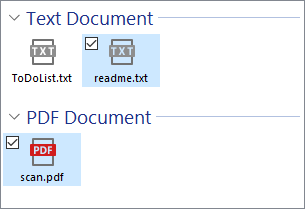
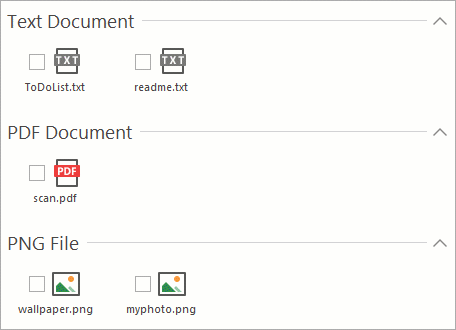
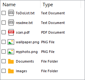
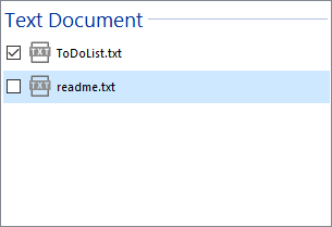
The form’s OnCreate and the control’s OnData event handlers below specify the item count and assign captions, subitems, and images to each item:
procedure TForm1.FormCreate(Sender: TObject);
begin
  dxListViewControl1.Items.Count := 7;
end;

procedure TForm1.dxListViewControl1Data(Sender: TdxCustomListView;
  AItem: TdxListItem);
const
  AItems: array[0..6, 0..1] of string = (
    ('ToDoList.txt', 'Text Document'),
    ('readme.txt', 'Text Document'),
    ('scan.pdf', 'PDF Document'),
    ('wallpaper.png', 'PNG File'),
    ('myphoto.png', 'PNG File'),
    ('Documents', 'File Folder'),
    ('Images', 'File Folder')
  );
  AImageIndexes: array [0..6] of Integer = (0, 0, 1, 2, 2, 3, 3);
begin
  AItem.Caption := AItems[AItem.Index][0];
  AItem.SubItems.Add(AItems[AItem.Index][1]);
  AItem.ImageIndex := AImageIndexes[AItem.Index];
end;
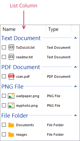
The following image shows the result:
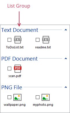
Manage Groups
Assign True to the GroupView property of the control in standard mode to display items in groups.
Manage Groups in Code
The control allows you to add, delete, and populate groups at runtime.
Add Groups
You can call the group collection‘s Add and Insert functions to add groups to the control.
The following code appends a new group with the default settings:
dxListViewControl1.Groups.Add;
Delete Groups
The group collection has the Delete and Clear procedures that allow you to remove groups from the control.
The following code deletes all groups:
dxListViewControl1.Groups.Clear;
Populate Groups
You can assign a group to an item’s Group property to add the item to the group. You can also set an item’s GroupID property to a group identifier to do the same. To remove an item from a group, assign nil (in Delphi) or nullptr (in C++Builder) to the item’s Group property or set the item’s GroupID property to -1.
The following code adds the first item to the first group:
var
  AItem: TdxListItem;
  AGroup: TdxListGroup;
begin
if (dxListViewControl1.Items.Count > 0) and (dxListViewControl1.Groups.Count > 0) then
  begin
    AItem := dxListViewControl1.Items[0];
    AGroup := dxListViewControl1.Groups[0];
    AItem.Group := AGroup;
  end;
end;
Manage Groups at Design Time
The List View Editor has the Groups tab that allows you to add and delete groups at design time.
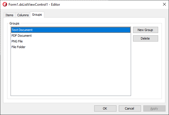
The New Group button appends a new group to the control. You can click the Delete button to delete all selected groups.
You can select a group and specify its properties in the Object Inspector.
Use the Group combo box in the Items tab to specify which group contains the focused item in the preview box on the left.
Manage Columns
The List View control in Report mode shows items in columns. Item display modes are explained in subsequent sections.
Manage Columns in Code
The control allows you to add, delete, and resize columns at runtime.
Add Columns
You can call the column collection‘s Add and Insert functions to add columns to the control. The first created column shows item captions, other columns display subitems.
The following code appends a new column with the default settings:
dxListViewControl1.Columns.Add;
Delete Columns
The column collection has the Delete and Clear procedures that allow you to remove groups from the control.
The following code deletes all columns:
dxListViewControl1.Columns.Clear;
Resize Columns
You can call a column’s ApplyBestFit procedure to adjust the width of a column and display all its content. The control’s ApplyBestFit procedure allows you to adjust the width of all columns.
The following code resizes all columns in the control to display all their content:
dxListViewControl1.ApplyBestFit(nil, False);
You can use a column’s Width property to set the column’s width. Each column has the MinWidth and MaxWidth properties that allow you to specify its width constraints.
Manage Columns at Design Time
The List View Editor has the Columns tab that allows you to add and delete columns at design time.
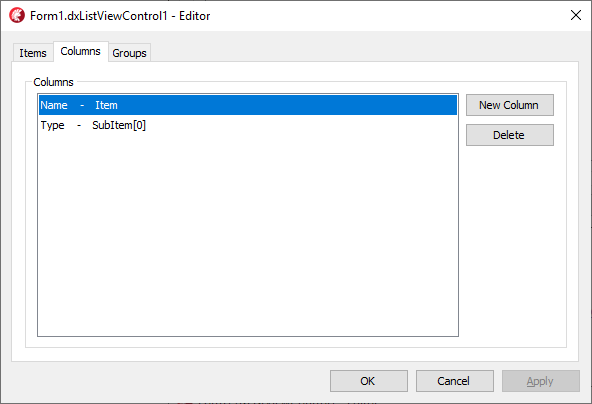
The New Column button appends a new column to the control. The Delete button allows you to delete all selected columns.
You can select a column and specify its properties in the Object Inspector.
Customize List View Style
The List View allows you to display items in different modes and customize images, fonts, and paddings for all UI elements.
Switch Item Display Modes
The control’s ViewStyle property specifies the active item display mode. The following table lists the control’s item display modes, corresponding ViewStyle property values, and control appearance settings:
Item Display Mode | ViewStyle Property Value | The Control’s Property | Example |
|---|---|---|---|
Icon | Icon |
| |
List | List |
| |
Report | Report |
| |
SmallIcon | SmallIcon |
|
Note
The ViewStyle property’s type is a scoped enumeration. Use the type name (TdxListViewStyle) together with a scope resolution token (. in Delphi or :: in C++Builder) followed by an enumeration value to refer to this value. For example, use TdxListViewStyle.Icon (in Delphi) or TdxListViewStyle::Icon (in C++Builder) to refer to the Icon value in code.
Show Images
The List View can show images in different UI elements.
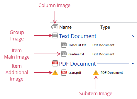
The control’s ImageOptions property allows you to specify image containers for different UI elements. The following table lists UI element image types and the corresponding properties you can use to specify image containers and image indexes of elements:
UI Element Image Type | Image Container | An Element’s Image Index |
|---|---|---|
Column images | A column’s ImageIndex property | |
Group images | A group’s TitleImage property | |
Item main images | ImageOptions.LargeImages (in Icon mode) or ImageOptions.SmallImages (in other modes) | An item’s ImageIndex property |
Item additional images | An item’s StateIndex property | |
Subitem images | An item’s SubItemImages property |
Customize Fonts
The control allows you to use custom fonts for different UI elements.
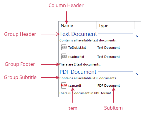
The List View shows all UI elements with the default font out-of-the-box (that is, the control uses font settings defined in a parent form or panel). You can use the control’s Fonts property to specify custom fonts for the following UI elements:
Column headers (Fonts.ColumnHeader)
Group headers (Fonts.GroupHeader)
Group subtitles (Fonts.GroupSubtitle)
Group footers (Fonts.GroupFooter)
Item captions (Fonts.Item)
Subitems (Fonts.SubItem)
Adjust Paddings
The control allows you to use custom fonts for different UI elements. The control’s PaddingOptions property allows you to specify padding settings for the following:
List View content (PaddingOptions.View)
Group headers (PaddingOptions.GroupHeader)
Group content (PaddingOptions.GroupContent)
Items (PaddingOptions.Item)
Enable Explorer Style
You can set the control’s ExplorerStyle property to True to make the control’s appearance and behavior similar to Windows Explorer. The following table shows the standard and Explorer styles in different modes:
Mode | Standard Style | Explorer Style |
|---|---|---|
Icon |
|
|
List |
|
|
Report |
|
|
SmallIcon |
|
|