Link Arrangement
- 2 minutes to read
Icon and regular layouts
Links in NavBar Views can be displayed using two distinct layouts: the regular and icon layouts.
If the regular layout is applied, each link is represented by its image and caption, and links are arranged from top to bottom.
If the icon view is used, links are represented only by images and they are arranged across, and then down.
The group’s ShowAsIconView property determines the layout used by the group. When set to False (the default value), the regular layout is applied. Otherwise, a NavBar group arranges links using the icon layout.
Note that only Side Bar Views support the icon layout. The ShowAsIconView property in Explorer Bar Views is not used. These Views always use the regular link layout.
Small and large images
Links are presented within a group either by a small or large image. They get images from one of the two image lists specified by the NavBar control’s OptionsImage.SmallImages and OptionsImage.LargeImages properties and the choice depends upon the group’s LinksUseSmallImage attribute. If LinksUseSmallImage is set to True, all links within a group get images from the OptionsImage.SmallImages image list. Otherwise, the OptionsImage.LargeImages list is used.
A link does not store any information required for displaying itself within a group. Instead, a link obtains the necessary data from the item object to which it refers. The image index of the link is controlled by the item’s SmallImageIndex and LargeImageIndex properties. They specify image indexes within the OptionsImage.SmallImages and OptionsImage.LargeImages lists respectively.
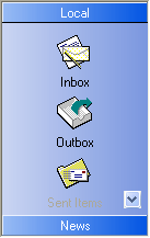
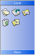
The following screenshots show the same NavBar group when the LinksUseSmallImage property is set to True and False respectively:
| The LinksUseSmallImage property is set to True | The LinksUseSmallImage property is set to False |
|---|---|
 |
 |
Each NavBar group can also be associated with small or large images. A group image is displayed within the group header and this is supported only by Explorer Bar Views. Images are assigned to groups in the similar manner as for links. A NavBar group provides the SmallImageIndex and LargeImageIndex properties specifying the indexes of group images within the OptionsImage.SmallImages and OptionsImage.LargeImages lists respectively. A group will use either a small or large image depending on the UseSmallImages property.
The next image shows two groups. The first group displays a large image within its header, while the second group uses the small one.
