Side Bar View
- 2 minutes to read
All standard Views provided by the NavBar control are divided into two general categories: Side Bar Views and Explorer Bar Views. Side Bar Views also have a subcategory of Navigation Pane Views.
Side Bar Views display only the contents of a single group at a time. Group headers in such Views are displayed at the top and/or bottom sides of the NavBar control. Clicking a collapsed group’s header expands the corresponding group, and collapses the previously expanded group.
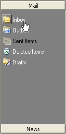
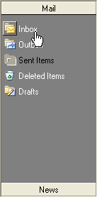
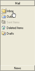
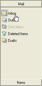
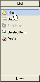
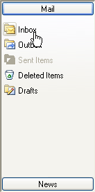
A NavBar control provides the following Side Bar Views:
| BaseView | FlatView | VSToolBoxView | XP1View |
|---|---|---|---|
 |
 |
 |
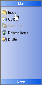 |
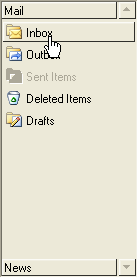
| Office1View | Office2View | Office3View | XP2View |
|---|---|---|---|
 |
 |
 |
 |
Navigation Pane Views
Navigation Pane Views fall into a subcategory of Side Bar Views. These Views have similar a appearance and general behavior, except that Navigation Pane Views also provide the following UI elements for end-user layout customization: overflow panel, context menu, collapsed/expanded arrow, and splitter.
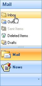
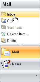
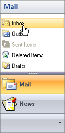
Office12NavigationPaneView (Blue Color Scheme) | Office12NavigationPaneView (Black Color Scheme) | Office12NavigationPaneView (Silver Color Scheme) |
|---|---|---|
|
|
|
| Office11NavigationPaneView |
|---|
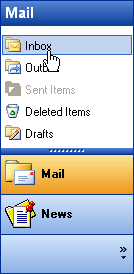 |
When the NavBar control cannot display the entire contents of an active group, up and/or bottom scroll buttons appear allowing end-users to scroll the contents of the group.
Side Bar Views enable you to display group links as icons. In this instance, links are arranged into rows. When this layout is applied, only link images (without captions) are displayed. To activate this layout, set the ShowAsIconView property of the NavBar group to True.
The following images demonstrate the differences between regular and icon layouts:
| Regular View | Icon View |
|---|---|
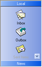 |
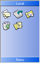 |