Group
- 2 minutes to read
The NavBar control is comprised of groups. Groups are visual elements that have header and client areas. Group headers display explanatory information about the groups’ content. They can also be clicked by end-users to hide/show the corresponding client areas.
Groups can serve for two purposes:
- Displaying a set of links.
The NavBar control maintains collections of groups and items. You can display an item’s content within a group by creating a link between the desired item and the group. Please refer to the Linking Groups and Items topic for details on how to do this.
- Embedding of controls into a group’s client area.
You can customize a group so that it serves as a container for controls. Please refer to the Embedding Controls into Groups topic for details.
The appearance and arrangement of groups depends upon the applied View.
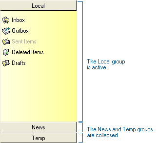
Side Bar Views only display a single group’s contents at a time (the active group). Other groups are collapsed and only represented by their headers. Clicking on a collapsed group header expands that group and collapses the one previously active.
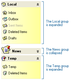
Explorer Bar Views are capable of displaying the contents of all groups (collapsed and expanded) at once. Groups are arranged one under another and can be expanded and collapsed independently.