PieSeriesLabel Class
Stores pie series label settings.
Namespace: DevExpress.XamarinForms.Charts
Assembly: DevExpress.XamarinForms.Charts.dll
NuGet Package: DevExpress.XamarinForms.Charts
Declaration
public class PieSeriesLabel :
    SeriesLabel
Related API Members
The following members return PieSeriesLabel objects:
Remarks
Series Point Labels (or series labels, for short) are used to identify particular data points within a series.
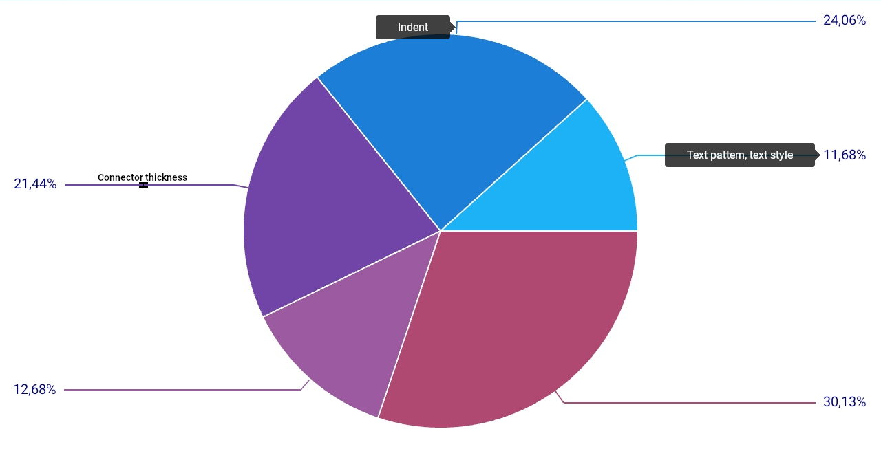
Series labels are hidden by default. To display them on a pie chart, create a PieSeriesLabel object and assign it to the PieSeries.Label property. The PieSeriesLabel class has a set of properties that you can use to specify label position and appearance:
- Position - Specifies whether series labels should be displayed inside pie segments or if they should be pained outside a pie chart and organized into two columns.
- Indent - Specifies the distance between the edge of a pie segment and its label.
- TextPattern - Specifies the text pattern for series labels.
- Style - Allows you to customize label appearance.
You can also use the PieSeriesLabel.TextProvider property to generate custom text strings for series labels based on point values.
Example
This example demonstrates how to add labels to pie chart segments, customize the text pattern, layout and appearance of series labels.
<dxc:PieChartView>
    <dxc:PieChartView.Series>
            <dxc:PieSeries>
              <dxc:PieSeries.Label>
                  <dxc:PieSeriesLabel Position="TwoColums" TextPattern="{}{VP}%" Indent="20">
                      <dxc:PieSeriesLabel.Style>
                          <dxc:PieSeriesLabelStyle ConnectorThickness="2">
                              <dxc:PieSeriesLabelStyle.TextStyle>
                                  <dxc:TextStyle Color="DarkBlue" Size="20"/>
                              </dxc:PieSeriesLabelStyle.TextStyle>
                          </dxc:PieSeriesLabelStyle>
                      </dxc:PieSeriesLabel.Style>
                  </dxc:PieSeriesLabel>
              </dxc:PieSeries.Label>
        </dxc:PieSeries>
    </dxc:PieChartView.Series>
</dxc:PieChartView>