ComboBoxEdit Class
A combo box editor.
Namespace: DevExpress.Maui.Editors
Assembly: DevExpress.Maui.Editors.dll
NuGet Package: DevExpress.Maui.Editors
Declaration
public class ComboBoxEdit :
    ComboBoxEditBase,
    IComboBoxEditController,
    IItemsController,
    IEditController,
    IDXViewController,
    IElementController
Remarks
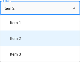
ComboBoxEdit allows selection from a drop-down list of predefined items.
It consists of an edit box and drop-down list that appears when a user taps the edit box or drop-down icon. The editor allows users to locate items by their names (see Filter Items).
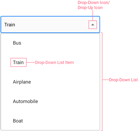
The combo box can also include the following optional elements:
Drop-Down Item List
Use the ItemsSource property to define a drop-down item list.
<dxe:ComboBoxEdit>
  <dxe:ComboBoxEdit.ItemsSource>
    <x:Array Type="{x:Type x:String}">
      <x:String>Item 1</x:String>
      <x:String>Item 2</x:String>
      <x:String>Item 3</x:String>
    </x:Array>
  </dxe:ComboBoxEdit.ItemsSource>
</dxe:ComboBoxEdit>
Specify the Selected Item
The following properties allow you to manage the selected item:
SelectedItem - Gets or sets an object that specifies a data source’s item to which the combo box’s selected item corresponds. This is a bindable property.
SelectedIndex - Gets or sets an index of an item in the data source to which the combo box’s selected item corresponds. This is a bindable property.
SelectedValue - Gets or sets the selected item’s value. Use the ComboBoxEdit.ValueMember inherited property to specify the bound data source’s property that contains values. This is a bindable property.
Use the SelectionChangedCommand property to specify the command executed when the selection of an item changes. You can also handle the SelectionChanged event that fires when the selection changes.
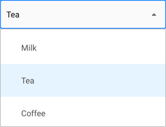
Bind to a List of Primitive Types
You can bind the ItemsSource property to a list of primitive types (string, integer values, and so on.):
using System.Collections.Generic;
using System.ComponentModel;
using Microsoft.Maui.Controls;

namespace ComboBoxExample {
    public partial class MainPage : ContentPage {
        public MainPage() {
            InitializeComponent();
            this.BindingContext = new List<string>() { "Milk", "Tea", "Coffee" };
        }
    }
}
<dxe:ComboBoxEdit ItemsSource="{Binding}"/>
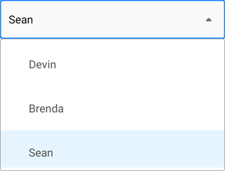
Bind to a Collection of Custom Objects
You can also bind the ItemsSource property to a collection of custom objects. Use the DisplayMember and ValueMember properties to specify the names of data source fields that contain captions for items in the drop-down list and their values. To obtain the selected item’s value, you can use the SelectedValue property.
using System.Collections.Generic;
using System.ComponentModel;
using Microsoft.Maui.Controls;

namespace ComboBoxExample {
    public partial class MainPage : ContentPage {
        public MainPage() {
            InitializeComponent();
            this.BindingContext = new List<Person>() {
                new Person {Name = "Devin", Age = 50, Location = "Atlanta"},
                new Person {Name = "Brenda", Age = 25, Location = "Memphis"},
                new Person {Name = "Sean", Age = 36, Location = "Houston"}
            };
        }
    }

    public class Person {
        public string Name { get; set; }
        public int Age { get; set; }
        public string Location { get; set; }
    }
}
<dxe:ComboBoxEdit ItemsSource="{Binding}"
                  DisplayMember="Name"
                  ValueMember="Age"/>
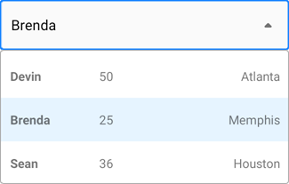
Define Item Template
The combo box allows you to define a drop-down list item template with the ItemTemplate property. Use the DisplayMember property to specify the data source field whose values are displayed in the edit box when a user selects an item.
using System.Collections.Generic;
using System.ComponentModel;
using Microsoft.Maui.Controls;

namespace ComboBoxExample {
    public partial class MainPage : ContentPage {
        public MainPage() {
            InitializeComponent();
            this.BindingContext = new List<Person>() {
                new Person {Name = "Devin", Age = 50, Location = "Atlanta"},
                new Person {Name = "Brenda", Age = 25, Location = "Memphis"},
                new Person {Name = "Sean", Age = 36, Location = "Houston"}
            };
        }
    }

    public class Person {
        public string Name { get; set; }
        public int Age { get; set; }
        public string Location { get; set; }
    }
}
<dxe:ComboBoxEdit ItemsSource="{Binding}"
                  DisplayMember="Name">
    <dxe:ComboBoxEdit.ItemTemplate>
      <DataTemplate>
        <Grid ColumnDefinitions="*,*,*">
          <Label Padding="10" Text="{Binding Name}" FontAttributes="Bold" />
          <Label Padding="10" Grid.Column="1" Text="{Binding Age}" />
          <Label Padding="10" Grid.Column="2" Text="{Binding Location}" HorizontalTextAlignment="End" />
        </Grid>
      </DataTemplate>
    </dxe:ComboBoxEdit.ItemTemplate>
</dxe:ComboBoxEdit>
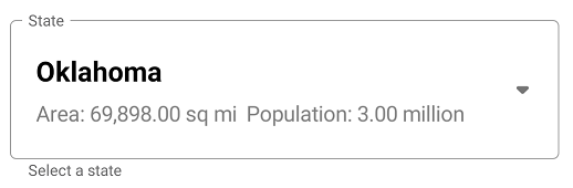
Selected Item Template
Use the DisplayItemTemplate property to specify the data template used to render the selected item in the edit box.
The example below shows how to specify a data template used to render items in the drop-down list and the edit box.
<ContentPage
    xmlns="http://xamarin.com/schemas/2014/forms"
    xmlns:x="http://schemas.microsoft.com/winfx/2009/xaml"
    xmlns:dxe="clr-namespace:DevExpress.Maui.Editors;assembly=DevExpress.Maui.Editors">
  <ContentPage.Resources>
    <ResourceDictionary>
        <DataTemplate x:Key="ItemTemplate">
             <StackLayout Padding="5">
                <Label Text="{Binding State}"
                       TextColor="Black"
                       FontSize="Medium"
                       FontAttributes="Bold"/>
                <StackLayout Orientation="Horizontal">
                    <Label Text="{Binding Path=Area}"
                           TextColor="Gray"
                           FontSize="Small"/>
                    <Label Text="{Binding Path=Population}"
                           TextColor="Gray"
                           FontSize="Small" />
                </StackLayout>
            </StackLayout>
        </DataTemplate>
    </ResourceDictionary>
  </ContentPage.Resources>
  <ContentPage.BindingContext>
    <viewModel:ComboBoxEditViewModel/>
  </ContentPage.BindingContext>
  <ContentPage.Content>
    <dxe:ComboBoxEdit LabelText="State"
        ItemsSource="{Binding States}"
        ItemTemplate="{StaticResource ItemTemplate}"
        SelectedItemTemplate="{StaticResource ItemTemplate}"
        VerticalOptions="Center"
        Margin="16,0"/>
  </ContentPage.Content>
</ContentPage>
public class StateData {
    public StateData(string state, int area, int population) {
        State = state;
        Area = $"Area: {area:#,##0.00} sq mi"";
        Population = $"Population: {population / 1000000:#,##0.00} million";
    }

    public string State { get; private set; }
    public string Area { get; private set; }
    public string Population { get; private set; }
}

public class ComboBoxEditViewModel {
    public List<StateData> States { get; }
    public ComboBoxEditViewModel() {
    States = new List<StateData>();
    States.Add(new StateData("Oklahoma", 69898, 3964000));
    //...
}
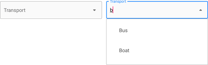
Filter Items
Enable the IsFilterEnabled property to allow users to search for drop-down items by their display text.
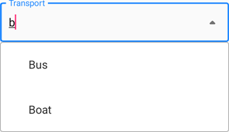
The following list shows related properties and events:
FilterText - Returns the text typed by a user in the edit box.
FilterCondition - Gets or sets the comparison operator.
FilterComparisonType - Gets or sets the string comparison rules.
FilterTextChanged, FilterTextChangedCommand - Allow you to respond to search query changes.
When the filter functionality is enabled, you can specify the combo box’s PlaceholderText property to show a text prompt. The combo box shows this prompt in the edit box before a user enters a filter query.
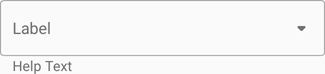
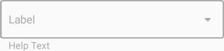
Label
A label is the editor’s input prompt string (LabelText). Editors display this string inside the edit box (when the editor is empty and not focused) or at the top of the editor.
To pin the label to the top edge of the editor box, set the IsLabelFloating property to false.
To customize the label’s appearance settings, use the following properties:
LabelColor, FocusedLabelColor, and DisabledLabelColor – Specify label text color for different editor states.
LabelFontSize, TextFontFamily, TextFontAttributes – Configure the label font settings.
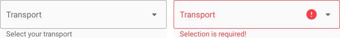
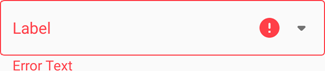
Help Text and Error Message
You can display the following labels below an editor:
- HelpText - A brief editor description.
- ErrorText - A message shown when an error occurs (HasError is true).
The BottomTextTopIndent property specifies the indent between the editor’s bottom border and the help or error text.
To specify the color and font attributes for the help/error text, use the following properties:
Property | Description |
|---|---|
Specify the help text color for different states of an editor. | |
Specifies the error message text color. | |
BottomTextFontSize | Specify font settings. |
If HelpText is not set, ErrorText appears as an additional line below the edit box and page content shifts down. To prevent this behavior, set the ReserveBottomTextLine property to true.
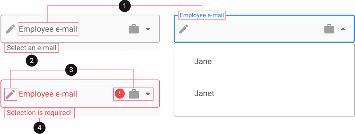
Icons
The combo box can display three icons in the edit box.
- Drop-down/drop-up icon - toggles the visibility of a drop-down list.
- Error icon - appears in the error state (HasError is
true). - Custom icons - can be shown on the left or right within the box.
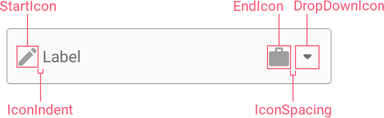
Use the following members to manage the combo box icons:
Icon | Property | Description |
|---|---|---|
Drop-Down and Drop-Up Icons | Gets or sets the custom drop-down icon image. This is a bindable property. | |
Gets or sets whether the ComboBoxEdit.DropDownIcon is visible. This is a bindable property. | ||
Error Icon | Gets or sets the error icon image. This is a bindable property. | |
Allow you to perform an action when a user clicks the error icon. | ||
Gets or sets the color of an icon displayed when HasError is set to | ||
Custom Icons | Specify custom icons. | |
StartIconClicked / StartIconCommand | Allow you to perform an action when a user clicks a custom icon. | |
Specify icon colors. | ||
Specify icon visibility. | ||
Common | Specify icon colors for different states of the text editor. | |
Gets or sets the distance between an icon and input text (affix). This is a bindable property. | ||
Gets or sets the distance between icons. This is a bindable property. | ||
Gets or sets the vertical alignment of icons. This is a bindable property. |
User Interaction
Editors raise the following events on user interaction:
- Tap - Fires when the user taps the editor.
- DoubleTap - Fires when the user double taps the editor.
- LongPress - Fires when the user presses and holds the editor.
Editor Appearance
You can use the following properties to customize the editor’s appearance settings for different states:
Combo Box State | Properties |
|---|---|
Default | BorderColor |
Focused | FocusedBorderColor |
Disabled | DisabledBorderColor |
Error |
The following list shows common appearance settings applied in all states:
Property | Description |
|---|---|
Gets or sets whether edit box corners are rounded or cut. This is a bindable property. | |
Gets or sets the radius of the combo box and drop-down list corners. | |
Adjust the font settings. |
Example
The following example shows how to customize combo box appearance and set up item filtering.
State | Appearance |
|---|---|
Unfocused |
|
Focused |
|
Filtered |
|
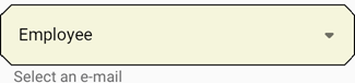
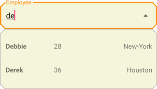
<dxe:ComboBoxEdit ItemsSource="{Binding}"

                  LabelText="Employee"
                  IsLabelFloating="True"
                  HelpText="Select an e-mail"
                  BorderColor="Black"
                  FocusedBorderColor="DarkOrange"
                  BackgroundColor="Beige"
                  LabelColor="Black"
                  FocusedLabelColor="DarkOrange"
                  CornerRadius="10"
                  CornerMode="Cut"
                  DropDownBackgroundColor="Beige"
                  DropDownSelectedItemBackgroundColor="Brown"
                  DropDownSelectedItemTextColor="White"

                  IsFilterEnabled="True"
                  FilterCondition="StartsWith"
                  FilterComparisonType="CurrentCultureIgnoreCase">

  <dxe:ComboBoxEdit.ItemTemplate>
    <DataTemplate>
      <Grid>
        <Label Margin="10,15,0,15" Text="{Binding Name}" FontAttributes="Bold"/>
        <Label Margin="0,15,0,15" Grid.Column="1" Text="{Binding Age}"/>
        <Label Margin="0,15,10,15" Grid.Column="2" Text="{Binding Location}" HorizontalTextAlignment="End"/>
      </Grid>
    </DataTemplate>
  </dxe:ComboBoxEdit.ItemTemplate>
</dxe:ComboBoxEdit>
using System.Collections.Generic;
using System.ComponentModel;
using Microsoft.Maui.Controls;

namespace ComboBoxExample {
    public partial class MainPage : ContentPage {
        public MainPage() {
            InitializeComponent();
            this.BindingContext = new List<Person>() {
                new Person {Name = "Jane", Age = 43, Location = "Atlanta"},
                new Person {Name = "Margaret", Age = 25, Location = "Memphis"},
                new Person {Name = "Debbie", Age = 28, Location = "New-York"},
                new Person {Name = "John", Age = 19, Location = "Detroit"},
                new Person {Name = "Derek", Age = 36, Location = "Houston"}
            };
        }
    }

    public class Person {
        public string Name { get; set; }
        public int Age { get; set; }
        public string Location { get; set; }
    }
}