AutoCompleteTokenEdit Class
An editor for single or multiple item selection that allows you to load items dynamically based on the user input and your custom logic.
Namespace: DevExpress.Maui.Editors
Assembly: DevExpress.Maui.Editors.dll
NuGet Package: DevExpress.Maui.Editors
Declaration
public class AutoCompleteTokenEdit :
    AutoCompleteEditBase
Remarks
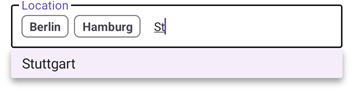
The AutoCompleteTokenEdit control displays items in a drop-down list that appears as a user types in the edit box. A user can select multiple items:
If you need an editor that allows a user to select a single item from a list, refer to the AutoCompleteEdit control.
Add an AutoCompleteTokenEdit to the App
Before you proceed, first read the following topics:
- Get Started with DevExpress Controls for .NET Multi-platform App UI (.NET MAUI)
- Get Started with DevExpress Data Editors for .NET MAUI
The following markup shows how to add an AutoCompleteTokenEdit to a page:
<ContentPage ...
             xmlns:dxe="clr-namespace:DevExpress.Maui.Editors;assembly=DevExpress.Maui.Editors">
    <ScrollView>
        <VerticalStackLayout Spacing="25" Padding="30,0" VerticalOptions="Start">
            <dxe:AutoCompleteTokenEdit x:Name="LocationEdit"/>
            <!-- Other controls here. -->
        </VerticalStackLayout>
    </ScrollView>
</ContentPage>
Load Items
Specify the AutoCompleteTokenEdit‘s ItemsSourceProvider property to populate the editor’s drop-down list with items. The AutoCompleteTokenEdit ships with a set of providers that allow you to load items in synchronous or asynchronous mode. The providers automatically assign the item collection to the editor’s ItemsSource property.
The editor shows the “No Results Found” message in the drop-down list if no suitable items are found. Use the NoResultsFoundText property to change the message text.
Load Items Asynchronously
The AsyncItemsSourceProvider uses the specified delegate to supply items in asynchronous mode.
Follow the steps below to supply items to the editor in asynchronous mode:
- Attach the AsyncItemsSourceProvider to the editor and handle its ItemsRequested event.
- Use the Request event argument to specify the method that returns items. The provider assigns the returned collection to the ItemsSource property.
- Use the Text event argument to obtain the text entered in the edit box and pass it to the specified method.
You can also specify the following options:
- RequestDelay – the time that should elapse after the text is changed and the request is called. Use this parameter to reduce the number of requests as a user types.
- CharacterCountThreshold – the number of entered characters after which the provider starts to make requests. For example, the provider can make requests only if a user enters at least three characters.
The provider cancels the previous request if a new request is submitted. You can use the CancellationToken event argument to cancel the previous request.
The following example shows how to load AutoCompleteTokenEdit items asynchronously:
<dxe:AutoCompleteTokenEdit LabelText="Async Token Edit">
    <dxe:AutoCompleteTokenEdit.ItemsSourceProvider>
        <dxe:AsyncItemsSourceProvider ItemsRequested="AsyncItemsSourceProvider_ItemsRequested" />
    </dxe:AutoCompleteTokenEdit.ItemsSourceProvider>
</dxe:AutoCompleteTokenEdit>
readonly ObservableCollection<string> itemsSource = new ObservableCollection<string> {
        "Berlin",
        "Hamburg",
        "Munich",
        "Stuttgart",
        // Insert other items here.
};

void AsyncItemsSourceProvider_ItemsRequested(System.Object sender, DevExpress.Maui.Editors.ItemsRequestEventArgs e) {
    e.Request = () => this.itemsSource.Where(i => i.Contains(e.Text, StringComparison.CurrentCultureIgnoreCase)).ToList();
}
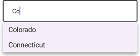
Load Items Synchronously
Assign a FilteredItemsSourceProvider to the editor’s ItemsSourceProvider property to add items according to the specified filter.
Specify the provider’s ItemsSource property to define the View Model’s collection of objects used to create editor items.
Then, use the following options to configure filter parameters:
- FilterCondition – Specifies whether items should start with or contain the entered text.
- FilterComparisonType – Specifies culture and case rules used to compare the entered text with items.
- FilterMembers – Specifies the data fields that are used to search items.
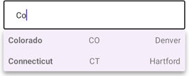
The following example populates the AutoCompleteTokenEdit‘s drop-down list with filtered items. This example uses the ItemsEditBase.DisplayMember property to obtain the display text for items:
<dxe:AutoCompleteTokenEdit x:Name="autoCompleteTokenEdit" DisplayMember="Name">
    <dxe:AutoCompleteTokenEdit.BindingContext>
        <local:AutoCompleteTokenEditViewModel/>
    </dxe:AutoCompleteTokenEdit.BindingContext>
    <dxe:AutoCompleteTokenEdit.ItemsSourceProvider>
        <dxe:FilteredItemsSourceProvider ItemsSource="{Binding ItemsSource}"
                                         FilterCondition="Contains"
                                         FilterComparisonType="CurrentCultureIgnoreCase"
                                         FilterMembers="Name, Capital"/>
    </dxe:AutoCompleteTokenEdit.ItemsSourceProvider>
</dxe:AutoCompleteTokenEdit>
public class State {
    public string Name { get; set; }
    public string Abbr { get; set; }
    public string Capital { get; set; }
}

public class AutoCompleteTokenEditViewModel : INotifyPropertyChanged {
    ObservableCollection<State> itemsSource = new ObservableCollection<State>();
    public ObservableCollection<State> ItemsSource { get { return itemsSource; } set { itemsSource = value; OnPropertyChanged(nameof(ItemsSource)); } }
    public AutoCompleteTokenEditViewModel() {
        ItemsSource.Add(new State() { Name = "California", Abbr = "CA", Capital = "Sacramento" });
        ItemsSource.Add(new State() { Name = "Colorado", Abbr = "CO", Capital = "Denver" });
        ItemsSource.Add(new State() { Name = "Connecticut", Abbr = "CT", Capital = "Hartford" });
    }
    public event PropertyChangedEventHandler PropertyChanged;
    protected void OnPropertyChanged(string propertyName) {
        PropertyChanged?.Invoke(this, new PropertyChangedEventArgs(propertyName));
    }
}
You can also specify the ItemsEditBase.ItemsSource property explicitly. In this case, the editor loads items in synchronous mode.
Specify How to Display Items
To define the data source member that contains the display text for the drop-down list items, use the ItemsEditBase.DisplayMember property.
<dxe:AutoCompleteTokenEdit x:Name="autoCompleteTokenEdit" DisplayMember="Name"...>
    <!--...-->
</dxe:AutoCompleteTokenEdit>
You can also use the ItemTemplate property to specify the content and appearance for items in the editor’s drop-down list:
<dxe:AutoCompleteTokenEdit x:Name="autoCompleteTokenEdit">
    <!--...-->
    <dxe:AutoCompleteTokenEdit.ItemTemplate>
        <DataTemplate>
            <Grid ColumnDefinitions="*,*,*">
                <Label Padding="10" Text="{Binding Name}" FontAttributes="Bold"/>
                <Label Padding="10" Grid.Column="1" Text="{Binding Abbr}"/>
                <Label Padding="10" Grid.Column="2" Text="{Binding Capital}" />
            </Grid>
        </DataTemplate>
    </dxe:AutoCompleteTokenEdit.ItemTemplate>
    <!--...-->
</dxe:AutoCompleteTokenEdit>
Note that the ItemTemplate property has a higher priority over the DisplayMember property. This means that only ItemTemplate affects drop-down item representation if you set both properties.
For information on how to customize the appearance of selected tokens in the edit box, refer to the following section: Customize Token Appearance.
Obtain Selected Items
After a user selects items in the editor’s drop-down list, they appear in the edit box. Use the AutoCompleteTokenEdit.SelectedItems property to obtain the items displayed in the edit box.
Each change to the selected items raises the ItemsEditBase.SelectionChanged event. Handle the event or use the ItemsEditBase.SelectionChangedCommand to respond to user selection actions.
Disable Edit Operations
Use the editor’s IsEnabled property to disable or activate the editor. If you need to hide the editor, set its IsVisible property to False. If you want to allow a user to select and copy the editor text and prohibit text editing, set the editor’s IsReadOnly property to true.
Text Changed
The TextChanged event fires when the edit box content is changed. Use the Reason event argument to determine whether the content is updated because the user entered new text or selected an autocomplete item, or the content was revised in code. You can also use the TextChangedCommand property to specify the command executed when text is changed.
You can handle the TextChanged event to supply items. Ensure that the Reason event argument is set to UserInput and update the collection bound to the ItemsSource property. The TextChanged event allows you to load items one by one, which can be helpful when data loads slowly from the source.
The TextChanged event allows you to load items one by one, which can be helpful if there is a slow connection between the app and the data source.
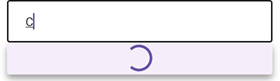
Show Wait Indicator
If the LoadingProgressMode property is set to Auto, the editor automatically displays a wait indicator in the drop-down window when the text in the edit box changes, and automatically hides it when the ItemsSource collection is updated.
In Manual mode, use the IsLoadingInProgress property to show and hide the wait indicator. You can also use the WaitIndicatorColor property to specify its color.
The following example demonstrates how to show a wait indicator when loading items:
<ContentPage.BindingContext>
    <local:AutoCompleteTokenEditViewModel/>
</ContentPage.BindingContext>

        <dxe:AutoCompleteTokenEdit TextChanged="AutoCompleteTokenEdit_TextChanged" WidthRequest="400"
                          ItemsSource="{Binding ItemsSource}"
                          LoadingProgressMode="Manual"/>
private void AutoCompleteTokenEdit_TextChanged(object sender, DevExpress.Maui.Editors.AutoCompleteEditTextChangedEventArgs e) {
    AutoCompleteTokenEdit edit = sender as AutoCompleteTokenEdit;
    AutoCompleteEditViewModel viewModel = edit.BindingContext as AutoCompleteEditViewModel;
    if (e.Reason == DevExpress.Maui.Editors.AutoCompleteEditTextChangeReason.UserInput) {
        edit.IsLoadingInProgress = true;
        Task.Factory.StartNew(new Action(() => {
            Thread.Sleep(3000);
            Dispatcher.Dispatch(new Action(() => {
                viewModel.ItemsSource = Model.Queries.Where(i => i.Contains(edit.Text)).ToList<string>();
                edit.IsLoadingInProgress = false;
            }));
        }));
    }
}
// View Model
public class AutoCompleteTokenEditViewModel : INotifyPropertyChanged {
    List<string> itemsSource = new List<string>();
    public List<string> ItemsSource { get { return itemsSource; } set { itemsSource = value; OnPropertyChanged(nameof(ItemsSource)); } }

    public event PropertyChangedEventHandler PropertyChanged;
    protected void OnPropertyChanged(string propertyName) {
        PropertyChanged?.Invoke(this, new PropertyChangedEventArgs(propertyName));
    }
}
// Model
class Model {
    public static List<string> Queries = new List<string>();
    static Model() {
        Queries.Add("California");
        Queries.Add("Colorado");
        Queries.Add("Connecticut");
    }
}
Customize Token Appearance
You can customize the appearance of tokens. For example, you can add an icon and specify the fill color. To do this, use the properties below:
- IsTokenIconVisible
- Allows you to show token icons.
- IconMember
- Specifies a data source member that contains icons for tokens.
- TokenIconSize
- Specifies the size of token icons.
- TokenAppearance
- Allows you to customize token appearance settings, such as border color, text color, font size, and so on.
Clear the Edit Box
A user can tap the Clear icon to remove all selected items from the edit box. To show the icon, enable the ClearIconVisibility property. Specify the
ClearIcon property to replace the default icon  with a custom icon. To paint the icon, set the ClearIconColor property.
To respond to user Clear icon clicks, use the ClearIconCommand or handle the ClearIconClicked event.
Add Label
A label is the editor’s input prompt string (LabelText). Editors display this string inside the edit box (when the editor is empty and not focused) or at the top of the editor.

To pin the label to the top edge of the editor box, set the IsLabelFloating property to false.
To customize the label’s appearance settings, use the following properties:
LabelColor, FocusedLabelColor, and DisabledLabelColor – Specify label text color for different editor states.
LabelFontSize, TextFontFamily, TextFontAttributes – Configure the label font settings.
The following example adds a label to an AutoCompleteTokenEdit with the specified text color and font:
<dxe:AutoCompleteTokenEdit x:Name="LocationEdit" WidthRequest="500"
                           LabelText="Location"
                           LabelColor="Gray"
                           LabelFontSize="14">
    <!--...-->
</dxe:AutoCompleteTokenEdit>
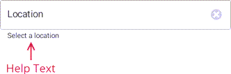
Show Help Text
Specify the editor’s HelpText property to display a text prompt (so-called “null text”) under the edit box.
The following API members configure the help text appearance depending on the editor state:
- HelpTextColor
- Gets or sets the color of the help text shown below the edit box. This is a bindable property.
- DisabledHelpTextColor
- Gets or sets the color of the help text shown below the disabled editor. This is a bindable property.
The following markup sets up an AutoCompleteTokenEdit‘s help text:
<dxe:AutoCompleteTokenEdit ...
                           HelpText="Select a location"
                           HelpTextColor="Black"
                           DisabledHelpTextColor="DarkGray">
    <!--...-->
</dxe:AutoCompleteTokenEdit>
Show Error Message
Specify the ErrorText property and set the HasError property to true to show an error message:
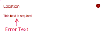
<dxe:AutoCompleteTokenEdit x:Name="LocationEdit"
                           ErrorText="This field is required"
                           ErrorColor="DarkRed">
    <!--...-->
</dxe:AutoCompleteTokenEdit>

<Button Clicked="Button_Clicked" Text="Click" WidthRequest="100"/>
private void Button_Clicked(object sender, EventArgs e) {
    if (string.IsNullOrEmpty(LocationEdit.Text))
        LocationEdit.HasError = true;
    else
        LocationEdit.HasError = false;
}
If HelpText is not set, ErrorText appears as an additional line below the edit box and page content shifts down. To prevent this behavior, set the ReserveBottomTextLine property to true.
Specify the editor’s ErrorColor property to set the error text fill color.
To replace the default error icon with a custom icon, use the ErrorIcon property. Specify the ErrorIconColor property to customize the icon’s fill color.
You can also implement any custom logic when a user clicks the error icon. To do this, handle the ErrorIconClicked event or use the ErrorIconCommand and ErrorIconCommandParameter properties.
Customize Help and Error Text Settings
To specify the color and font attributes for the help and error text, use the following properties:
- BottomTextFontSize
- Gets or sets the font size of the editor’s help and error text. This is a bindable property.
- BottomTextFontFamily
- Gets or sets the font family name for the editor’s help and error text. This is a bindable property.
- BottomTextFontAttributes
- Gets or sets whether the editor’s help and error text is bold or italic. This is a bindable property.
- BottomTextTopIndent
- Gets or sets the distance between the editor’s bottom border and help/error text. This is a bindable property.
Show Start and End Icons
You can add start and/or end icons to an AutoCompleteTokenEdit:
Use the following API to add and configure start and end icons:
Start Icon
- IsStartIconVisible
- Gets or sets whether the leading icon is visible. This is a bindable property.
- StartIcon
- Gets or sets the leading icon image. This is a bindable property.
- StartIconColor
- Gets or sets the color of a custom icon displayed at the editor’s near edge. This is a bindable property.
- StartIconCommand
- Gets or sets the command executed when a user taps the leading icon. This is a bindable property.
- StartIconClicked
- Occurs when a user taps the leading icon.
End Icon
- IsEndIconVisible
- Gets or sets whether the trailing icon is visible. This is a bindable property.
- EndIcon
- Gets or sets the trailing icon image. This is a bindable property.
- EndIconColor
- Gets or sets the color of a custom icon displayed at the editor’s far edge. This is a bindable property.
- EndIconCommand
- Gets or sets the command executed when a user taps the trailing icon. This is a bindable property.
- EndIconClicked
- Occurs when a user taps the trailing icon.
User Interaction
Editors raise the following events on user interaction:
- Tap - Fires when the user taps the editor.
- DoubleTap - Fires when the user double taps the editor.
- LongPress - Fires when the user presses and holds the editor.