TokenEdit Class
An editor for single or multiple item selection with a predefined item source.
Namespace: DevExpress.Maui.Editors
Assembly: DevExpress.Maui.Editors.dll
NuGet Package: DevExpress.Maui.Editors
Declaration
public class TokenEdit :
    ComboBoxEditBase,
    ITokenEditController,
    IItemsController,
    IEditController,
    IDXViewController,
    IElementController
Remarks
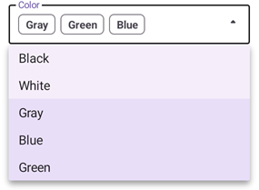
The TokenEdit allows a user to select multiple tokens from a predefined list:
If you need an editor that allows a single item to be selected, refer to the following control: ComboBoxEdit.
If you have a large item source, we recommend that you use AutoCompleteTokenEdit and load its items asynchronously.
Add a TokenEdit to the App
Before you proceed, first read the following topics:
- Get Started with DevExpress Controls for .NET Multi-platform App UI (.NET MAUI)
- Get Started with DevExpress Data Editors for .NET MAUI
The following markup shows how to add a TokenEdit to a page:
<ContentPage ...
             xmlns:dxe="clr-namespace:DevExpress.Maui.Editors;assembly=DevExpress.Maui.Editors">
    <ScrollView>
        <VerticalStackLayout Spacing="25" Padding="30,0" VerticalOptions="Start">
            <dxe:TokenEdit />
            <!-- Other controls here. -->
        </VerticalStackLayout>
    </ScrollView>
</ContentPage>
Specify a List of Available Tokens
Use a TokenEdit‘s ItemsSource property to populate the editor’s drop-down list with items.
Bind to a List of Primitive Types
You can bind the ItemsSource property to a list of primitive types (string, integers, and so on).
The following code populates the TokenEdit drop-down list with string values:
<ContentPage.BindingContext>
    <local:ViewModel />
</ContentPage.BindingContext>
<ScrollView>
    <VerticalStackLayout Spacing="25" Padding="30,0" VerticalOptions="Start">
        <dxe:TokenEdit ItemsSource="{Binding ItemsSource}"/>
        <!--...-->
    </VerticalStackLayout>
</ScrollView>
public class ViewModel {
    public ViewModel() {
        ItemsSource = new ObservableCollection<string> {
        "Black",
        "White",
        "Gray",
        "Blue",
        "Green"
    };
    }
    public ObservableCollection<string> ItemsSource { get; }
}
Bind to a List of Complex Objects
You can also bind the ItemsSource property to a collection of custom objects. Use the DisplayMember and ValueMember properties to specify the names of data source fields that contain captions for items in the drop-down list and their values. Values can be used to specify selected items. For more information, refer to the following section: Manage Selected Items.
The following example binds a TokenEdit to a collection of Person objects:
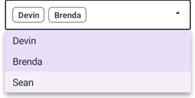
<dxe:TokenEdit ItemsSource="{Binding}"
    DisplayMember="Name"
    ValueMember="Age"
    WidthRequest="400"/>
public partial class MainPage : ContentPage {
    public MainPage() {
        InitializeComponent();
        this.BindingContext = new ObservableCollection<Person>() {
        new Person {Name = "Devin", Age = 50, Location = "Atlanta"},
        new Person {Name = "Brenda", Age = 25, Location = "Memphis"},
        new Person {Name = "Sean", Age = 36, Location = "Houston"}
    };
    }
}
public class Person {
    public string Name { get; set; }
    public int Age { get; set; }
    public string Location { get; set; }
}
Specify How to Display Items
You can manage how items look in the editor’s drop-down list. To do this, specify the editor’s ItemTemplate property. Note that to specify the text used in selected tokens, set the editor’s DisplayMember property. Define the TokenEdit.TokenAppearance property to specify the token content in the edit box.
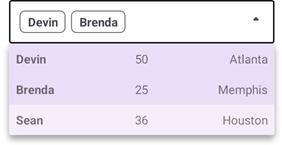
<dxe:TokenEdit ItemsSource="{Binding}"
               DisplayMember="Name"
               ValueMember="Age"
               WidthRequest="400">
    <dxe:TokenEdit.ItemTemplate>
        <DataTemplate>
            <Grid ColumnDefinitions="*,*,*">
                <Label Padding="10" Text="{Binding Name}" FontAttributes="Bold" />
                <Label Padding="10" Grid.Column="1" Text="{Binding Age}" />
                <Label Padding="10" Grid.Column="2" Text="{Binding Location}" />
            </Grid>
        </DataTemplate>
    </dxe:TokenEdit.ItemTemplate>
</dxe:TokenEdit>
public partial class MainPage : ContentPage {
    public MainPage() {
        InitializeComponent();
        this.BindingContext = new List<Person>() {
            new Person {Name = "Devin", Age = 50, Location = "Atlanta"},
            new Person {Name = "Brenda", Age = 25, Location = "Memphis"},
            new Person {Name = "Sean", Age = 36, Location = "Houston"}
        };
    }
}
public class Person {
    public string Name { get; set; }
    public int Age { get; set; }
    public string Location { get; set; }
}
Also see the following section for drop-down customization options: Customize Drop-Down Menu and Its Items.
Manage Selected Items
Users can tap items in the editor’s drop-down list to select tokens.
You can predefine selected items and obtain a list of selected items. To do this, use the following properties:
The example below uses item values to specify items selected in a token editor:
<ContentPage.BindingContext>
    <local:ViewModel/>
</ContentPage.BindingContext>
<ScrollView>
    <VerticalStackLayout Spacing="25" Padding="30,0" VerticalOptions="Start">
        <dxe:TokenEdit ItemsSource="{Binding ItemsSource}"
                       SelectedValues="{Binding SelectedValues}"
                       DisplayMember="Name"
                       ValueMember="Location"
                       WidthRequest="400"/>
    </VerticalStackLayout>
</ScrollView>
public class ViewModel {
    public ViewModel() {
        ItemsSource = new ObservableCollection<Person>() {
                new Person {Name = "Devin", Age = 50, Location = "Atlanta"},
                new Person {Name = "Brenda", Age = 25, Location = "Memphis"},
                new Person {Name = "Sean", Age = 36, Location = "Houston"}
        };
        SelectedValues = new ObservableCollection<string> { "Atlanta", "Houston" };
    }
    public ObservableCollection<Person> ItemsSource { get; }
    public ObservableCollection<string> SelectedValues { get; }
}

public class Person {
    public string Name { get; set; }
    public int Age { get; set; }
    public string Location { get; set; }
}
Use the SelectionChangedCommand property to specify the command executed when the collection of selected items is changed. You can also handle the SelectionChanged event that occurs when the selection changes.
Enable Filtering
Set the editor IsFilterEnabled property to true to allow users to filter drop-down list items:
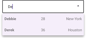
The following example filters items that start with the text a user types into the edit box. Note that the editor filters items against values that the DisplayMember specifies. So, you need to define the DisplayMember property before you enable filtering.
<dxe:TokenEdit ItemsSource="{Binding}"
               DisplayMember="Name"
               IsFilterEnabled="True"
               FilterCondition="StartsWith"
               FilterComparisonType="CurrentCultureIgnoreCase"
               WidthRequest="400">
    <dxe:TokenEdit.ItemTemplate>
        <DataTemplate>
            <Grid ColumnDefinitions="*,*,*">
                <Label Margin="10,15,0,15" Text="{Binding Name}" FontAttributes="Bold"/>
                <Label Margin="0,15,0,15" Grid.Column="1" Text="{Binding Age}" />
                <Label Margin="0,15,10,15" Grid.Column="2" Text="{Binding Location}" />
            </Grid>
        </DataTemplate>
    </dxe:TokenEdit.ItemTemplate>
</dxe:TokenEdit>
public partial class MainPage : ContentPage {
    public MainPage() {
        InitializeComponent();
        this.BindingContext = new List<Person>() {
            new Person {Name = "Jane", Age = 43, Location = "Atlanta"},
            new Person {Name = "Margaret", Age = 25, Location = "Memphis"},
            new Person {Name = "Debbie", Age = 28, Location = "New-York"},
            new Person {Name = "John", Age = 19, Location = "Detroit"},
            new Person {Name = "Derek", Age = 36, Location = "Houston"}
        };
    }
}

public class Person {
    public string Name { get; set; }
    public int Age { get; set; }
    public string Location { get; set; }
}
If you want to predefine a filter expression, specify the FilterText property.
To add any custom logic on changes in the filter text, handle the FilterTextChanged event or use the FilterTextChangedCommand property.
Disable Edit Operations
Use the editor’s IsEnabled property to disable or activate the editor. If you need to hide the editor, set its IsVisible property to False. If you want to allow a user to select and copy the editor text and prohibit text editing, set the editor’s IsReadOnly property to true.
Add Label
A label is the editor’s input prompt string (LabelText). Editors display this string inside the edit box (when the editor is empty and not focused) or at the top of the editor.
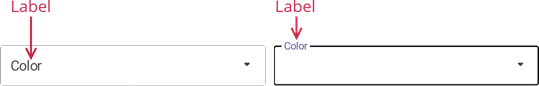
To pin the label to the top edge of the editor box, set the IsLabelFloating property to false.
To customize the label’s appearance settings, use the following properties:
LabelColor, FocusedLabelColor, and DisabledLabelColor – Specify label text color for different editor states.
LabelFontSize, TextFontFamily, TextFontAttributes – Configure the label font settings.
The following example adds the label to a TokenEdit and specifies its color and font size:
<dxe:TokenEdit ...
               LabelText="Color"
               LabelColor="DarkGreen"
               LabelFontSize="14"/>
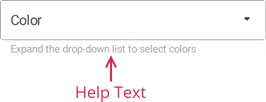
Show Help Text
Specify the editor’s HelpText property to display a text prompt (so-called “null text”) under the edit box.
The following API members configure the help text appearance depending on the editor state:
- HelpTextColor
- Gets or sets the color of the help text shown below the edit box. This is a bindable property.
- DisabledHelpTextColor
- Gets or sets the color of the help text shown below the disabled editor. This is a bindable property.
The following markup specifies a TokenEdit‘s help text:
<dxe:TokenEdit x:Name="tokenEdit" WidthRequest="400"
               ...
               HelpText="Expand the drop-down list to select colors"
               HelpTextColor="DarkGray"/>
Show Error Message
Specify the ErrorText property and set the HasError property to true to show an error message:
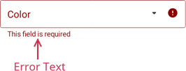
The following example shows an error message when a user clicks the Submit button while no tokens are selected:
<dxe:TokenEdit x:Name="tokenEdit" WidthRequest="400"
               ErrorText="This field is required"
               ErrorColor="DarkRed"/>
<Button Clicked="Button_Clicked" Text="Submit" WidthRequest="100"/>
private void Button_Clicked(object sender, EventArgs e) {
    if (tokenEdit.SelectedItems == null)
        tokenEdit.HasError = true;
    else
        tokenEdit.HasError = false;
}
If HelpText is not set, ErrorText appears as an additional line below the edit box and page content shifts down. To prevent this behavior, set the ReserveBottomTextLine property to true.
Specify the editor’s ErrorColor property to set the error text fill color.
To replace the default error icon with a custom icon, use the ErrorIcon property. Specify the ErrorIconColor property to customize the icon’s fill color.
You can also implement any custom logic when a user clicks the error icon. To do this, handle the ErrorIconClicked event or use the ErrorIconCommand and ErrorIconCommandParameter properties.
Show Start and End Icons
You can add start and/or end icons to a TokenEdit:
Use the following API to add and configure start and end icons:
Start Icon
- IsStartIconVisible
- Gets or sets whether the leading icon is visible. This is a bindable property.
- StartIcon
- Gets or sets the leading icon image. This is a bindable property.
- StartIconColor
- Gets or sets the color of a custom icon displayed at the editor’s near edge. This is a bindable property.
- StartIconCommand
- Gets or sets the command executed when a user taps the leading icon. This is a bindable property.
- StartIconClicked
- Occurs when a user taps the leading icon.
End Icon
- IsEndIconVisible
- Gets or sets whether the trailing icon is visible. This is a bindable property.
- EndIcon
- Gets or sets the trailing icon image. This is a bindable property.
- EndIconColor
- Gets or sets the color of a custom icon displayed at the editor’s far edge. This is a bindable property.
- EndIconCommand
- Gets or sets the command executed when a user taps the trailing icon. This is a bindable property.
- EndIconClicked
- Occurs when a user taps the trailing icon.
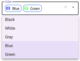
Customize Token Appearance
You can customize the appearance of tokens. For example, you can add an icon and specify the fill color. To do this, use the properties below:
- IsTokenIconVisible
- Allows you to show token icons.
- IconMember
- Specifies a data source member that contains icons for tokens.
- TokenIconSize
- Specifies the size of token icons.
- TokenAppearance
- Allows you to customize token appearance settings, such as border color, text color, font size, and so on.
The following example configures the appearance of token icons and token outline:
<ContentPage.BindingContext>
    <local:ViewModel />
</ContentPage.BindingContext>

<dxe:TokenEdit x:Name="tokenEdit" WidthRequest="400"
               LabelText="Color"
               ItemsSource="{Binding ItemsSource}"
               ClearIconVisibility="Always"
               DisplayMember="ColorName"
               IconMember="ColorSampleIcon"
               IsTokenIconVisible="True">
    <dxe:TokenEdit.TokenAppearance>
        <dxe:TokenAppearance BorderColor="CornflowerBlue"
                             BorderThickness="2"
                             CornerRadius="14"
                             FontFamily="Univia-Pro"
                             FontSize="14" />
    </dxe:TokenEdit.TokenAppearance>
</dxe:TokenEdit>
public class ViewModel {
    public ViewModel() {
        ItemsSource = new List<ColorInfo> {
            new ColorInfo("Black","#000000"),
            new ColorInfo("White","#ffffff"),
            new ColorInfo("Gray", "#e5e5e5"),
            new ColorInfo("Blue", "#0000ff"),
            new ColorInfo("Green", "#00ff00")
        };
    }
    public IList<ColorInfo> ItemsSource { get; }
}

public class ColorInfo {
    public string ColorName { get; set; }
    public ImageSource ColorSampleIcon { get; set; }
    public ColorInfo(string name, string color) {
        ColorName = name;
        ColorSampleIcon = new FontImageSource() { Glyph = $"{name[0]}", Color = Color.FromArgb(color) };
    }
}
For more information about font icons, refer to the following page: Fonts in .NET MAUI – Display font icons.
Customize Drop-Down Menu and Its Items
Use the IsDropDownIconVisible property to manage the editor’s drop-down menu icon visibility. When you need to determine whether the drop-down menu is shown, use the IsDropDownOpen property.
The following properties allow you to configure the appearance options for the drop-down menu and its items:
- DropDownBackgroundColor
- Gets or sets the drop-down list background color. This is a bindable property.
- DropDownIcon
- Gets or sets the custom drop-down icon image. This is a bindable property.
- DropDownIconColor
- Gets or sets the color of the drop-down/drop-up icon. This is a bindable property.
- DropDownItemFontAttributes
- Gets or sets the drop-down item’s font attributes. This is a bindable property.
- DropDownItemFontFamily
- Gets or sets the drop-down item’s font family. This is a bindable property.
- DropDownItemFontSize
- Gets or sets the drop-down item’s font size. This is a bindable property.
- DropDownItemPadding
- Gets or sets the drop-down item’s padding. This is a bindable property.
- DropDownItemTextColor
- Gets or sets the text color of the drop-down list items. This is a bindable property.
- DropDownSelectedItemBackgroundColor
- Gets or sets the background color of an item selected in the drop-down list. This is a bindable property.
- DropDownSelectedItemTextColor
- Gets or sets the color of a selected item’s text in the drop-down list. This is a bindable property.
User Interaction
Editors raise the following events on user interaction:
- Tap - Fires when the user taps the editor.
- DoubleTap - Fires when the user double taps the editor.
- LongPress - Fires when the user presses and holds the editor.