Date Filter in WinForms Dashboard
- 11 minutes to read
The Date Filter dashboard item allows you to filter dashboard data based on the selected data range. The range can be relative (Last 3 Months), use fixed dates (01-01-2018), or presets (Month-to-date). You can also filter dates before or after a specified date.
The Date Filter item displays a set of intervals that can be used as quick filters.

End-users can click the button to invoke the Date Picker:

Add a New Date Filter to the Dashboard
- WinForms Designer
In the WinForms Designer, click the Filter Elements drop-down button in the Insert group on the Home ribbon page and select Date Filter.

- Visual Studio Designer
- In the Visual Studio Designer, drag the DateFilter component from the Toolbox and drop it on the dashboard.
- In code
- Create the DateFilterDashboardItem class instance and add it to the Dashboard.Items collection.
Bind to Data
You can use DateTime/DateOnly fields for a date filter.
- Dashboard Designer
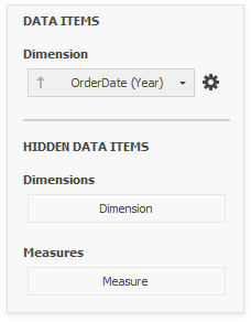
Use the Data Items Pane to make data binding. Drag the dimension field from the Data Source Browser to the data item, and click the Options button to select group intervals.
- In code
- Use the DateFilterDashboardItem.Dimension property to specify a dimension that provides filter values.
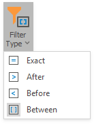
Filter Type
A filter can be a date-time (date) value, date-time (date) range, or infinite interval before or after a specified date.
You can specify the filter type as follows:
- Dashboard Designer
Click the drop-down Filter Type in the ribbon (Date Filter Tools contextual tab-> Design page -> Layout group):
- In Code
- Use the DateFilterDashboardItem.FilterType property.
Date Picker

The DateFilter item contains a Date Picker - a button with a drop-down calendar. This button initially displays “Click to set filter”. To change this text, provide the DateFilterDatePickerButtonDefaultText localization string or handle the DashboardViewer.DashboardItemControlCreated event and subscribe to the DateFilterControl.CustomDisplayText event.
The calendar drops down when the end user:
- clicks the button without a specified range (the button with the “Click to set filter” caption)
- clicks the Edit icon (
 ) on the button with the specified date-time range.
A drop-down calendar may contain a single calendar control (the Filter Type is Exact, Before or After) or two calendar controls (the Filter Type is Between).
When the user selects the date, the Date Picker caption displays information about that date (date range) and an icon. The caption text is constructed from a custom string with date placeholders. If the user clicks the caption, The Date Picker button acts as a checked button to apply the date range (checked) or reset the date filter (unchecked) to its default value. When the user clicks the icon, the drop-down calendar appears and enables the user to select another date range.
The Date Picker component can be located at the near end of the Quick Button series, at its far end, or it can be hidden. To change the Date Picker location:
- In the Dashboard Designer
Click the Date Picker Location check button in the ribbon (Date Filter Tools contextual tab-> Design page -> Layout group):

- In Code
- Set the DateFilterDashboardItem.DatePickerLocation property.
Display Format
You can specify the date-time value format as follows:
- In the Dashboard Designer
- Use the Format submenu in the data item menu, as described in the Formatting Data topic.
- In Code
- Use the dimension’s DateTimeFormat property.
You can specify a custom string displayed in the Date Picker component as follows:
- In the Dashboard Designer
Use the Edit Names dialog. To invoke the dialog, right-click the DateFilter item and click the Edit Names… menu item or click the Edit Names button in the Design Ribbon tab.

- In Code
- Use the DateFilterDashboardItem.DisplayTextPattern property.
You can include placeholders in a custom string. The {0} placeholder is the interval’s start, the {1} placeholder is the interval’s end.
Create Quick Filters in UI
Quick Filters are a set of predefined date periods you can show as buttons in the Date Filter UI, such as Today, Yesterday, Last 30 Days, and so on. These intervals are preconfigured and have a DateTime/DateOnly range assigned to them. When the user selects one of the quick filters, the dashboard automatically filters data based on that relative date range:

The DateFilter’s context menu contains commands with the same captions that act the same ways as these buttons.
A newly created DateFilter dashboard item has no quick filters. To add a quick filter in the Dashboard Designer, do one of the following:
- Click the Options button (the
 icon) next to the Argument placeholder.
 - Select the Edit Periods command in the item’s context menu.
Click the Edit Periods in the ribbon (Date Filter Tools contextual tab → Design page → Interactivity group):

This invokes the Edit Periods dialog. You can select a predefined range or add a custom period, and specify the quick filter’s range and caption.

In addition to a variety of predefined ranges, you can set a custom period - a period with custom boundaries (Start point and End point). You can specify the following settings for the start/end boundaries:
Boundaries Settings
You can specify the following settings for the start/end boundaries.
- Caption
- Specifies a custom periods caption.
- Start Mode
- Specifies the start boundary mode.
- End Mode
- Specifies the end boundary mode.
Boundaries Modes
The following modes are available for the start and end boundaries:
- None
- The selection begins from the start/end of the visible range.
- Fixed
- Allows you to select a specific date value using the calendar. Use the Start/End Date option to set a value.
- Flow
- Allows you to select a relative date value. The Interval option specifies the interval between the current date and the required date. The Offset option allows you to set the number of such intervals. The Offset option can accept negative and positive values. Negative values correspond to dates before the current date, while positive values correspond to future dates.
Review the following examples of custom period set up.
Fixed Custom Periods Examples
Name | Settings |
|---|---|
2018 | Start Point
End Point
|
Q1 2017 | Start Point
End Point
|
Flow Custom Periods Examples
Name | Settings |
|---|---|
6 Months | Start Point
End Point
|
Year to date | Start Point
End Point
|
Last Month | Start Point
End Point
|
If you set both start and end intervals with Flow Mode and 0 Offset configuration, the system subtracts 1 millisecond from the calculated end date to create a Start Point. This adjustment ensures that the Start Point is always strictly less than the End Point according to the selected end interval (year, month, week, and so on).
Create Quick Filter in Code
To add a quick filter in code, create the DateTimePeriod objects and add them to the DateFilterDashboardItem.DateTimePeriods collection.
using DevExpress.DashboardCommon;
// ...
dateFilterItem.DateTimePeriods.AddRange(
    DateTimePeriod.CreateLastYear(),
    DateTimePeriod.CreateNextDays("Next 7 Days", 7),
    new DateTimePeriod
    { Name = "Month To Date",
        Start = new FlowDateTimePeriodLimit(DateTimeInterval.Month,0),
        End = new FlowDateTimePeriodLimit(DateTimeInterval.Day,1)
    },
    new DateTimePeriod
    { Name = "Jul-18-2018 - Jan-18-2019",
        Start = new FixedDateTimePeriodLimit(new DateTime(2018, 7, 18)),
        End = new FixedDateTimePeriodLimit(new DateTime(2019, 1, 18)) }
    );
// Specify the period selected when the control is initialized.
dateFilterItem.DefaultDateTimePeriodName = "Year To Date";
Arrange Quick Filters
Quick filters in the DateFilter item can be arranged horizontally or vertically. The default mode is auto height, in which quick filters are displayed horizontally and the dashboard item shrinks automatically to fit the items and save space.
To specify the arrangement mode:
- In the Dashboard Designer
Click the Arrangement Mode drop-down in the ribbon (Date Filter Tools contextual tab-> Design page -> Layout group):

- In Code
- Set the DateFilterDashboardItem.ArrangementMode property.

Auto Height Arrangement Mode

Vertical Arrangement Mode

Horizontal Arrangement Mode
Customize Underlying Controls
You can customize the appearance of DateFilter buttons and drop-down calendar. To do this, access the underlying DateFilterControl as described in the Access to Underlying Controls topic and change its settings.
Example
The following code snippet creates a DateFilter dashboard item in code:
using DevExpress.DashboardCommon;
using DevExpress.DashboardWin.Localization;
using DevExpress.DataAccess.Excel;
using DevExpress.XtraEditors;
using System;

namespace DateFilterDashboardItemSample
{
    public partial class Form1 : XtraForm
    {
        public Form1()
        {
            InitializeComponent();
        }

        private void Form1_Load(object sender, EventArgs e)
        {
            DashboardExcelDataSource excelDataSource = CreateExcelDataSource();
            Dashboard dBoard = new Dashboard();
            dBoard.DataSources.Add(excelDataSource);

            dBoard.BeginUpdate();
            // Create dashboard items.
            ChartDashboardItem chart = CreateChart(excelDataSource);
            dBoard.Items.Add(chart);
            DateFilterDashboardItem dateFilterItem = CreateDateFilterItem(excelDataSource);
            dBoard.Items.Add(dateFilterItem);
            DashboardItemGroup group = CreateGroup();
            dBoard.Groups.Add(group);
            group.AddRange(dateFilterItem, chart);
            // Create the layout tree.
            DashboardLayoutItem dateFilterLayoutItem = new DashboardLayoutItem(dateFilterItem, 30);
            DashboardLayoutItem chartLayoutItem = new DashboardLayoutItem(chart, 70);
            DashboardLayoutGroup groupLayoutItem = new DashboardLayoutGroup(group, 100);
            groupLayoutItem.ChildNodes.AddRange(dateFilterLayoutItem, chartLayoutItem);
            DashboardLayoutGroup rootGroup = new DashboardLayoutGroup(null, 100);
            rootGroup.ChildNodes.Add(groupLayoutItem);
            rootGroup.Orientation = DashboardLayoutGroupOrientation.Vertical;
            dBoard.LayoutRoot = rootGroup;
            dBoard.EndUpdate();

            dashboardViewer1.Dashboard = dBoard;
        }

        private DashboardItemGroup CreateGroup()
        {
            DashboardItemGroup group = new DashboardItemGroup();
            group.Name = "Sales by Date";
            return group;
        }

        private DateFilterDashboardItem CreateDateFilterItem(DashboardExcelDataSource excelDataSource)
        {
            DateFilterDashboardItem dateFilter = new DateFilterDashboardItem();
            dateFilter.Name = string.Empty;
            dateFilter.ShowCaption = false;
            dateFilter.DataSource = excelDataSource;
            dateFilter.Dimension = new Dimension("orderDateId", "OrderDate", DateTimeGroupInterval.DayMonthYear);
            dateFilter.Dimension.DateTimeFormat.DateTimeFormat = DateTimeFormat.Short;
            dateFilter.ArrangementMode = DateFilterArrangementMode.Vertical;
            dateFilter.FilterType = DateFilterType.Between;
            dateFilter.DatePickerLocation = DatePickerLocation.Far;
            dateFilter.DateTimePeriods.AddRange(
                DateTimePeriod.CreateLastYear(),
                DateTimePeriod.CreateNextDays("Next 7 Days", 7),
                new DateTimePeriod
                {
                    Name = DashboardWinLocalizer.GetString(DashboardWinStringId.PeriodMonthToDate),
                    Start = new FlowDateTimePeriodLimit
                    {
                        Interval = DateTimeInterval.Month,
                        Offset = 0
                    },
                    End = new FlowDateTimePeriodLimit
                    {
                        Interval = DateTimeInterval.Day,
                        Offset = 1
                    }
                },
                new DateTimePeriod
                {
                    Name = "Jul-18-2018 - Jan-18-2019",
                    Start = new FixedDateTimePeriodLimit
                    {
                        Date = new DateTime(2018, 7, 18)
                    },
                    End = new FixedDateTimePeriodLimit
                    {
                        Date = new DateTime(2019, 1, 18)
                    }
                }
            );
            return dateFilter;
        }

        private ChartDashboardItem CreateChart(DashboardExcelDataSource excelDataSource)
        {
            ChartDashboardItem chart = new ChartDashboardItem();
            chart.Name = string.Empty;
            chart.ShowCaption = false;
            chart.DataSource = excelDataSource;
            chart.Arguments.Add(new Dimension("OrderDate", DateTimeGroupInterval.DayMonthYear));
            chart.Panes.Add(new ChartPane());
            SimpleSeries salesAmountSeries = new SimpleSeries(SimpleSeriesType.Line);
            salesAmountSeries.Value = new Measure("Extended Price");
            chart.Panes[0].Series.Add(salesAmountSeries);
            return chart;
        }

        private DashboardExcelDataSource CreateExcelDataSource()
        {
            DashboardExcelDataSource excelDataSource = new DashboardExcelDataSource();
            excelDataSource.FileName = "SalesPerson.xlsx";
            ExcelWorksheetSettings worksheetSettings = new ExcelWorksheetSettings("Data");
            excelDataSource.SourceOptions = new ExcelSourceOptions(worksheetSettings);
            excelDataSource.Fill();
            return excelDataSource;
        }
    }
}