DxGridDataColumn.CellDisplayTemplate Property
Specifies a template used to display the column’s cells.
Namespace: DevExpress.Blazor
Assembly: DevExpress.Blazor.v21.2.dll
NuGet Package: DevExpress.Blazor
Declaration
[Parameter]
public RenderFragment<GridDataColumnCellDisplayTemplateContext> CellDisplayTemplate { get; set; }
Property Value
| Type | Description |
|---|---|
| RenderFragment<GridDataColumnCellDisplayTemplateContext> | The template for the column’s cells. |
Remarks
The CellDisplayTemplate property allows you to specify custom content and change the appearance of cells in individual columns. To define a common template for cells of all Grid columns, use the DxGrid.DataColumnCellDisplayTemplate.
The CellDisplayTemplate property accepts a GridDataColumnCellDisplayTemplateContext object as the context parameter. You can use the parameter’s members to get information about a column cell (DataColumn, Value, DisplayText, VisibleIndex). You can also access the Grid object and use its members to obtain additional information about the Grid.
Note that if you use the DataColumnCellDisplayTemplate or CellDisplayTemplate, the CustomizeCellDisplayText event does not fire.
Examples
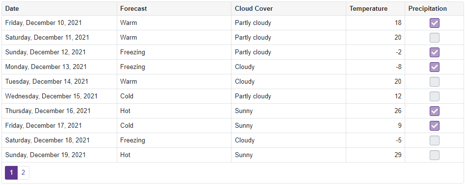
Show Checkboxes
The code below uses the CellDisplayTemplate property to customize the appearance of the Precipitation column that contains Boolean values. The column cells display checkboxes instead of plain text.
@inject WeatherForecastService ForecastService

<DxGrid Data="@Data">
    <Columns>
        <DxGridDataColumn FieldName="Date"
                          DisplayFormat="D" />
        <DxGridDataColumn FieldName="Forecast" />
        <DxGridDataColumn FieldName="CloudCover" />
        <DxGridDataColumn FieldName="TemperatureC"
                          Caption="Temperature"
                          Width="120px" />
        <DxGridDataColumn FieldName="Precipitation"
                          Width="120px">
            <CellDisplayTemplate>
                <DxCheckBox CssClass="d-inline-block" Enabled="false" Checked="(bool)context.Value" />
            </CellDisplayTemplate>
        </DxGridDataColumn>
    </Columns>
</DxGrid>

@code {
    object Data { get; set; }

    protected override void OnInitialized() {
        Data = ForecastService.GetForecast();
    }
}
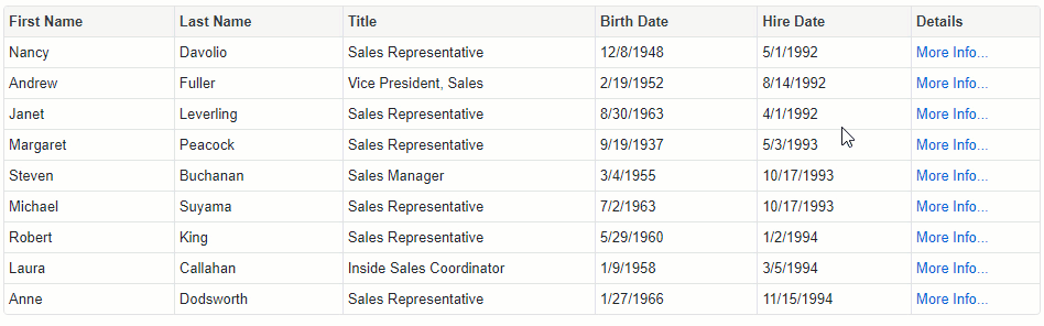
Show the More Info Links
The following example displays the More Info… links in cells of a column bound to the EmployeeId field. Users can click these links to view details about data rows in a pop-up window.
@using Microsoft.EntityFrameworkCore
@inject IDbContextFactory<NorthwindContext> NorthwindContextFactory
@implements IDisposable

<DxGrid Data="@Data">
    <Columns>
        <DxGridDataColumn FieldName="FirstName" />
        <DxGridDataColumn FieldName="LastName" />
        <DxGridDataColumn FieldName="Title" />
        <DxGridDataColumn FieldName="BirthDate" />
        <DxGridDataColumn FieldName="HireDate" />
        <DxGridDataColumn FieldName="EmployeeId" Caption="Details" AllowSort="false">
            <CellDisplayTemplate>
                <a class="d-block text-left" href="javascript:;" @onclick="() => ShowDetails(context)">More Info...</a>
            </CellDisplayTemplate>
        </DxGridDataColumn>
    </Columns>
</DxGrid>
<DxPopup @bind-Visible="@PopupVisible"
         HeaderText="@PopupHeaderText"
         HorizontalAlignment="HorizontalAlignment.Center"
         VerticalAlignment="VerticalAlignment.Center">
    @PopupContent
</DxPopup>

@code {
    IEnumerable<Employee> Data { get; set; }
    NorthwindContext Northwind { get; set; }
    Employee CurrentEmployee { get; set; }

    protected override void OnInitialized() {
        Northwind = NorthwindContextFactory.CreateDbContext();
        Data = Northwind.Employees
            .ToList();
    }
    bool PopupVisible {
        get { return CurrentEmployee != null; }
        set { if(!value) CurrentEmployee = null; }
    }
    string PopupHeaderText {
        get { return CurrentEmployee != null ? CurrentEmployee.FirstName + " " + CurrentEmployee.LastName : ""; }
    }
    string PopupContent {
        get { return CurrentEmployee != null ? CurrentEmployee.Notes : ""; }
    }
    public void ShowDetails(GridDataColumnCellDisplayTemplateContext context) {
        CurrentEmployee = Data.Where(e => e.EmployeeId == (int)context.Value).FirstOrDefault();
    }
    public void Dispose() {
        Northwind?.Dispose();
    }
}