DxPieChart<T> Class
A Pie Chart component.
Namespace: DevExpress.Blazor
Assembly: DevExpress.Blazor.v21.2.dll
NuGet Package: DevExpress.Blazor
Declaration
public class DxPieChart<T> :
    DxChartBase,
    IComponentContainer<IPieChartSeriesModel>,
    IPieChartJSInteropProxyServer,
    IChartJSInteropProxyServerBase,
    IJSCallback
Type Parameters
| Name | Description |
|---|---|
| T | The data item type. |
Remarks
The DevExpress Pie Chart component (<DxPieChart>) allows you to create Pie and Donut chart types for Blazor applications.
Add a Chart to a Project
Follow the steps below to add the Pie Chart component to an application:
- Use a DevExpress Project Template to create a new Blazor Server or Blazor WebAssembly application. If you use a Microsoft project template or already have a Blazor project, configure your project to incorporate DevExpress Blazor components.
- Add the
<DxPieChart>…</DxPieChart>markup to a Razor page. - Bind the component to data.
- Configure the component: add series, specify the chart’s size, define labels and tooltips, and so on (see the sections below).
Bind to Data
Use the Pie Chart’s Data property to specify an IEnumerable<T> data source. The chart should also contain at least one series to display data (see the section below for more information: Series). For a sample data source, refer to our GitHub repository.
Note
The chart component operates in bound mode only.
<DxPieChart Data="@SalesData">
    @* A place for series *@
</DxPieChart>

@code {
    IEnumerable<SaleInfo> SalesData;

    protected override async Task OnInitializedAsync() {
        SalesData = await Sales.GetSalesAsync();
    }
}
If the data source collection implements the INotifyCollectionChanged interface, the Chart is updated automatically each time the collection changes. Otherwise, use the RefreshData method to reload data and redraw the component. To re-render the Chart area without a data reload, call the RedrawAsync method.
Series
Use the DxPieChartSeries<T, TArgument, TValue> object to create a PieChart-specific series. You should use the following series properties to bind the data source fields to the series:
- ArgumentField: specifies the data source field that contains arguments for chart points.
- ValueField: specifies the data source field that contain values for chart points.
The table below lists settings for a pie series:
Member | Description |
|---|---|
Specifies the method that calculates summaries for points with the same argument value. | |
Specifies a data source field that contains arguments for series values. | |
Specifies an expression used to filter series values. | |
Specifies the name for a series. | |
Specifies a data source field that contains values for series points. | |
Specifies the series visibility. |
Place several series at the same chart hierarchy level to create a nested donut as shown in the example below:
<DxPieChart Data="@SalesData"
            T="SaleInfo">
    <DxPieChartSeries T="SaleInfo"
                      TArgument="string"
                      TValue="double"
                      ValueField="si => si.Amount"
                      ArgumentField="si => si.Region"
                      SummaryMethod="Enumerable.Sum"
                      Name="Region Sales">
    </DxPieChartSeries>
    <DxPieChartSeries T="SaleInfo"
                      TArgument="string"
                      TValue="double"
                      ValueField="si => si.Amount"
                      ArgumentField="si => si.City"
                      SummaryMethod="Enumerable.Sum"
                      Name="City Sales">
    </DxPieChartSeries>
    @* ... *@
</DxPieChart>

@code {
    @* ... *@
    protected override async Task OnInitializedAsync() {
        SalesData = (await Sales.GetSalesAsync()).Where(si => si.Region != "Africa" && si.Region != "Australia");
    }
}
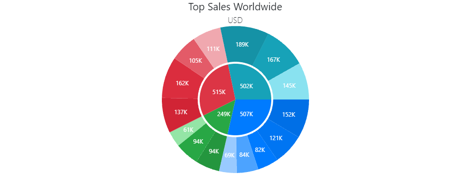
Donut
Use the InnerDiameter property to change the chart’s shape to Donut. The InnerDiameter is a value from 0 to 1 that is the ratio of the inner diameter to the outer diameter (Diameter).
The following code creates a donut with an outer diameter of 0.7 * 300 = 210 pixels, and inner diameter of 210 * 0.5 = 105 pixels.
<DxPieChart Data="@SalesData"
            Diameter="0.7"
            InnerDiameter="0.5"
            Height="300"
            Width="950">
    <DxPieChartSeries T="SaleInfo"
                      TArgument="string"
                      TValue="double"
                      ValueField="si => si.Amount"
                      ArgumentField="si => si.Region"
                      SummaryMethod="Enumerable.Sum">
    </DxPieChartSeries>
    <DxChartLegend Visible="false" />
</DxPieChart>
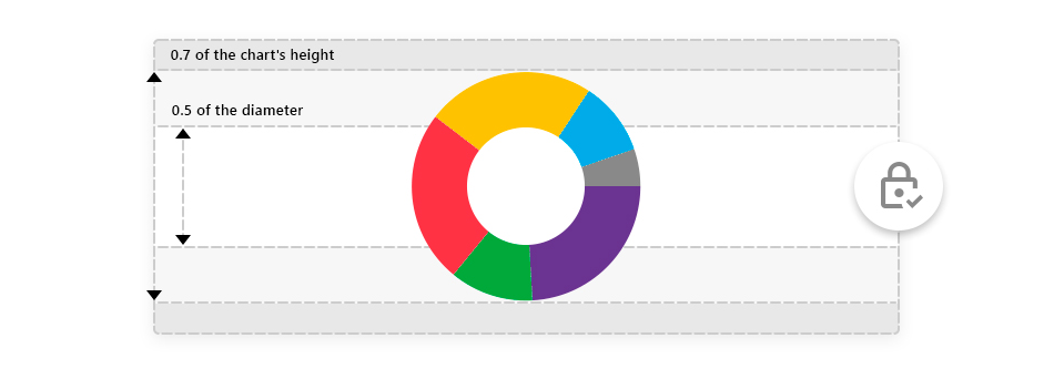
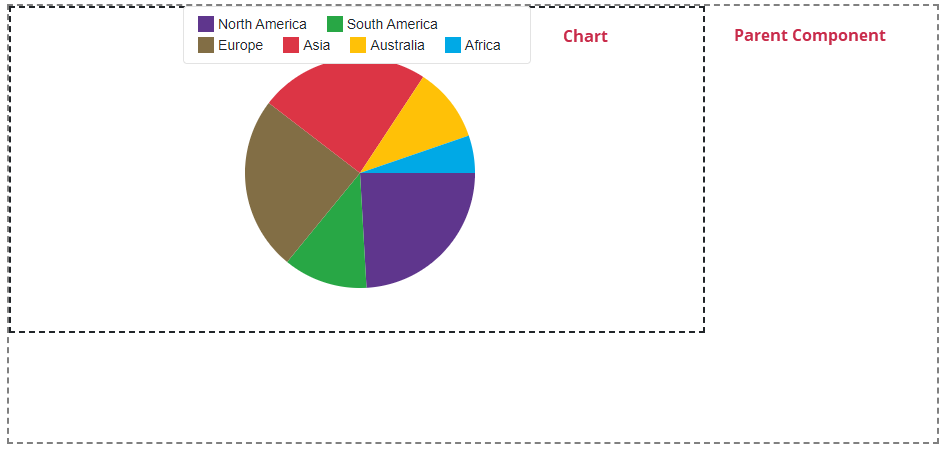
Sizing
You can change the size of the Pie Chart component.
Use the Width and Height properties to specify a custom size for the chart component. The example below sets the chart component size to 75% of the parent component (<div>).
<div style="width: 932px; height: 440px">
    <DxPieChart Data="@SalesInfo" Width="75%" Height="75%"> @* Width = 699px; Height = 330px *@
        @* ... *@
    </DxPieChart>
</div>
Labels
Use the DxChartSeriesLabel component to show and configure labels for series data points. These settings apply to all labels in the series.
To override individual label settings, handle the chart’s CustomizeSeriesPoint event and use the event argument’s PointLabel property.
The following example demonstrates how to:
- Use the DxChartSeriesLabel component to specify the position of all labels.
- Use the DxChartSeriesLabelConnector component to customize connectors between data points and labels.
- Handle the CustomizeSeriesPoint event to show only labels whose values are greater than 20.
<DxPieChart Data="@DataList" CustomizeSeriesPoint="@PreparePointLabel">
    <DxPieChartSeries T="DailyData"
                      TArgument="DateTime"
                      TValue="int"
                      ArgumentField="@(s => s.Date)"
                      ValueField="@(s => s.Value)">
        <DxChartSeriesLabel Position="RelativePosition.Outside">
            <DxChartSeriesLabelConnector Visible="true" Width="2" />
        </DxChartSeriesLabel>
    </DxPieChartSeries>
    <DxChartLegend Visible="false" />
</DxPieChart>

@code {
  protected override void OnInitialized()
  {
        DataList = GetData();
  }
  protected void PreparePointLabel(ChartSeriesPointCustomizationSettings pointSettings)
  {
        int value = (int)pointSettings.Point.Value;
        if (value > 20)
            pointSettings.PointLabel.Visible = true;
  }
}

Use the LabelOverlap property to specify how the chart resolves overlapping labels.
The code below hides point labels that overlap:
<DxPieChart Data="@SalesData" LabelOverlap="PieChartLabelOverlap.Hide">
    @*...*@
</DxPieChart>

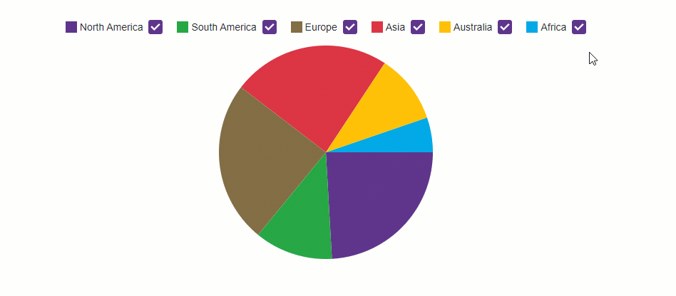
Legend
A Pie Chart’s legend lists all chart sectors. The DxChartLegend component implements the chart legend. Use the Visible property to hide or show the legend, and the Position property to specify the legend’s position.
Enable the AllowToggleSeries property to display checkboxes that toggle the visibility of individual sectors.
<DxPieChart Data="@SalesData">
    <DxPieChartSeries T="SaleInfo"
                      TArgument="string"
                      TValue="double"
                      ValueField="si => si.Amount"
                      ArgumentField="si => si.Region"
                      SummaryMethod="Enumerable.Sum">
    </DxPieChartSeries>
    <DxChartLegend AllowToggleSeries="true"
                   Position="RelativePosition.Outside" />
</DxPieChart>
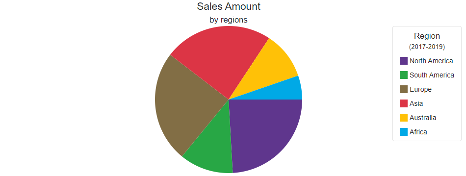
Titles and Subtitles
The <DxPieChart> component can display titles (DxChartTitle) and subtitles (DxChartSubTitle) for the following items:
- The Pie Chart component (
<DxPieChart>) - Legend (
<DxChartLegend>)
<DxPieChart Data="@SalesData" Width="950">
    <DxChartTitle Text="Sales Amount">
        <DxChartSubTitle Text="by regions" />
    </DxChartTitle>
    <DxPieChartSeries T="SaleInfo"
                      TArgument="string"
                      TValue="double"
                      ValueField="si => si.Amount"
                      ArgumentField="si => si.Region"
                      SummaryMethod="Enumerable.Sum">
    </DxPieChartSeries>
    <DxChartLegend HorizontalAlignment="HorizontalAlignment.Right"
                   Orientation="Orientation.Vertical">
        <DxChartTitle Text="Region">
            <DxChartSubTitle Text="(2017-2019)" />
        </DxChartTitle>
    </DxChartLegend>
</DxPieChart>
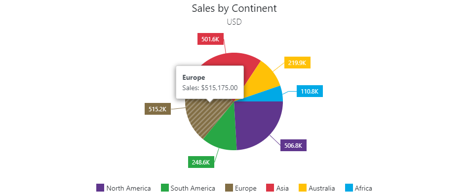
Tooltips
The Pie Chart can display tooltips when the mouse pointer is above a chart series. Use the DxChartTooltip element to specify tooltip templates.
The Tooltip class contains the following properties:
- Enabled - Specifies whether tooltips are enabled. Set this property to true to display tooltips.
- Position - Specifies the tooltip position.
<DxPieChart Data="@SalesData">
    <DxChartTooltip Enabled="true"
                    Position="RelativePosition.Outside">
        <div style="margin: 0.75rem">
            <div class="font-weight-bold">@context.Point.Argument</div>
            <div>Sales: @($"${context.Point.Value:#,0.00}")</div>
        </div>
    </DxChartTooltip>
    <DxPieChartSeries T="SaleInfo"
                      TArgument="string"
                      TValue="double"
                      ValueField="si => si.Amount"
                      ArgumentField="si => si.Region"
                      SummaryMethod="Enumerable.Sum">
        <DxChartSeriesLabel Visible="true"
                            Position="RelativePosition.Outside"
                            Format="ChartElementFormat.Thousands(1)">
            <DxChartSeriesLabelConnector Visible="true" />
        </DxChartSeriesLabel>
    </DxPieChartSeries>
    @* ... *@
</DxPieChart>
Troubleshooting
If a Blazor application throws unexpected exceptions, refer to the following help topic: Troubleshooting.