DxChart<T> Class
A Chart component.
Namespace: DevExpress.Blazor
Assembly: DevExpress.Blazor.v21.2.dll
NuGet Package: DevExpress.Blazor
Declaration
public class DxChart<T> :
    DxChart,
    IModelProvider<ChartArgumentAxisModel>,
    IModelProvider<ChartValueAxisModel>,
    IModelProvider<ChartZoomAndPanSettingsModel>,
    IModelProvider<ChartScrollBarSettingsModel>,
    IModelProvider<ChartPaneModel>,
    IModelProvider<ChartCommonSeriesBaseModel>,
    IComponentContainer<IXYChartSeriesModel>,
    IChartJSInteropProxyServer,
    IChartJSInteropProxyServerBase,
    IJSCallback
Type Parameters
| Name | Description |
|---|---|
| T | The data item type. |
Remarks
The DevExpress Chart component (<DxChart>) allows you to create Line, Area, Bar, Bubble, and other chart types for Blazor applications.
Add a Chart to a Project
Follow the steps below to add the Chart component to an application:
- Use a DevExpress Project Template to create a new Blazor Server or Blazor WebAssembly application. If you use a Microsoft project template or already have a Blazor project, configure your project to incorporate DevExpress Blazor components.
- Add the
<DxChart>…</DxChart>markup to a Razor page. - Bind the component to data.
- Configure the component: add series and axes, specify a legend, titles, tooltips, and so on (see the sections below).
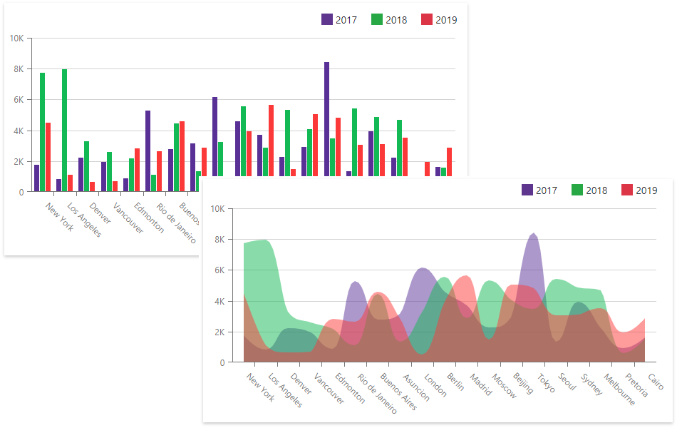
Chart Types
<DxChart> contains a variety of 2D series types that display data as a single chart or a combination of different series.
Chart View | Series Type | Demo |
|---|---|---|
Area |
DxChartStackedSplineAreaSeries | |
Bar | ||
Bubble | ||
Financial | ||
Line | ||
Scatter |
To create a pie or donut chart, use the DxPieChart<T> component with the DxPieChartSeries<T, TArgument, TValue> object.
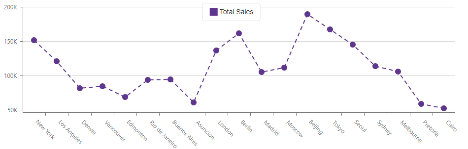
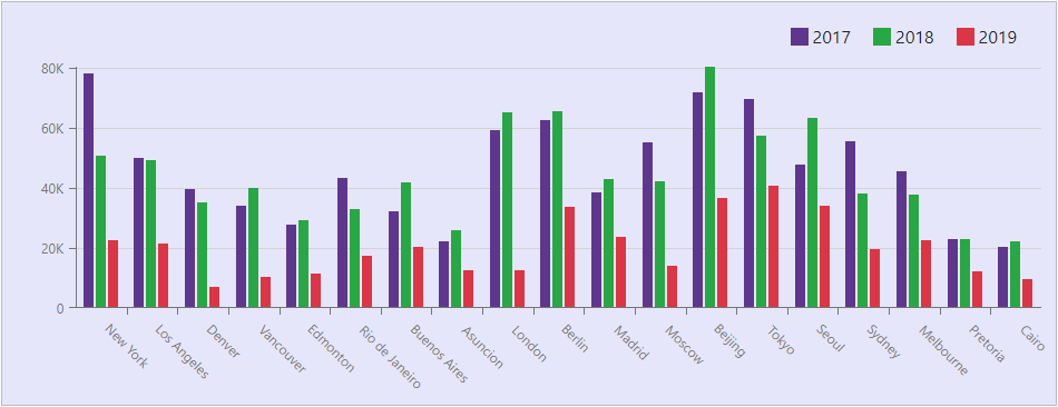
Bind to Data
Use the Data property to specify an IEnumerable<T> data source, and the series ArgumentField and ValueField properties to specify data source fields that contain arguments and values for chart points. For a sample data source, refer to our GitHub repository.
Note
The Chart operates in bound mode only.
<DxChart Data="@SalesData">
    <DxChartLineSeries Name="2017"
                       Filter="@((SaleInfo s) => s.Date.Year == 2017)"
                       ArgumentField="@(s => s.City)"
                       ValueField="@(s => s.Amount)"
                       SummaryMethod="Enumerable.Sum"/>
    <DxChartLineSeries Name="2018"
                       Filter="@((SaleInfo s) => s.Date.Year == 2018)"
                       ArgumentField="@(s => s.City)"
                       ValueField="@(s => s.Amount)"
                       SummaryMethod="Enumerable.Sum"/>
    <DxChartLineSeries Name="2019"
                       Filter="@((SaleInfo s) => s.Date.Year == 2019)"
                       ArgumentField="@(s => s.City)"
                       ValueField="@(s => s.Amount)"
                       SummaryMethod="Enumerable.Sum"/>
    <DxChartLegend Position="RelativePosition.Outside" HorizontalAlignment="HorizontalAlignment.Right" />
</DxChart>

@code {
    IEnumerable<SaleInfo> SalesData;

    protected override async Task OnInitializedAsync() {
        SalesData = await Sales.GetSalesAsync();
    }
}
If the data source collection implements the INotifyCollectionChanged interface, the Chart is updated automatically each time the collection changes. Otherwise, use the RefreshData method to reload data and redraw the component. To re-render the Chart area without a data reload, call the RedrawAsync method.
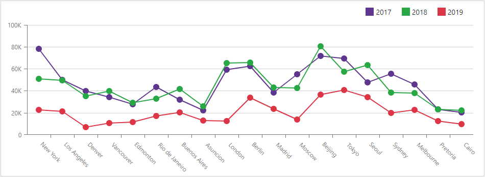
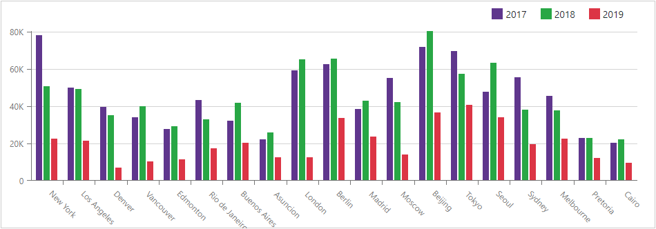
Series
A chart series is a collection of related data points. You can specify common settings for all chart series, or add series to the component markup and configure series-specific settings individually. If you have several series, place them at the same Chart hierarchy level.
Common Settings
Use the DxChartCommonSeries object to specify common settings for all chart series. The SeriesType property specifies the chart type.
<DxChart Data="@SalesData">
    <DxChartCommonSeries NameField="@((SaleInfo s) => s.Date.Year)"
                         ArgumentField="@((SaleInfo s) => s.City)"
                         ValueField="@((SaleInfo s) => s.Amount)"
                         SeriesType="ChartSeriesType.Bar"
                         SummaryMethod="Enumerable.Max">
    </DxChartCommonSeries>
</DxChart>

@code {
    IEnumerable<SaleInfo> SalesData;

    protected override async Task OnInitializedAsync() {
        SalesData = await Sales.GetSalesAsync();
    }
}
The table below lists common settings for chart series:
Member | Description |
|---|---|
Specifies the method that calculates summaries for points with the same argument value. | |
Specifies a data source field that stores arguments for series values. | |
Specifies a filter that is applied to data source objects. | |
Specifies a data source field that is used to group data by series. | |
Specifies which data source field contains pane names for chart series. | |
Specifies whether the series should break on points with null values. | |
Specifies a series template. | |
Specifies a data source field that contains values for series points. |
Note
Individual series settings have priority over common series settings.
Type-Specific Settings
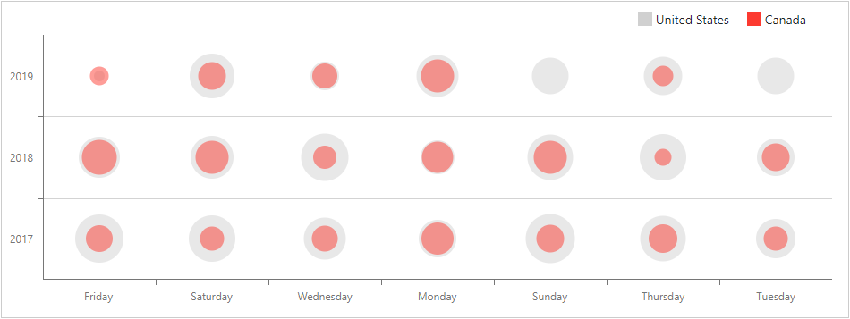
Type-specific series have their own settings. For example, Bubble series display chart data as points with different sizes called “bubbles”. To specify a data source field that defines bubble sizes, use the DxChartBubbleSeries.SizeField property.
@using System.Drawing

<DxChart Data="@SalesData">
    <DxChartBubbleSeries Name="United States"
                         Filter="@((SaleInfo s) => s.Country == "United States")"
                         ArgumentField="@(s => s.Date.DayOfWeek.ToString())"
                         ValueField="@(s => s.Date.Year)"
                         SizeField="@(s => s.Amount)"
                         Color="@(Color.FromArgb(208, 208, 208))"
                         SummaryMethod="Enumerable.Max" />
    <DxChartBubbleSeries Name="Canada"
                         Filter="@((SaleInfo s) => s.Country == "Canada")"
                         ArgumentField="@(s => s.Date.DayOfWeek.ToString())"
                         ValueField="@(s => s.Date.Year)"
                         SizeField="@(s => s.Amount)"
                         Color="@(Color.FromArgb(252, 58, 48))"
                         SummaryMethod="Enumerable.Max" />
    <DxChartLegend Position="RelativePosition.Outside" HorizontalAlignment="HorizontalAlignment.Right" />
</DxChart>

@code {
    IEnumerable<SaleInfo> SalesData;

    protected override async Task OnInitializedAsync() {
        SalesData = await Sales.GetSalesAsync();
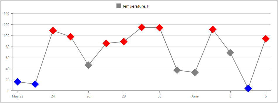
For line series, you can use the DxChartSeriesPoint component to customize the point’s color, size, symbol, and visibility. These settings apply to all points in a series. To override individual point settings, handle the chart’s CustomizeSeriesPoint event.
@inject WeatherForecastService ForecastService

<DxChart Data="@ChartData" CustomizeSeriesPoint="@PreparePointColor">
    <DxChartLineSeries AggregationMethod="@(i => (int)i.Average())"
                       Color="@System.Drawing.Color.Gray"
                       ValueField="@((WeatherForecast i) => i.TemperatureF)"
                       ArgumentField="@(i => i.Date.Date)"
                       Name="Temperature, F">
        <DxChartSeriesPoint Symbol="ChartPointSymbol.Polygon" Color="@System.Drawing.Color.Gray" Size="25" />
    </DxChartLineSeries>
</DxChart>

@code {
    WeatherForecast[] ChartData;

    protected override async Task OnInitializedAsync() {
        ChartData = await ForecastService.GetForecastAsync();
    }

    protected void PreparePointColor(ChartSeriesPointCustomizationSettings pointSettings) {
        double value = (double)pointSettings.Point.Value;
        if (value > 75)
            pointSettings.PointAppearance.Color = System.Drawing.Color.Red;
        else if (value < 25)
            pointSettings.PointAppearance.Color = System.Drawing.Color.Blue;
    }
}
For the line series and constant line you can specify the dash style. For example, make the line dashed, dotted, or apply one of the predefined patterns.
The following example shows how to define a dashed line series:
<DxChart Data="@SalesData">
    <DxChartLineSeries Name="Total Sales"
                       ArgumentField="@((SaleInfo s) => s.City)"
                       ValueField="@((SaleInfo s) => s.Amount)"
                       SummaryMethod="Enumerable.Sum"
                       DashStyle="ChartDashStyle.Dash">
    </DxChartLineSeries>
</DxChart>
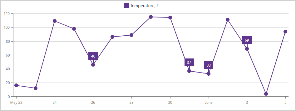
Labels
Use the DxChartSeriesLabel component to show and configure labels for series data points. These settings apply to all labels in the series.
To override individual label settings, handle the chart’s CustomizeSeriesPoint event and use the event argument’s PointLabel property.
@inject WeatherForecastService ForecastService

<DxChart Data="@ChartData" CustomizeSeriesPoint="@PreparePointLabel">
    <DxChartLineSeries AggregationMethod="@(i => (int)i.Average())"
                       ValueField="@((WeatherForecast i) => i.TemperatureF)"
                       ArgumentField="@(i => i.Date.Date)"
                       Name="Temperature, F">
        <DxChartSeriesLabel Position="RelativePosition.Outside">
            <DxChartSeriesLabelConnector Visible="true" Width="3" />
        </DxChartSeriesLabel>
    </DxChartLineSeries>
</DxChart>

@code {
    WeatherForecast[] ChartData;

    protected override async Task OnInitializedAsync() {
        ChartData = await ForecastService.GetForecastAsync();
    }

    protected void PreparePointLabel(ChartSeriesPointCustomizationSettings pointSettings) {
        double value = (double)pointSettings.Point.Value;
        if (value > 25 && value < 75)
            pointSettings.PointLabel.Visible = true;
    }
}
Use the LabelOverlap property to specify how the chart resolves overlapping labels.
The code below hides overlapping point labels:
<DxChart Data="@SalesData" LabelOverlap="ChartLabelOverlap.Hide">
    @*...*@
</DxChart>
Axes
Primary X and Y axes are automatically created based on the first series’ data type. The DxChartArgumentAxis class defines the X-axis, and the DxChartValueAxis class defines the Y-axis. The Visible property specifies an axis visibility. The DxChartAxisTitle object specifies the axis title.
Axis labels are displayed on the chart’s X-axis. The <DxChart> uses smart label management to ensure that labels do not overlap. The Format property specifies the axis label’s format.
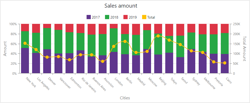
If the data range or format is series-specific, each series can use its own Y-axis. The number of Y-axes in a chart is not limited.
<DxChart Data="@SalesData">
    <DxChartTitle Text="Sales amount" />
    <DxChartLegend Position="RelativePosition.Outside" />
    <DxChartValueAxis>
        <DxChartAxisLabel Format="ChartElementFormat.Percent()"></DxChartAxisLabel>
        <DxChartAxisTitle Text="Amount"></DxChartAxisTitle>
    </DxChartValueAxis>
    <DxChartValueAxis Name="TotalAxis" Alignment="ChartAxisAlignment.Far">
        <DxChartAxisTitle Text="Total Amount"></DxChartAxisTitle>
    </DxChartValueAxis>
    <DxChartArgumentAxis>
        <DxChartAxisTitle Text="Cities"></DxChartAxisTitle>
    </DxChartArgumentAxis>
    @* ... *@
</DxChart>
You can also customize the axes in the following ways:
- Specify an axis position. Use the Alignment property.
- Define the visual range. Use the DxChartAxisRange object.
- Swap the axes to display the X-axis vertically and the Y-axis horizontally. Use the DxChart.Rotated property.
- Change an axis type. Use the DxChartArgumentAxis.Type and DxChartAxis.Type properties.
- Cut a part of an axis. Use the DxChartScaleBreak component.
- Specify next to which edge the Chart should display an axis. Use the Alignment property.
- Shift an axis. Use the Offset property to specify the shift in pixels or the CustomPosition property to specify the axes intersection point.
- Invert an axis. Use the Inverted property.
- Mark an individual axis value. Use the DxChartConstantLine object.
Axes Ticks
Major ticks divide an axis into sections that mark values on this axis. Minor ticks divide an axis segment between two neighboring major ticks. Minor ticks cannot be displayed on the axis of Discrete type.
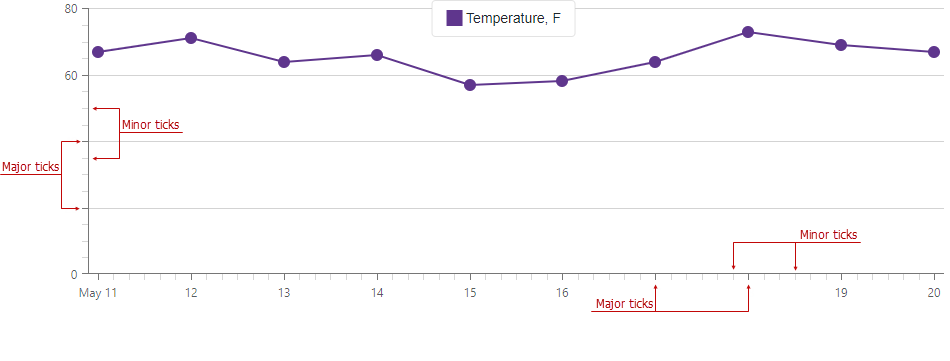
Use the DxChartAxisTick class to customize appearance of major ticks and the DxChartAxisMinorTick class for minor ticks.
You can also use the following properties to manage axis ticks:
- DiscreteDivisionMode: Specifies whether ticks and grid lines lie between or next to axis labels.
- TickInterval: Specifies the interval between major ticks. Does not apply to discrete axes.
- MinorTickInterval: Specifies the interval between minor ticks. Applies only to continuous axes.
- MinorTickCount: Specifies the number of minor ticks between two neighboring major ticks.
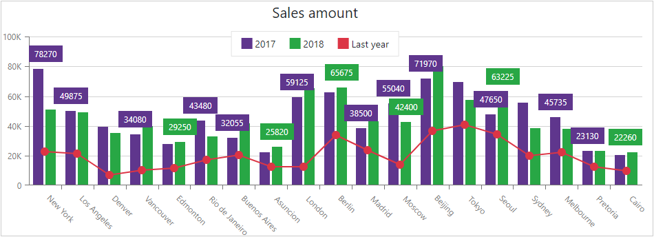
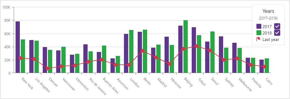
Legend
A chart’s legend lists all chart series. The DxChartLegend component implements the chart legend. Use the Visible property and series’ Name property to specify the legend’s visibility, and the Position property to specify the legend’s position.
Enable the AllowToggleSeries property to display checkboxes that toggle the visibility of individual series.
<DxChart Data="@SalesData">
    <DxChartLegend AllowToggleSeries="true"
                   Orientation="Orientation.Vertical"
                   HorizontalAlignment="HorizontalAlignment.Right">
        <DxChartTitle Text="Years">
            <DxChartSubTitle Text="(2017-2019)"></DxChartSubTitle>
        </DxChartTitle>
    </DxChartLegend>
    <DxChartBarSeries Name="2017" ... />
    <DxChartBarSeries Name="2018" ... />
    <DxChartLineSeries Name="2019" ... />
        <DxChartSeriesLegendItem IconCssClass="oi oi-flag">
            <TextTemplate>Last year</TextTemplate>
        </DxChartSeriesLegendItem>
    </DxChartLineSeries>
</DxChart>
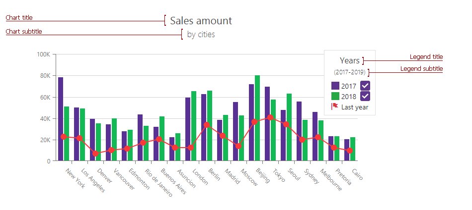
Titles and Subtitles
The <DxChart> component can display titles (DxChartTitle) and subtitles (DxChartSubTitle) for the chart component and legend.
<DxChart Data="@SalesData">
   <DxChartTitle Text="Sales amount">
       <DxChartSubTitle Text="by cities"></DxChartSubTitle>
   </DxChartTitle>
    <DxChartLegend AllowToggleSeries="true"
                   Orientation="Orientation.Vertical"
                   HorizontalAlignment="HorizontalAlignment.Right">
        <DxChartTitle Text="Years">
            <DxChartSubTitle Text="(2017-2019)"></DxChartSubTitle>
        </DxChartTitle>
    </DxChartLegend>
</DxChart>
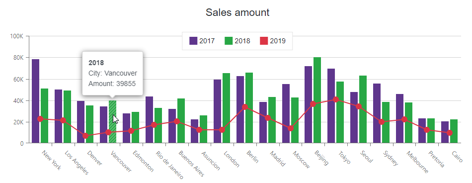
Tooltips
The Chart can display tooltips when the mouse pointer is above a chart series. Use the DxChartTooltip element to specify tooltip templates.
The Tooltip class contains the following properties:
- Enabled - Specifies whether tooltips are enabled. Set this property to true to display tooltips.
- Position - Specifies the tooltip position.
<DxChart Data="@SalesData"
         CssClass="mw-1100">
    <DxChartTitle Text="Sales amount" />

    <DxChartTooltip Enabled="true" Position="RelativePosition.Outside">
        <div style="margin: 0.75rem">
            <div class="font-weight-bold">@context.Point.SeriesName</div>
            <div>City: @context.Point.Argument</div>
            <div>Amount: @context.Point.Value</div>
        </div>
    </DxChartTooltip>

    <DxChartBarSeries Name="2017"
                      Filter="@((SaleInfo s) => s.Date.Year == 2017)"
                      SummaryMethod="Enumerable.Sum"
                      ArgumentField="@(s => s.City)"
                      ValueField="@(s => s.Amount)" />
    <DxChartBarSeries Name="2018"
                      Filter="@((SaleInfo s) => s.Date.Year == 2018)"
                      SummaryMethod="Enumerable.Sum"
                      ArgumentField="@(s => s.City)"
                      ValueField="@(s => s.Amount)" />
    <DxChartLineSeries Name="2019"
                       Filter="@((SaleInfo s) => s.Date.Year == 2019)"
                       SummaryMethod="Enumerable.Sum"
                       ArgumentField="@(s => s.City)"
                       ValueField="@(s => s.Amount)" />
</DxChart>
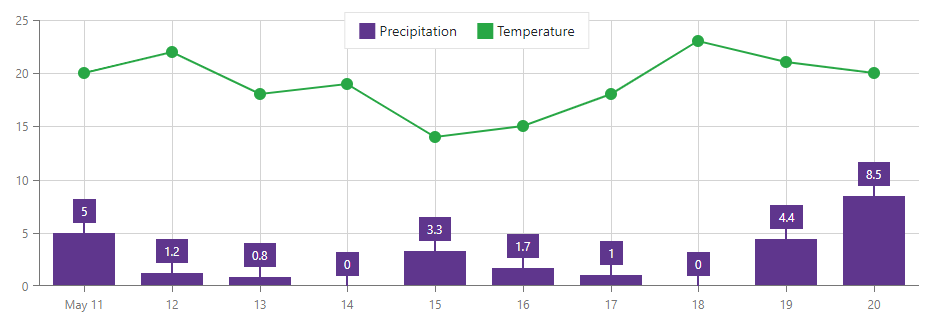
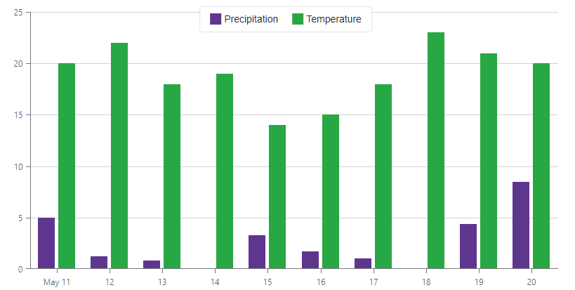
Grid Lines
The DxChartAxisGridLines object specifies Chart grid lines. To show/hide grid lines, use this axis’s Visible property.
The code below sets the argument axis’s Visible property to true to show vertical grid lines in the Chart component.
<DxChart Data="@forecasts">
    <DxChartBarSeries ArgumentField="@((WeatherForecast i) => i.Date)"
                      ValueField="@((WeatherForecast i) => i.Precipitation)"
                      Name="Precipitation">
        <DxChartSeriesLabel Visible="true">
            <DxChartSeriesLabelConnector Visible="true" Width="2" />
        </DxChartSeriesLabel>
    </DxChartBarSeries>
    <DxChartLineSeries ArgumentField="@((WeatherForecast i) => i.Date)"
                       ValueField="@((WeatherForecast i) => i.TemperatureC)"
                       Name="Temperature">
    </DxChartLineSeries>
    <DxChartArgumentAxis>
        <DxChartAxisGridLines Visible="true" />
    </DxChartArgumentAxis>
    @* ... *@
</DxChart>
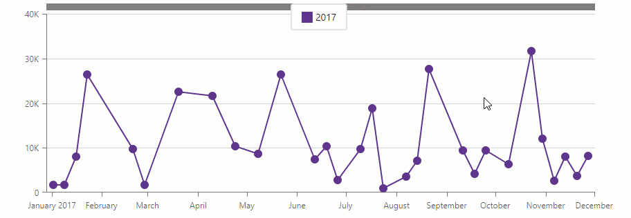
Zoom and Pan
Users can zoom and pan the chart with the mouse wheel or touch gestures. To enable zoom/pan, add a DxChartZoomAndPanSettings object and specify its ArgumentAxisZoomAndPanMode and ValueAxisZoomAndPanMode properties. To disable the mouse wheel or touch gestures, use the AllowMouseWheel / AllowTouchGestures properties.
You can also add a scroll bar that allows users to pan the chart along the argument axis. To do this, add a DxChartScrollBarSettings object and set its ArgumentAxisScrollBarVisible property to true. Use the ArgumentAxisScrollBarPosition property to specify the scroll bar’s position.
@using Chart.Data

<DxChart Data="@SalesData">
    <DxChartLineSeries Name="2017"
                        Filter="@((SaleInfo s) => s.Date.Year == 2017)"
                        ArgumentField="@(s => s.Date)"
                        ValueField="@(s => s.Amount)">
        <DxChartAggregationSettings Enabled="true" Method="ChartAggregationMethod.Sum" />
    </DxChartLineSeries>
    <DxChartZoomAndPanSettings ArgumentAxisZoomAndPanMode="ChartAxisZoomAndPanMode.Both"
                               ValueAxisZoomAndPanMode="ChartAxisZoomAndPanMode.Pan" />
    <DxChartScrollBarSettings ArgumentAxisScrollBarVisible="true"
                              ArgumentAxisScrollBarPosition="ChartScrollBarPosition.Top" />
</DxChart>

@code {
    IEnumerable<SaleInfo> SalesData;

    protected override async Task OnInitializedAsync() {
        SalesData = await Sales.GetSalesAsync();
    }
}
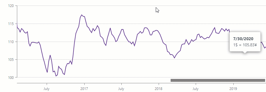
When the chart contains the large number of points, you can aggregate data to optimize performance.
Data Aggregation
The <DxChart> component can use different aggregate methods to group data and decrease the number of visible points. This feature allows you to optimize chart performance.
Data aggregation is available for the X-axis. The chart splits the X-axis into intervals, aggregates data for each interval and shows the result values as series points. When users zoom the chart, it re-aggregates data.
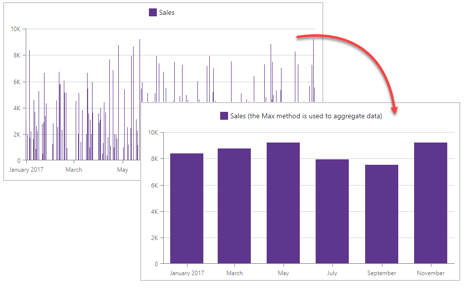
To enable aggregation, add a DxChartAggregationSettings object to the markup and set its Enabled property to true. To specify an aggregation method, use the Method property (the default method is Auto).
    <DxChart T="BargainDataPoint"
                Data="@UsdJpyData"
                @key="@Params.ThemeName"
                CssClass="w-100">
        <DxChartLegend Position="RelativePosition.Inside"
                        VerticalAlignment="VerticalEdge.Top"
                        HorizontalAlignment="HorizontalAlignment.Right" />
        <DxChartLineSeries T="BargainDataPoint"
                            TArgument="DateTime"
                            TValue="double"
                            ArgumentField="i => i.DateTimeStamp"
                            ValueField="i => i.Price"
                            Name="USDJPY">
            <DxChartSeriesPoint Visible="false" />
            <DxChartAggregationSettings Enabled="true"
                                        Method="ChartAggregationMethod.Average" />
        </DxChartLineSeries>
        <DxChartArgumentAxis>
            <DxChartAxisRange StartValue="new DateTime(2020, 01, 01)"
                              EndValue="new DateTime(2021, 01, 29)" />
        </DxChartArgumentAxis>
        <DxChartZoomAndPanSettings ArgumentAxisZoomAndPanMode="ChartAxisZoomAndPanMode.Both" />
        <DxChartScrollBarSettings ArgumentAxisScrollBarVisible="true"
                                  ArgumentAxisScrollBarPosition="ChartScrollBarPosition.Bottom" />
        <DxChartTooltip Enabled="true" Position="RelativePosition.Outside">
            <div style="margin: 0.75rem">
                <div class="font-weight-bold">@(((DateTime)context.Point.Argument).ToString("d"))</div>
                <div>1$ = @(context.Point.Value)¥</div>
            </div>
        </DxChartTooltip>
    </DxChart>

    @code {
        IEnumerable<BargainDataPoint> UsdJpyData;
        @inject ICurrencyExchangeDataProvider UsdJpyDataProvider

        protected override async Task OnInitializedAsync() {
            UsdJpyData = await UsdJpyDataProvider.GetDataAsync();
        }
    }
Note
You can also use summary methods to optimize chart performance.
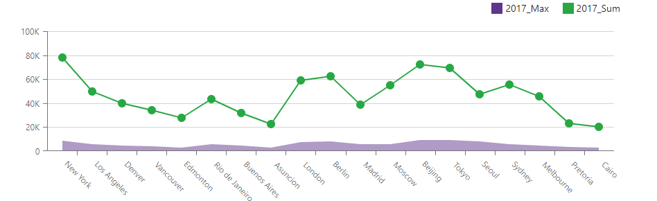
Data Summaries
The Chart component can use a summary method to group data. This method calculates summaries for points with the same argument value, and the chart shows the resulting values as series points. This feature allows you to decrease the number of visible points and to optimize chart performance.
Note that the chart calculates summaries when it loads data and does not re-calculate them when users zoom the chart.
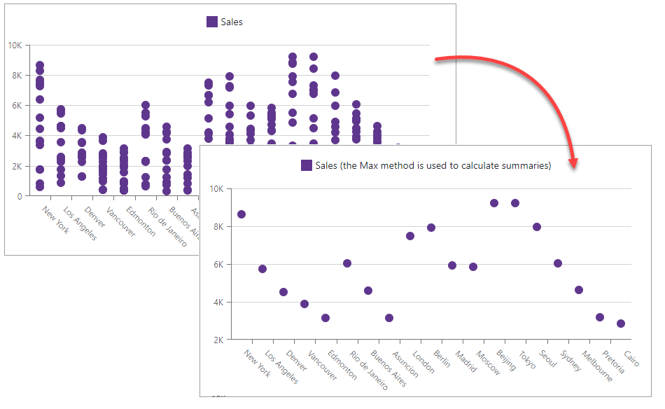
You can specify a common summary method for all chart series (DxChartCommonSeries.SummaryMethod) or an individual method for each series (DxChartSeries.SummaryMethod).
@using Chart.Data

<DxChart Data="@SalesData">
    <DxChartAreaSeries Name="2017_Max"
                        Filter="@((SaleInfo s) => s.Date.Year == 2017)"
                        ArgumentField="@(s => s.City)"
                        ValueField="@(s => s.Amount)"
                        SummaryMethod="Enumerable.Max" />
    <DxChartLineSeries Name="2017_Sum"
                        Filter="@((SaleInfo s) => s.Date.Year == 2017)"
                        ArgumentField="@(s => s.City)"
                        ValueField="@(s => s.Amount)"
                        SummaryMethod="Enumerable.Sum" />
    <DxChartLegend Position="RelativePosition.Outside" HorizontalAlignment="HorizontalAlignment.Right" />
</DxChart>

@code {
    IEnumerable<SaleInfo> SalesData;

    protected override async Task OnInitializedAsync() {
        SalesData = await Sales.GetSalesAsync();
    }
}
Note
You can also use aggregation methods to optimize chart performance.
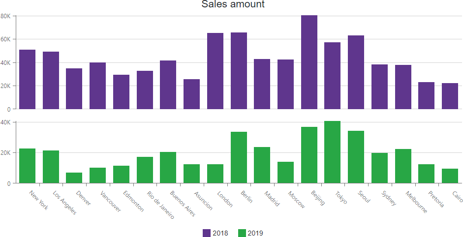
Multiple Panes
The <DxChart> component allows you to create charts with multiple panes under each other. A pane (DxChartPane) can display one or more series and can share its argument axis with other panes. To specify the pane where a series is displayed, use the series Pane property.
You can specify the pane Height in pixels or percentages.
<DxChart Data="@SalesData" Height="500px">
    <DxChartTitle Text="Sales amount" />
    <DxChartLegend Position="RelativePosition.Outside" VerticalAlignment="VerticalEdge.Bottom" />
    <DxChartPane Name="Pane1" Height="60%" />
    <DxChartPane Name="Pane2" />
    <DxChartBarSeries Name="2018"
                      Filter="@((SaleInfo s) => s.Date.Year == 2018)"
                      SummaryMethod="Enumerable.Sum"
                      Pane="Pane1"
                      ArgumentField="@(s => s.City)"
                      ValueField="@(s => s.Amount)" />
    <DxChartBarSeries Name="2019"
                      Filter="@((SaleInfo s) => s.Date.Year == 2019)"
                      SummaryMethod="Enumerable.Sum"
                      Pane="Pane2"
                      ArgumentField="@(s => s.City)"
                      ValueField="@(s => s.Amount)" />
</DxChart>
Size
Use the chart’s Width and Height properties to change the component’s size.
<DxChart Data="@forecasts" Width="800px" Height="400px">
    <DxChartBarSeries ArgumentField="@((WeatherForecast i) => i.Date)"
                      ValueField="@((WeatherForecast i) => i.Precipitation)"
                      Name="Precipitation">
    </DxChartBarSeries>
    <DxChartBarSeries ArgumentField="@((WeatherForecast i) => i.Date)"
                      ValueField="@((WeatherForecast i) => i.TemperatureC)"
                      Name="Temperature">
    </DxChartBarSeries>
</DxChart>
Appearance Customization
Use the chart’s CssClass property to customize the chart’s appearance. The following snippet changes the chart’s background color and font size:
<style>
    .my-style {
        background-color: lavender;
        font-size: 16px;
    }
</style>

<DxChart Data="@SalesData" CssClass="my-style">
    <DxChartCommonSeries NameField="@((SaleInfo s) => s.Date.Year)"
                         ArgumentField="@(s => s.City)"
                         ValueField="@(s => s.Amount)"
                         SummaryMethod="Enumerable.Sum"
                         SeriesType="BarSeriesType.Value">
    </DxChartCommonSeries>
    <DxChartLegend Position="RelativePosition.Outside" HorizontalAlignment="HorizontalAlignment.Right" />
</DxChart>
You can also apply CSS styles to chart elements:
For more information, refer to the following help topic: CSS Classes.
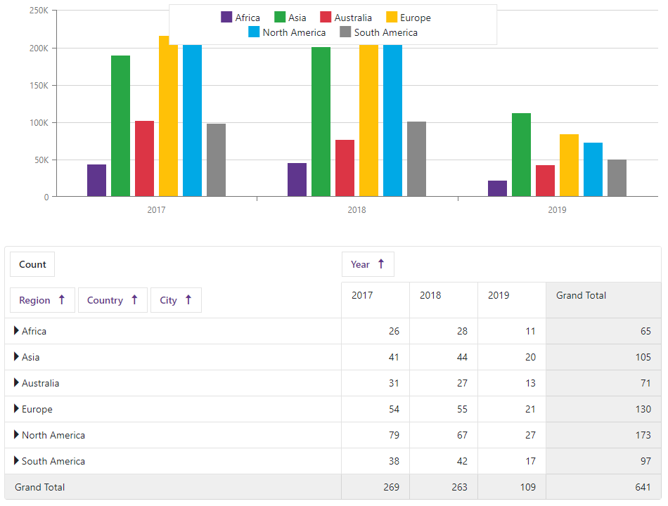
Visualize Pivot Grid Data
You can link <DxChart> to the DxPivotGrid<T> component as follows:
- Create a method that asynchronously loads data from an IEnumerable<T> data source (Sales.Load() in this example).
- Create a DxPivotGridDataProvider<T> object based on the created method.
- Bind the Chart to the provider object. Use the ChartDataSource property.
- Bind the Pivot Grid to the provider object. Use the PivotGridDataSource property.
<DxChart Data="@(PivotGridDataProvider.ChartDataSource)">
    <DxChartCommonSeries NameField="@((IChartDataItem s) => s.SeriesName)"
                         ArgumentField="@(s => s.Argument)"
                         ValueField="@(s => s.Value)"
                         SeriesType="ChartSeriesType.Bar" />
</DxChart>

<DxPivotGrid Data="@(PivotGridDataProvider.PivotGridDataSource)">
    <DxPivotGridField Field="@nameof(SaleInfo.Region)" SortOrder="PivotGridSortOrder.Ascending"
        Area="PivotGridFieldArea.Row"></DxPivotGridField>
    <DxPivotGridField Field="@nameof(SaleInfo.Country)" Area="PivotGridFieldArea.Row"></DxPivotGridField>
    <DxPivotGridField Field="@nameof(SaleInfo.City)" Area="PivotGridFieldArea.Row"></DxPivotGridField>
    <DxPivotGridField Field="@nameof(SaleInfo.Date)" GroupInterval="PivotGridGroupInterval.Year"
        Area="PivotGridFieldArea.Column" Caption="Year"> </DxPivotGridField>
    <DxPivotGridField Field="@nameof(SaleInfo.OrderId)" Caption="Count" Area="PivotGridFieldArea.Data"
        SummaryType="PivotGridSummaryType.Count"> </DxPivotGridField>
</DxPivotGrid>

@code {
    DxPivotGridDataProvider<SaleInfo> PivotGridDataProvider = DxPivotGridDataProvider<SaleInfo>.Create(Sales.Load());
}
The Chart shows data from the Pivot Grid’s lowest expanded level. The Chart is updated when a user expands or collapses rows/columns in the Pivot Grid.
Troubleshooting
If a Blazor application throws unexpected exceptions, refer to the following help topic: Troubleshooting.