Grid
- 4 minutes to read
The DevExpress Grid for Blazor (DxGrid) allows you to display, manage, and shape tabular data.
Data Binding
The DevExpress Blazor Grid supports the following data binding scenarios:
- Synchronous Data Binding
- Asynchronous Data Binding
- Observable Data Collections
- Large Data (Server Mode Sources)
- Large Data (Queryable Collections)
Column Types
The DevExpress Blazor Grid includes different column types:
- Bound Data Columns
- These columns get values from the bound data source.
- Unbound Data Columns
- These columns display values that are not stored in the bound data source. You can calculate column values based on other column values or based on custom logic.
- Command Column
- This column displays CRUD-related buttons (New, Edit, and Delete) and the Clear button that resets values in the filter row.
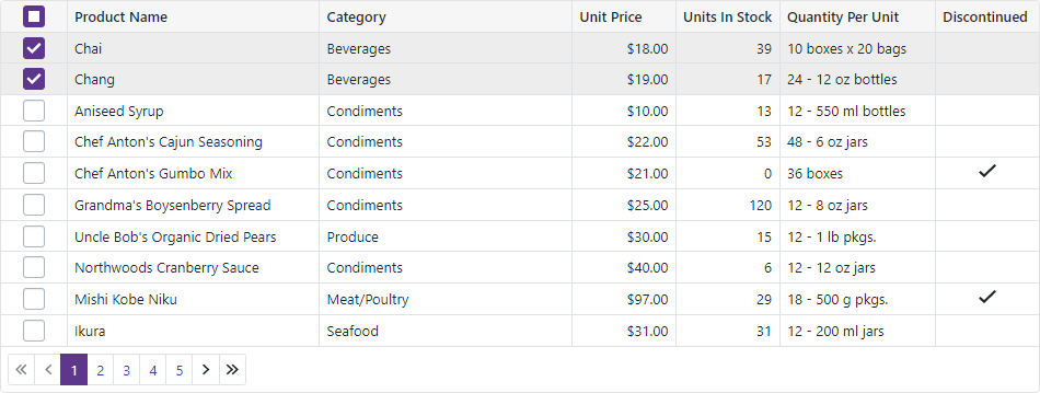
- Selection Column
- This column allows users to select and deselect rows. It contains checkboxes in multiple selection mode and radio buttons in single selection mode.
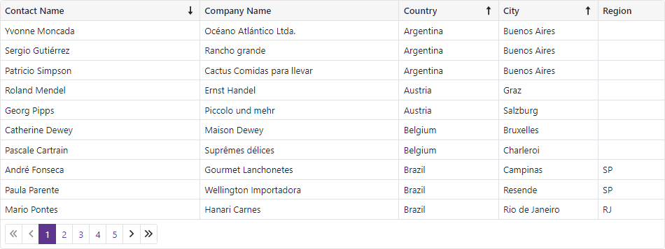
Sort Data
The DevExpress Blazor Grid allows users to sort data by an unlimited number of columns. The sort glyph indicates the column’s current sort order (ascending or descending). You can also sort data in code.
The Grid supports different sort modes:
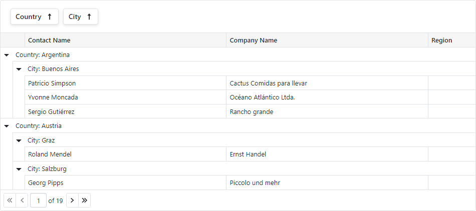
Group Data
Users can drag and drop column headers onto the Group Panel to group Grid data. You can also group data by any number of columns in code.
The Grid supports interval grouping and custom grouping algorithms.
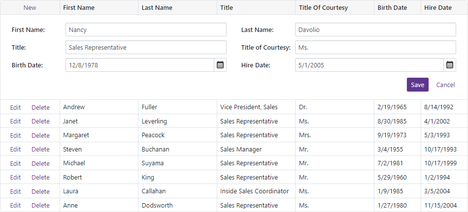
Edit Data
The DevExpress Blazor Grid allows users to edit its data within a standard or pop-up edit form.
The Grid validates user input automatically based on data annotation attributes. You can also implement and apply custom validation rules.
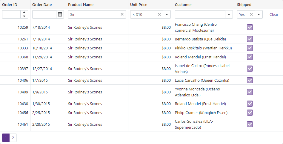
Filter Data
The DevExpress Blazor Grid ships with a built-in filter row. This row displays in-place text editors where users can type filter values. You can also manage filter options in code.
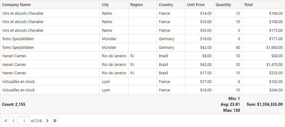
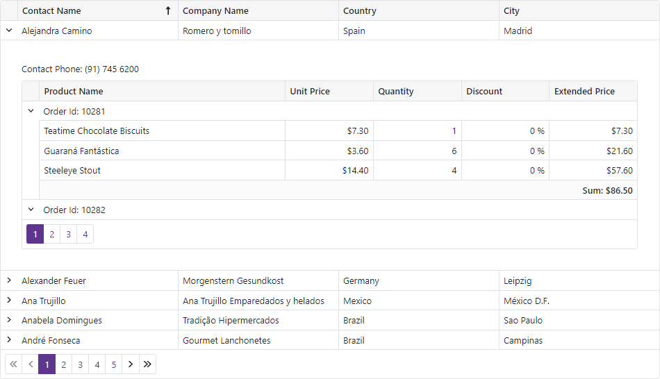
Summary
You can compute summaries across all Grid records (total summaries) or for individual groups (group summaries).
The Grid includes predefined aggregate functions: Sum, Min, Max, Avg, and Count. In addition to these functions, custom logic can also be used to calculate summary values.
Selection
The DevExpress Blazor Grid supports single and multiple row selection. Users can select and deselect rows by mouse clicks or in the selection column. You can also manage selection in code.
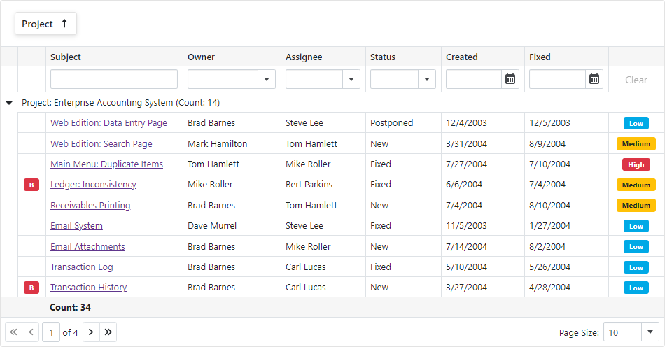
Master-Detail View
The DevExpress Blazor Grid allows you to build hierarchical layouts of any complexity and depth.
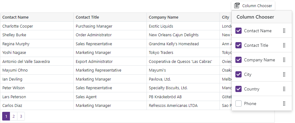
Column Management
Users can resize and reorder Grid columns at runtime. The Grid also supports the Column Chooser that allows users to manage column visibility and position.
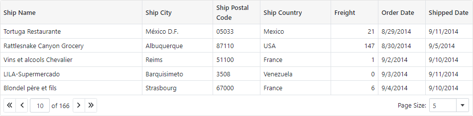
Paging
The DevExpress Blazor Grid can split data rows across multiple pages and display a pager to enable data navigation. The Grid includes multiple options for pager customization.
The Grid also ships with the page size selector that allows users to change page size at runtime.
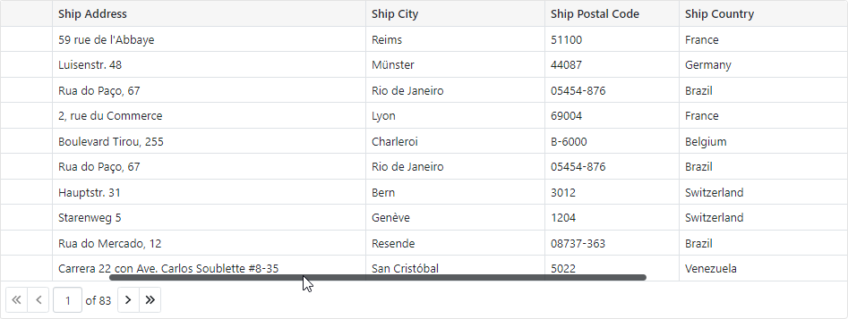
Scrolling
The DevExpress Blazor Grid displays a vertical/horizontal scrollbar when content height/width exceeds the size of the component itself.
Appearance
Use templates to customize content and appearance of different Grid elements:
- Column Cell Display Template
- Column Header Caption Template
- Column Filter Row Cell Template
- Column Group Row Template
- Column Group Footer Template
- Column Footer Template
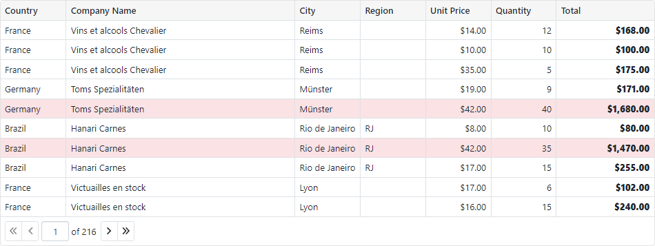
The Grid also allows you to color grid cells and rows according to their values.