Grid
- 7 minutes to read
The DevExpress Grid for Blazor (DxGrid) allows you to display, manage, and shape tabular data.
Data Binding
The DevExpress Blazor Grid supports the following data binding scenarios:
- Synchronous Data Binding
- Asynchronous Data Binding
- Observable Data Collections
- Large Data (Server Mode Sources)
- Large Data (Queryable Collections)
Column Types
The DevExpress Blazor Grid includes different column types:
- Bound Data Columns
- These columns get values from the bound data source.
- Unbound Data Columns
- These columns display values that are not stored in the bound data source. You can calculate column values based on other column values or based on custom logic.
- Command Column
- This column displays CRUD-related buttons (New, Edit, and Delete) and the Clear button that resets values in the filter row.
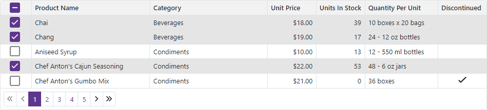
- Selection Column
- This column allows users to select and deselect rows. It contains checkboxes in multiple selection mode and radio buttons in single selection mode.
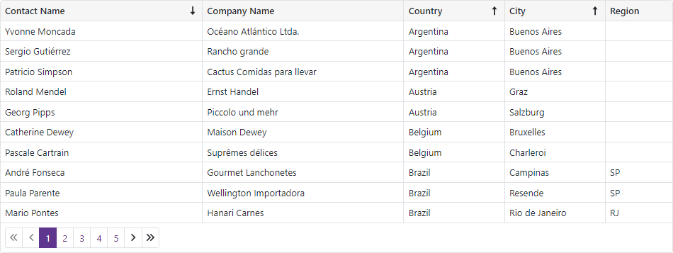
Sort Data
The DevExpress Blazor Grid allows users to sort data by an unlimited number of columns. The sort glyph indicates the column’s current sort order (ascending or descending). You can also sort data in code.
The Grid supports different sort modes:
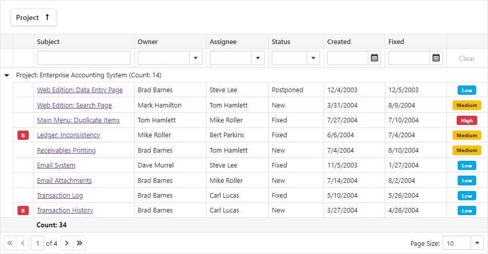
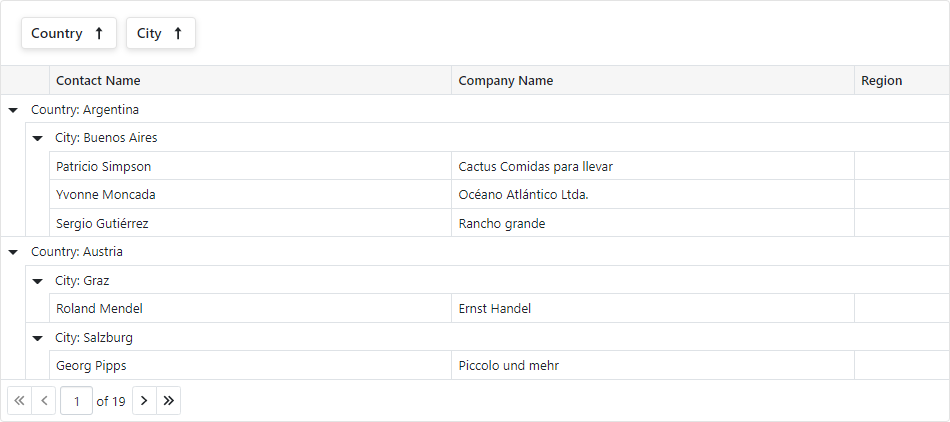
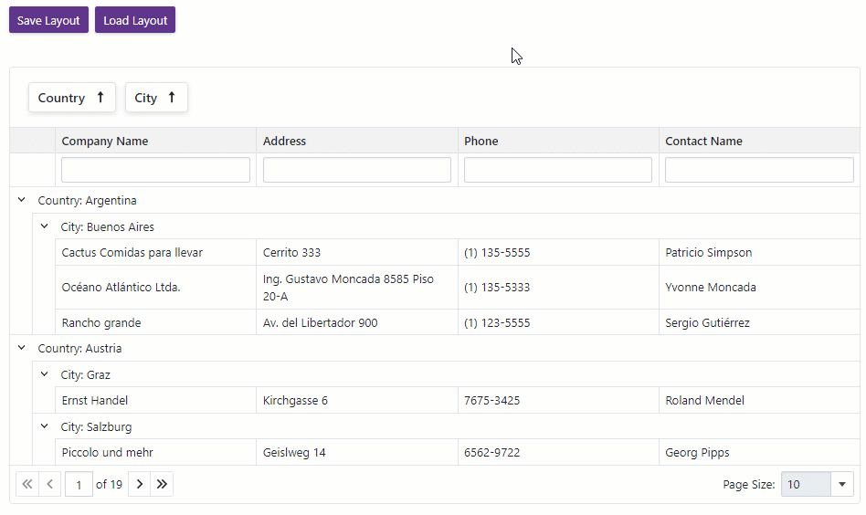
Group Data
Users can drag and drop column headers onto the Group Panel to group Grid data. You can also group data by any number of columns in code.
The Grid supports interval grouping and custom grouping algorithms.
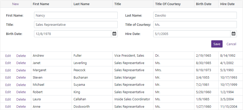
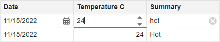
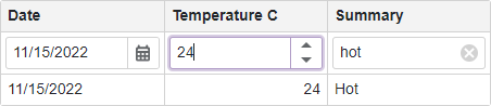
Edit Data
The DevExpress Blazor Grid supports the following edit modes:
- An inline edit row
- A standard edit form
- An edit form displayed in a pop-up window
The EditMode property specifies the current edit mode.
The Grid validates user input automatically based on data annotation attributes. You can also implement and apply custom validation rules.
Filter Data
The DevExpress Blazor Grid ships with the following elements that allow users to filter data.
Filter Row
Filter row displays in-place editors where users can type filter values. The grid can filter data by value or display text. You can also manage filter options in code.
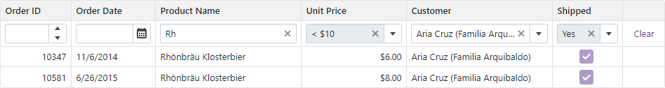
For more information, refer to the following topic: Filter Row.
Filter in Code
The DevExpress Blazor Grid allows you to filter its data in code. To apply filter criteria, create a criteria operator object that specifies the filter expression and send this object to one of the following methods:
- SetFilterCriteria(CriteriaOperator)
- Applies a filter to grid data.
- SetFieldFilterCriteria(String, CriteriaOperator)
- Applies a filter to the specified data field.
The specified methods allow you to filter grid data by every data source field, including fields that are not displayed in the grid. When a filter is applied, the Grid raises the FilterCriteriaChanged event.
For more information, refer to the following topic: Filter API.
Search Box
Users can type text in the search box to filter and highlight data. You can use the SearchText property to specify the search text in code.
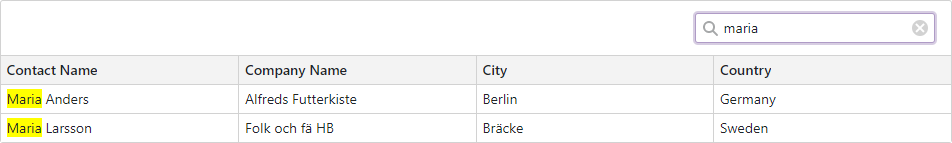
For more information, refer to the following topic: Search Box.
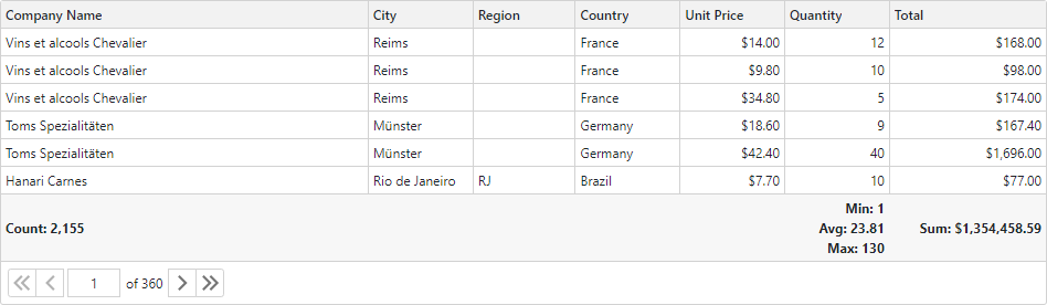
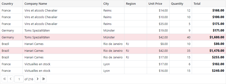
Summary
You can compute summaries across all Grid records (total summaries) or for individual groups (group summaries).
The Grid includes predefined aggregate functions: Sum, Min, Max, Avg, and Count. In addition to these functions, custom logic can also be used to calculate summary values.
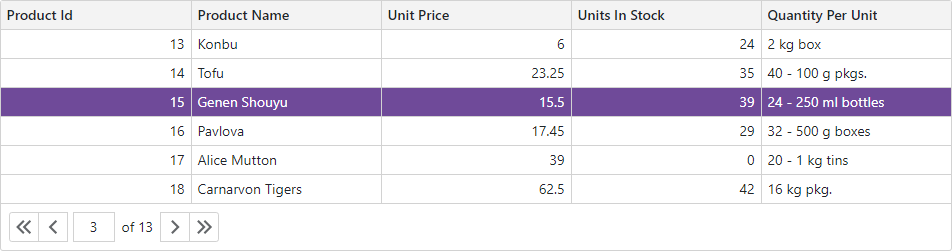
Focus
Set the FocusedRowEnabled property to true to display the focused row in the grid. Users can click a row to focus it. You can call the SetFocusedDataItemAsync(Object) and SetFocusedRowIndex(Int32) methods to move focus. When the focused row changes, the control raises the FocusedRowChanged event.
Selection
The DevExpress Blazor Grid supports single and multiple row selection. Users can select and deselect rows by mouse click or in the selection column. You can also manage selection in code.
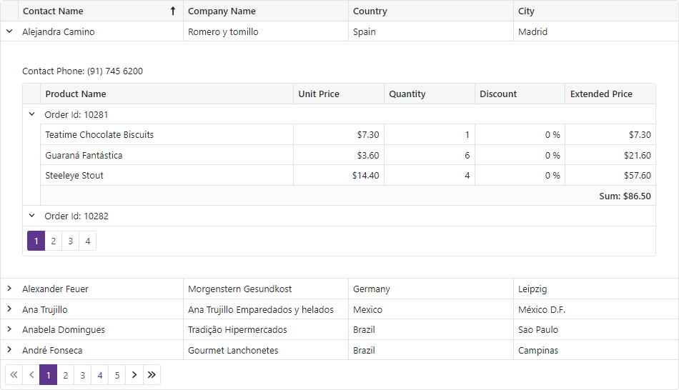
Master-Detail View
The DevExpress Blazor Grid allows you to build hierarchical layouts of any complexity and depth.
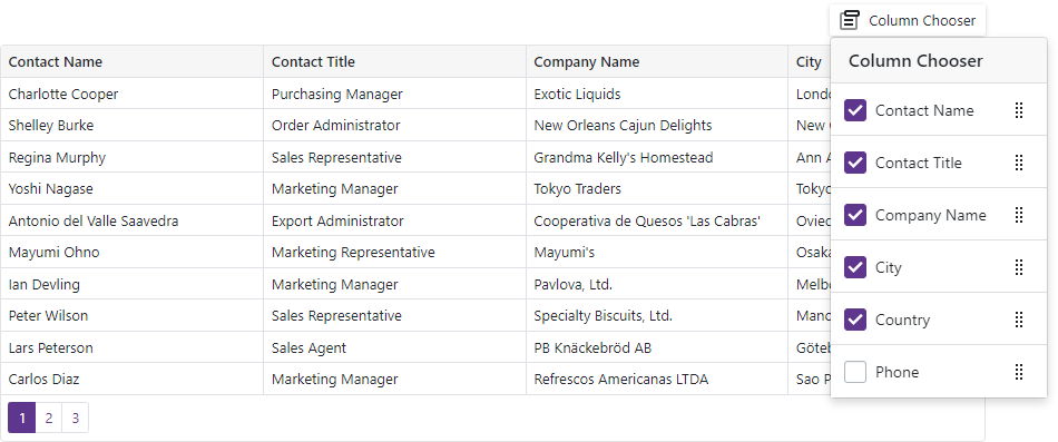
Column Management
Users can resize and reorder Grid columns at runtime. The Grid also supports the Column Chooser that allows users to manage column visibility and position.
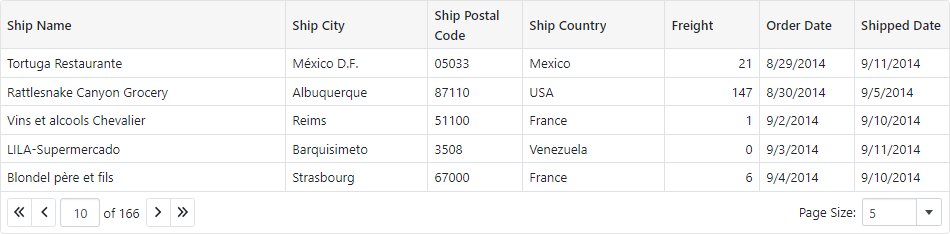
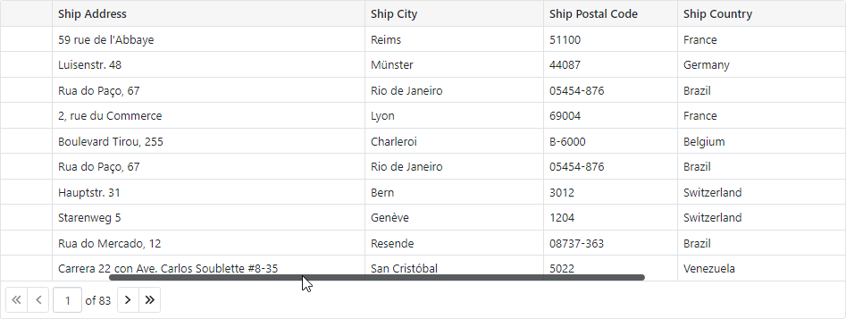
Paging
The DevExpress Blazor Grid can split data rows across multiple pages and display a pager to enable data navigation. The Grid includes multiple options for pager customization.
The Grid also ships with the page size selector that allows users to change page size at runtime.
Scrolling
The DevExpress Blazor Grid displays a vertical/horizontal scrollbar when content height/width exceeds the size of the component itself.
Save and Restore Layout
You can save and restore the Grid’s layout. Layout information includes the current page, column sort order and direction, column position, filter values, and grouped columns.
Export Data
The Grid allows you to export data to XLS, XLSX, and CSV formats. When exporting to Excel formats, the resulting file can maintain data grouping, sorting, filtering, totals, and group summaries. Call the following methods to export data:
All these methods accept the options parameter that allows you to customize the exported settings.
The grid exports data of every data column. A column whose Visible property is set to false is hidden in the document (has a zero width). Set a column’s ExportEnabled property to false to prevent the export of a specific column’s data.
For more information about data export in the Grid control, refer to the following topic: Export Data.
Appearance
The Grid allows you to customize the appearance of UI elements based on custom conditions or the format of column values.
Size Mode
You can apply different size modes to Grid elements (for instance, text size and row height) and other built-in grid components (for instance, pager and buttons).
Editor Render Mode
The Grid component can render editors in filter row and edit row cells in the following modes.
Integrated - the Grid renders editors so that they occupy the entire cell. Editor borders are not displayed.
Detached - the Grid renders standalone editors with borders and paddings between an editor and cell borders.
Templates
Use templates to customize content and appearance of different Grid elements: