Display Text
- 5 minutes to read
The Grid control creates element content based on the specified data source. You can customize text content of the following elements: data cells, column headers, group rows, and summaries. The display text of data cells and group rows can affect data shaping operations, while the display text of column headers and summary items affects only their appearance.
Data Cell
The Grid retrieves data cell values from the bound data source field (FieldName) and displays them as display text strings. You can modify them in the following ways:
- Use the DisplayFormat property to specify a display format for the column cells.
- Handle the CustomizeCellDisplayText event to fill data cells with custom display text strings. Use the DisplayText event argument property to specify the new display text string.
Data Shaping Operations Based on Cell Display Text
The Grid can use display text in the following data shaping operations:
| Operation | Description |
|---|---|
| Sort Data | The Grid sorts data rows by cell values. Set the SortMode property to DisplayText to sort data by display text. |
| Filter Data | The Grid filters data rows by cell values. Set the FilterMode property to DisplayText to filter data by display text. |
| Group Data | The Grid groups data rows by cell values. Set the GroupInterval property to DisplayText to filter data by display text. |
| Search Data | The Grid searches data by display text. |
Limitation: The Grid control does not support data shaping operations by display text when you use a Server Mode data source or GridDevExtremeDataSource.
If you create a template for an element, its content is not actually “display text”, and it cannot be used to perform data shaping operations.
<DxGrid Data="Products" PageSize="5"
        CustomizeCellDisplayText="Grid_CustomizeCellDisplayText">
    <Columns>
        <DxGridDataColumn FieldName="ProductName" />
        <DxGridDataColumn FieldName="CategoryId" SortMode="GridColumnSortMode.DisplayText" />
        <DxGridDataColumn FieldName="UnitPrice" DisplayFormat="c"  />
        <DxGridDataColumn FieldName="Discontinued" />
    </Columns>
</DxGrid>

@code {
    IEnumerable<Product> Products { get; set; }
    IEnumerable<Category> Categories { get; set; }

    protected override async Task OnInitializedAsync() {
        Categories = await NwindDataService.GetCategoriesAsync();
        Products = await NwindDataService.GetProductsAsync();
    }
    void Grid_CustomizeCellDisplayText(GridCustomizeCellDisplayTextEventArgs e) {
        if(e.FieldName == "CategoryId") {
            e.DisplayText = Categories.Where(c => c.CategoryId == (int)e.Value).First().CategoryName;
        }
    }
}
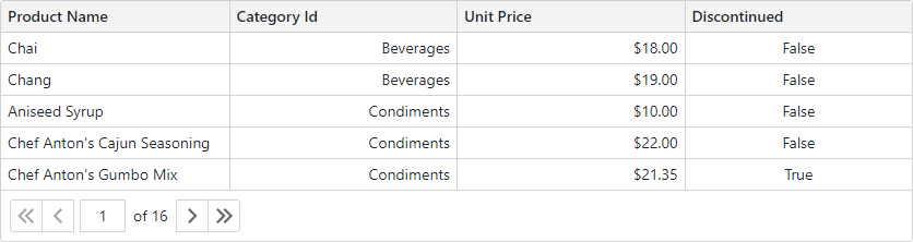
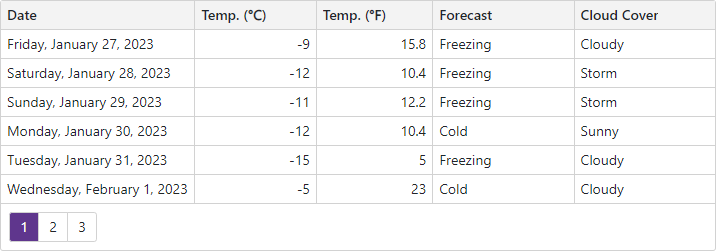
Column Header
The Grid creates column header display text based on the specified FieldName property value. The control adds spaces between words when a field name is named according to the CamelCase naming convention. You can use the Caption property to specify the column header text explicitly.
<DxGrid Data="@Data" PageSize="6">
    <Columns>
        <DxGridDataColumn FieldName="Date" DisplayFormat="D" />
        <DxGridDataColumn FieldName="TemperatureC" Caption="@("Temp. (\x2103)")" />
        <DxGridDataColumn FieldName="TemperatureF" Caption="@("Temp. (\x2109)")" />
        <DxGridDataColumn FieldName="Forecast" />
        <DxGridDataColumn FieldName="CloudCover" />
    </Columns>
</DxGrid>

@code {
    object Data { get; set; }
    protected override void OnInitialized() {
        Data = ForecastService.GetForecast();
    }
}
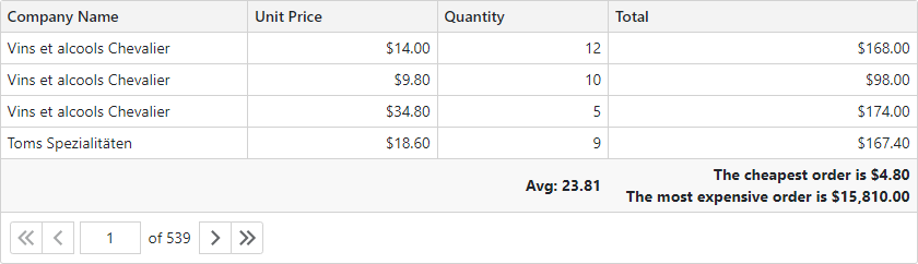
Summary Item
The Grid creates display text for a summary item based on the following predefined display formats:
- {aggregate function} = {0}
- For the COUNT summary and summaries that are shown in the same column where the values are calculated.
{0} – the calculated summary value. - {aggregate function} of {1} is {0}
- For summaries that are shown in another column.
{0} – the calculated summary value, {1} – the column’s caption.
You can modify these text strings in the following ways:
- Use the ValueDisplayFormat property to specify a display format for the summary item value.
- Handle the CustomizeSummaryDisplayText event to customize the summary display text. Use the DisplayText event argument property to specify the new display text.
<DxGrid @ref="Grid" Data="@Data" PageSize="4"
        CustomizeSummaryDisplayText="Grid_CustomizeSummaryDisplayText" >
    <Columns>
        <DxGridDataColumn FieldName="CompanyName" />
        <DxGridDataColumn FieldName="UnitPrice" DisplayFormat="c" />
        <DxGridDataColumn FieldName="Quantity"/>
        <DxGridDataColumn FieldName="Total" UnboundType="GridUnboundColumnType.Decimal"
                          DisplayFormat="c" UnboundExpression="[UnitPrice]*[Quantity]" />
    </Columns>
    <TotalSummary>
        <DxGridSummaryItem SummaryType="GridSummaryItemType.Min" FieldName="Total" />
        <DxGridSummaryItem SummaryType="GridSummaryItemType.Avg" FieldName="Quantity"
                           ValueDisplayFormat="0.00" />
        <DxGridSummaryItem SummaryType="GridSummaryItemType.Max" FieldName="Total" />
    </TotalSummary>
</DxGrid>

@code {
    //...
    void Grid_CustomizeSummaryDisplayText(GridCustomizeSummaryDisplayTextEventArgs e) {
        if (e.Item.SummaryType == GridSummaryItemType.Min) {
            e.DisplayText = $"The cheapest order is ${e.Value:n2}";
        }
        else if (e.Item.SummaryType == GridSummaryItemType.Max) {
            e.DisplayText = $"The most expensive order is ${e.Value:n2}";
        }
    }
}
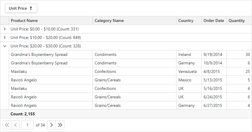
Group Row
When you group data, the Grid creates group row text according to the following pattern:
- {column}: {value} ({summary}, {summary})
- {column} – the group column’s header display text.
{value} – the group value’s display text.
{summary} – a summary item’s display text.
For instance, Country: Argentina (Count: 3)
Handle the CustomizeGroupValueDisplayText event to customize a group value’s display text in the summary display text. Use the DisplayText event argument property to specify the new display text.
<DxGrid @ref="Grid"
        Data="@Data"
        ShowGroupPanel="true"
        CustomGroup="Grid_CustomGroup"
        CustomizeGroupValueDisplayText="Grid_CustomizeGroupValueDisplayText"
       >
    <Columns>
        <DxGridDataColumn FieldName="ProductName" MinWidth="100" />
        <DxGridDataColumn FieldName="CategoryName" MinWidth="100" />
        <DxGridDataColumn FieldName="Country" Width="10%" />
        <DxGridDataColumn FieldName="OrderDate" MinWidth="70" Width="10%" />
        <DxGridDataColumn FieldName="UnitPrice" DisplayFormat="c" GroupIndex="0" GroupInterval="GridColumnGroupInterval.Custom" Width="10%" />
        <DxGridDataColumn FieldName="Quantity" Width="10%" />
    </Columns>
    <TotalSummary>
        <DxGridSummaryItem SummaryType="GridSummaryItemType.Count" FieldName="ProductName" />
    </TotalSummary>
    <GroupSummary>
        <DxGridSummaryItem SummaryType="GridSummaryItemType.Count" FieldName="UnitPrice" />
    </GroupSummary>
</DxGrid>

@code {
    // ...
    void Grid_CustomGroup(GridCustomGroupEventArgs e) {
        if(e.FieldName == "UnitPrice") {
            e.SameGroup = Grid_CompareColumnValues(e.Value1, e.Value2) == 0;
            e.Handled = true;
        }
    }
    int Grid_CompareColumnValues(object value1, object value2) {
        double val1 = Math.Floor(Convert.ToDouble(value1) / 10);
        double val2 = Math.Floor(Convert.ToDouble(value2) / 10);
        var res = System.Collections.Comparer.Default.Compare(val1, val2);
        if(res < 0)
            res = -1;
        else if(res > 0)
            res = 1;
        if(res == 0 || (val1 > 9 && val2 > 9))
            res = 0;
        return res;
    }
    void Grid_CustomizeGroupValueDisplayText(GridCustomizeGroupValueDisplayTextEventArgs e) {
        if(e.FieldName == "UnitPrice") {
            double val = Math.Floor(Convert.ToDouble(e.Value) / 10);
            string displayText = string.Format("{0:c} - {1:c} ", val * 10, (val + 1) * 10);
            if(val > 9)
                displayText = string.Format(">= {0:c} ", 100);
            e.DisplayText = displayText;
        }
    }
}