Reuse and Customize Components
- 5 minutes to read
Blazor framework allows you to build and reuse composite components. You can also render parts or entire components dynamically in C#.
Composite Components
This section describes how to create a composite Blazor component.
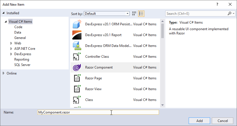
In Solution Explorer, right-click a folder with components and select Add → New Item. In the Add New Item dialog, select Razor Component, enter the component’s name, and click Add.
Add DevExpress Blazor components to the newly created *.razor file:
<h3>My Component</h3>

<DxCalendar VisibleDate="@DateTime.Today" />

<DxTextBox Text="@Text"
           ClearButtonDisplayMode="DataEditorClearButtonDisplayMode.Auto"
           NullText="Type text..." />

<DxButton Text="My Button" />

@code {
    [Parameter]
    public string Text { get; set; }
}
Add MyComponent code to a page (for example, Index.razor):
<MyComponent Text="My Text" />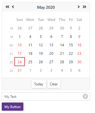
Refer to Microsoft documentation for additional information on how to create ASP.NET Core Razor components.
Build Components Dynamically
You can use the following methods to render Blazor components dynamically:
- Render fragments
- The RenderTreeBuilder object and its methods
- The BuildRenderTree method
Render Fragments
A render fragment is a custom UI element that you can reuse on pages or in component markup. To define a fragment, use either Razor template syntax or the RenderFragment delegate. To insert the fragment into markup, use the @ symbol.
Razor Template Syntax
The following code snippet demonstrates the renderTextBox fragment that renders a Text Box component.
@{
    RenderFragment<string> renderTextBox = (string model) =>
    @<DxTextBox Text="@model"></DxTextBox>;
}

@renderTextBox("MyText")
The following code snippet demonstrates the renderGrid fragment that renders the Grid component.
@{
    RenderFragment<DataItem> renderGrid = (model) =>
    @<DxGrid @key="@model" Data="@model.Data">
        @foreach (var column in model.ColumnNames) {
            <DxGridDataColumn FieldName="@column" @key="@column" />
        }
    </DxGrid>;
}

@renderGrid(dataObject)
Note that you cannot use this approach in code-behind (.cs) files.
RenderFragment Delegate
You can use the RenderFragment delegate to define render fragments for simple, nested components, and components that include <Template> elements.
The code above uses template syntax to render a Text Box component. You can render the same component dynamically using the RenderFragment delegate. To define a render fragment, call the RenderTreeBuilder‘s methods: OpenComponent, AddAttribute, and CloseComponent.
@renderTextBox()

@code {
    private RenderFragment renderTextBox() {
        RenderFragment item = b => {
            b.OpenComponent<DxTextBox>(0);
            b.AddAttribute(1, "Text", "My text");
            b.CloseComponent();
        };
        return item;
    }
}
Optionally, you can call the AddComponentReferenceCapture method to capture a reference to the component, for example:
builder.AddComponentReferenceCapture(n++, grid => Grid = (IGrid)grid);
Note
Refer to Manually build a render tree for additional information on how to use RenderTreeBuilder.
RenderFragment Delegate for Nested Components
You can create render fragments for nested components. For example, you need to build a Form Layout that contains a tabbed group with an item:
<DxFormLayout>
    <DxFormLayoutTabPage Caption="My Tab">
        <DxFormLayoutItem Caption="DynLayoutItem" ColSpanMd="6">
        </DxFormLayoutItem>
    </DxFormLayoutTabPage>
</DxFormLayout>
To build this component, define a render fragment that contains <DxFormLayoutTabPage>. Then add the ChildContent attribute that specifies a nested render fragment for <DxFormLayoutItem>. To add the attribute, call the AddAttribute(sequence, “ChildContent”, RenderFragment) method.
<DxFormLayout>
    <DxFormLayoutTabPages>
        @renderLayoutTabPage()
    </DxFormLayoutTabPages>
</DxFormLayout>

@code {
    private RenderFragment renderLayoutTabPage() {
        RenderFragment item = b => {
            b.OpenComponent<DxFormLayoutTabPage>(0);
            b.AddAttribute(1, "Caption", "My tab");
            b.AddAttribute(2, "ChildContent", (RenderFragment)((tabPageBuilder) => {
                tabPageBuilder.OpenComponent<DxFormLayoutItem>(0);
                tabPageBuilder.AddAttribute(1, "Caption", "DynLayoutItem");
                tabPageBuilder.AddAttribute(2, "ColSpanMd", 6);
                tabPageBuilder.CloseComponent();
            }));
            b.CloseComponent();
        };
        return item;
    }
}
A component can contain a template with another component, for example:
<DxFormLayout>
    <DxFormLayoutTabPage Caption="My Tab">
        <DxFormLayoutItem Caption="DynLayoutItem" ColSpanMd="6">
            <Template>
                <DxTextBox @bind-Text="@text"></DxTextBox>
            </Template>
        </DxFormLayoutItem>
    </DxFormLayoutTabPage>
</DxFormLayout>
To build this component, use the following code snippet. To add the <Template> attribute, use the AddAttribute(sequence, “Template”, RenderFragment<Object>delegate) method.
<DxFormLayout>
    <DxFormLayoutTabPages>
        @renderLayoutTabPage()
    </DxFormLayoutTabPages>
</DxFormLayout>

@code {
    private RenderFragment renderLayoutTabPage() {
        RenderFragment item = b => {
            b.OpenComponent<DxFormLayoutTabPage>(0);
            b.AddAttribute(1, "Caption", "My tab");
            b.AddAttribute(2, "ChildContent", (RenderFragment)((tabPageBuilder) => {
                tabPageBuilder.OpenComponent<DxFormLayoutItem>(0);
                tabPageBuilder.AddAttribute(1, "Caption", "DynLayoutItem");
                tabPageBuilder.AddAttribute(2, "ColSpanMd", 6);
                tabPageBuilder.AddAttribute(3, "Template", (RenderFragment<Object>)((context) => ((itemTemplate) => {
                    itemTemplate.OpenComponent<DxTextBox>(0);
                    itemTemplate.AddAttribute(1, "Text", text);
                    itemTemplate.CloseComponent();
                })));
                tabPageBuilder.CloseComponent();
            }));
            b.CloseComponent();
        };
        return item;
    }
}
BuildRenderTree Method
To create and reuse a modified version of an existing DevExpress Blazor component, create a ComponentBase descendant and override the BuildRenderTree method to generate the component’s content.
For example, you need to add multiple Grid components to an application, and some of them (Group 1) should have the same settings. You can end up with repeated code like demonstrated in the following example:
Group 1
<DxGrid PageSize="5" ShowFilterRow="false" PagerVisible="false" ShowGroupPanel="true" ...>
<DxGrid PageSize="5" ShowFilterRow="false" PagerVisible="false" ShowGroupPanel="true" ...>
<DxGrid PageSize="5" ShowFilterRow="false" PagerVisible="false" ShowGroupPanel="true" ...>
...
Group 2
<DxGrid PageSize="15" ShowFilterRow="false" ShowGroupPanel="false" SelectionMode="GridSelectionMode.Single" ...>
...
You can turn repeated code into a single composite parameter (for example, Settings). This parameter can accept a dictionary with grid settings.
- Create a ComponentBase descendant (for example,
MyGrid). - Add the
Data,ChildContent(for columns), andSettingsparameters to the class. Override the BuildRenderTree method to define the
MyGrid<T>component’s markup. This method accepts a RenderTreeBuilder object. Use its methods to add<DxGrid>to the markup and specify the component’s attributes.public class MyGrid<T> : ComponentBase { [Parameter] public IEnumerable<T> Data { get; set; } [Parameter] public RenderFragment ChildContent { get; set; } [Parameter] public Dictionary<string, object> Settings { get; set; } protected override void BuildRenderTree(RenderTreeBuilder builder) { builder.OpenComponent<DxGrid>(0); builder.AddAttribute(1, "Data", (object)Data); builder.AddAttribute(2, "Columns", ChildContent); if (Settings != null) { builder.AddMultipleAttributes(3, Settings); //OR //int seq = 3; //foreach (var item in Settings) { // builder.AddAttribute(seq++, item.Key, item.Value); //} } builder.CloseComponent(); } }Add the
MyGridcomponent to a page.<MyGrid Data="Forecasts" Settings="InputAttributes"> <DxGridCommandColumn Width="150px" /> <DxGridDataColumn FieldName="@nameof(WeatherForecast.Date)"></DxGridDataColumn> <DxGridDataColumn FieldName="@nameof(WeatherForecast.TemperatureC)"></DxGridDataColumn> <DxGridDataColumn FieldName="@nameof(WeatherForecast.TemperatureF)"></DxGridDataColumn> <DxGridDataColumn FieldName="@nameof(WeatherForecast.Summary)"></DxGridDataColumn> </MyGrid> @code { public List<WeatherForecast> Forecasts { get; set; } public Dictionary<string, object> InputAttributes { get; set; } = new Dictionary<string, object>() { { "PageSize", 5 }, { "ShowFilterRow", false }, { "PagerVisible" , false }, { "ShowGroupPanel", true } }; protected override async Task OnInitializedAsync() { base.OnInitialized(); WeatherForecast[] data = await ForecastService.GetForecastAsync(DateTime.Now); Forecasts = data.ToList(); } }