Paging
- 2 minutes to read
Data Paging Overview
By default, the Bootstrap Grid View automatically splits content across multiple pages and provides end-users with an embedded page navigation UI - Pager.

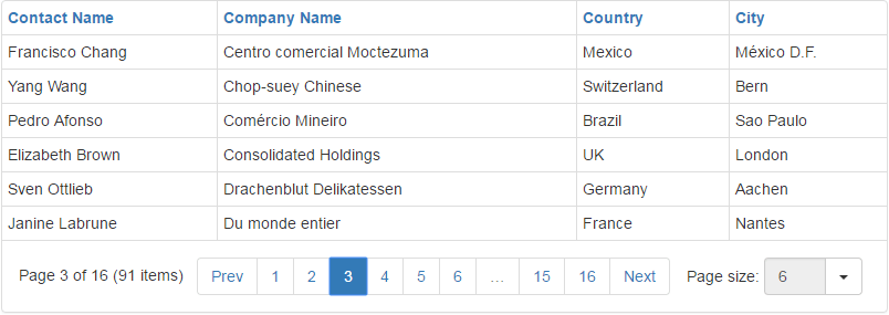
The built-in pager enables end-users to navigate through Grid View data. It consists of navigation buttons: “next”, “last”, “previous”, “first”, “All”; an indicator that displays the current page number and the total number of pages, and a page size item allowing you to specify the maximum number of rows that can be displayed within a page. To access and customize pager settings, use the BootstrapGridView.SettingsPager property.
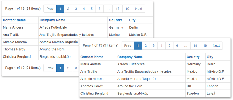
The pager can be displayed above or below the rows, or on both sides.

Use the ASPxGridPagerSettings.Position property to specify the pager’s position within the Grid View control.
You can access the maximum number of rows displayed within a page using the ASPxGridViewPagerSettings.PageSize property.
To disable page-mode navigation and display all rows within a grid, set the ASPxGridViewPagerSettings.Mode property to GridViewPagerMode.ShowAllRecords.
Navigation in Code
The active page is identified by the Grid View control’s ASPxGridBase.PageIndex property. Use this property to switch between pages in code. The total number of pages can be obtained via the ASPxGridBase.PageCount property.
After the active page has been changed, the ASPxGridBase.PageIndexChanged event is raised.