Selection
- 2 minutes to read
The Bootstrap Grid View allows end-users to change selection using any of the following methods.
- Click rows, provided that the ASPxGridViewBehaviorSettings.AllowSelectByRowClick option is enabled.
Click check boxes or radio buttons displayed within command column cells. The editor type (a radio button or check box) is automatically determined based on the currently active selection mode (a single or multiple row). To display check boxes or radio buttons, set the command column’s GridViewCommandColumn.ShowSelectCheckbox property to true. Alternatively, you can use the “Enable Selection” option within a grid’s Smart Tag menu.

Use the Select command column item. To display this item, set the command column’s GridViewCommandColumn.ShowSelectButton property to true.

The Bootstrap Grid View supports single and multiple row selection modes. You can switch the mode using a single option. To learn more, refer to the Multiple Row Selection topic.

To get the Grid View‘s selection, use the ASPxGridView.Selection property. The object returned by this property provides methods that allow you to select and deselect individual rows or all rows, obtain the number of selected rows, etc.
To respond to selection changes, handle the server-side ASPxGridBase.SelectionChanged event or the client-side ASPxClientGridView.SelectionChanged one.
Example
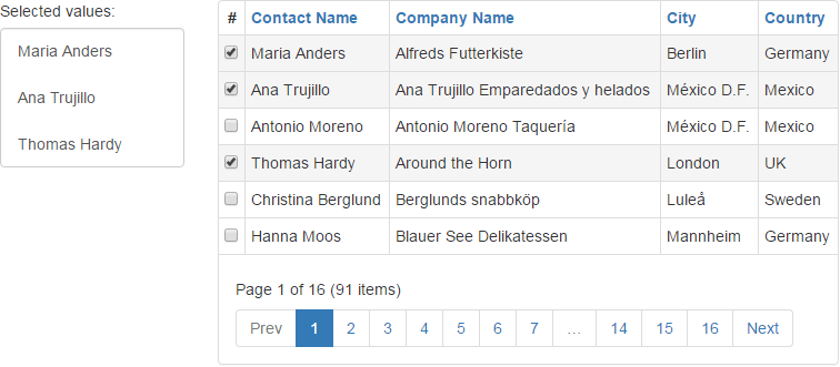
In this example, the client-side ASPxClientGridView.SelectionChanged event is handled to display selected contacts within the list box. Contact names are obtained using the ASPxClientGridView.GetSelectedFieldValues function.
The image below shows the result:

function OnGridSelectionChanged() {
    grid.GetSelectedFieldValues('ContactName', OnGridSelectionComplete);
}

function OnGridSelectionComplete(values) {
    selList.BeginUpdate();
    selList.ClearItems();
    for (var i = 0; i < values.length; i++) {
        selList.AddItem(values[i]);
    }
    selList.EndUpdate();
}