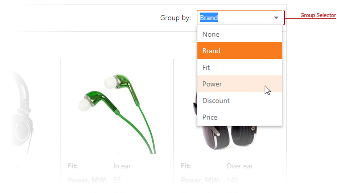
ASPxCardViewSettings.ShowGroupSelector Property
Specifies whether the card view displays the group selector.
Namespace: DevExpress.Web
Assembly: DevExpress.Web.v19.1.dll
Declaration
Property Value
| Type | Default | Description |
|---|---|---|
| Boolean | **false** | true, to display the group selector; otherwise, false. |
Property Paths
You can access this nested property as listed below:
| Library | Object Type | Path to ShowGroupSelector |
|---|---|---|
| ASP.NET Controls and MVC Extensions | ASPxCardView |
|
| CardViewSettings |
|
|
| CardViewSettings<CardType> |
|
|
| MVCxCardView |
|
|
| ASP.NET Bootstrap Controls | BootstrapCardView |
|
Remarks
Note
The ASPxCardView does not allows end users to group cards if the control is in table layout mode (ASPxCardView1.Settings.LayoutMode=LayoutMode.Table)
Example
WebForms:
<dx:ASPxCardView ID="CardView" runat="server" >
    <Columns>
        <dx:CardViewImageColumn FieldName="PhotoUrl" Caption="Photo" />
        <dx:CardViewTextColumn FieldName="Brand" GroupIndex="0" />
        ...
    </Columns>
    <Settings LayoutMode="Breakpoints" ShowGroupSelector="true" ShowHeaderPanel="true" />
    ...
</dx:ASPxCardView>
MVC:
Html.DevExpress().CardView<Headphone>(settings => {
    settings.Name = "cardView";
    settings.Columns.Add(c => {
        c.FieldName = "Brand";
        c.GroupIndex = 0;
    });
    ...
    settings.Settings.ShowGroupSelector = true;
    settings.Settings.ShowHeaderPanel = true;
}).Bind(Model).GetHtml();
Concept
- WebForms: Group Cards
Online Demo
- WebForms: ASPxCardView - Grouping
- MVC: CardView - Grouping
See Also