ASPxComboBox Class
Represents an editor which displays a list of items within its dropdown window.
Namespace: DevExpress.Web
Assembly: DevExpress.Web.v19.1.dll
Declaration
public class ASPxComboBox :
    ASPxAutoCompleteBoxBase,
    IListBoxColumnsOwner,
    IValueTypeHolder,
    IControlDesigner,
    IListEditItemRequestEventOwner,
    IListEditCustomFilteringEventOwner,
IListEditServerModeOwnerRelated API Members
The following members return ASPxComboBox objects:
| Library | Related API Members |
|---|---|
| ASP.NET Controls and MVC Extensions | ASPxCardViewGroupSelectorInitializeEventArgs.GroupSelector |
| eXpressApp Framework | RenderHelper.CreateASPxComboBox() |
Remarks
The ASPxComboBox represents a control that combines the functionality of a single-line text editor, button editor and dropdown list editor. The editor’s dropdown displays a list of items which can be selected by end-users. Selecting an item changes the editor’s edit value. Depending upon the ASPxComboBox.DropDownStyle property’s setting, users can change the editor’s value by simply selecting an item from the dropdown list, or they can be permitted to input new values into the editor’s edit box.
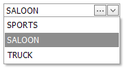
The ASPxComboBox editor’s item list can be generated dynamically through data binding or populated manually. List items are contained within the editor’s ASPxAutoCompleteBoxBase.Items collection. For an individual item, the caption text (ListEditItem.Text), associated value (ListEditItem.Value) and display image (ListEditItem.ImageUrl) can be defined.
Note
For the ASPxComboBox editor to function properly, values of all list items in the ASPxAutoCompleteBoxBase.Items collection should be unique. There should not be two or more list items with the same value of the ListEditItem.Value property.
To specify the selected item, the control’s ASPxComboBox.SelectedItem or ASPxComboBox.SelectedIndex property can be used. Values of list items can be associated with any value type which is specified by the ASPxComboBox.ValueType property.
Note
An item’s value (ASPxListEdit.ValueField](xref:DevExpress.Web.ASPxListEdit.ValueField)) should be unique.
If an item from the dropdown list is selected, the item’s caption text is displayed within the editor’s text box, and the associated value is assigned to the editor’s ASPxEdit.Value property. When the selected item changes, the ASPxComboBox.SelectedIndexChanged event is generated.
In order to bind the ASPxComboBox to a data source, the ASPxListEdit.DataSourceID (ASPxEditBase.DataSource) and ASPxEditBase.DataMember properties can be used. When retrieving items from the data source, item characteristics such as the text, value and image, are obtained from specific data fields defined via the ASPxListEdit.TextField, ASPxListEdit.ValueField and ASPxListEdit.ImageUrlField properties.
You can specify the dropdown window’s dimensions and appearance using the ASPxAutoCompleteBoxBase.DropDownHeight, ASPxAutoCompleteBoxBase.DropDownWidth and ASPxComboBox.DropDownStyle properties. The appearance of the item list can be defined via the ASPxAutoCompleteBoxBase.ListBoxStyle property. The common style of list items is specified by the ASPxAutoCompleteBoxBase.ItemStyle property. The ASPxAutoCompleteBoxBase.ItemImage property allows the common image settings to be applied to all list items.
The ASPxComboBox control provides the ASPxButtonEditBase.Buttons collection, to maintain its custom edit buttons. Each button is represented by an EditButton object, which exposes a set of properties allowing the button’s appearance and behavior to be defined. The settings of the default button, which invokes the dropdown list when clicked, can be customized by using the ASPxDropDownEditBase.DropDownButton property. When an end-user clicks any editor button, the server-side processing of the click can be performed in the ASPxButtonEditBase.ButtonClick event’s handler.
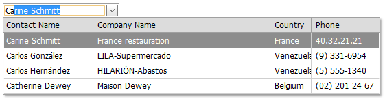
It’s possible to represent the ASPxComboBox‘s list data in several columns. This functionality is in effect if the editor’s items collection is obtained from a data source. Use the ASPxComboBox.Columns property to access the control’s columns collection. Each column within this collection should be bound to a data source field via the ListBoxColumn.FieldName property. You can also define a column’s header caption, width, visibility state and other settings via the column’s properties. The selected item is represented within a multi-column ASPxComboBox editor’s edit box, using a value whose format is based upon the setting of the ASPxAutoCompleteBoxBase.TextFormatString property.
Note
The client-side equivalent of this editor control is represented by the ASPxClientComboBox object. The editor’s client-side API is enabled if the ASPxEditBase.EnableClientSideAPI property is set to true, or any client event is handled. Available client events can be accessed via the ASPxComboBox.ClientSideEvents property.
Example
The following example demonstrates how to use the ASPxAutoCompleteBoxBase.TextFormatString property for a ASPxComboBox which contains several columns. The text of the selected ASPxComboBox item displayed within the input box is formatted by the ASPxAutoCompleteBoxBase.TextFormatString property. This property value is specified with respect to the selected ASPxRadioButtonList item. The complete sample project is available in the DevExpress Code Central database at E1331.
...
<script runat="server">
    protected void ASPxRadioButtonList1_SelectedIndexChanged(object sender, EventArgs e) {
        if (ASPxRadioButtonList1.SelectedIndex == 0) {
            ASPxComboBox1.TextFormatString = "{0} {1}, {2} Company";
        }
        if (ASPxRadioButtonList1.SelectedIndex == 1) {
            ASPxComboBox1.TextFormatString = "{1} {0}, {2} Company";
        }
    }
 </script>
...
        <dxe:ASPxRadioButtonList ID="ASPxRadioButtonList1" runat="server"
            onselectedindexchanged="ASPxRadioButtonList1_SelectedIndexChanged"
            ClientInstanceName="rbl">
            <ClientSideEvents SelectedIndexChanged="function(s, e) {
                e.processOnServer=true;
            }" />
            <Items>
                <dxe:ListEditItem Text="FirstName LastName, Company" Value="Format1" />
                <dxe:ListEditItem Text="LastName FirstName, Company" Value="Format2" />
            </Items>
        </dxe:ASPxRadioButtonList>
        <br/>
        <dxe:ASPxComboBox ID="ASPxComboBox1" runat="server"
            DataSourceID="AccessDataSource1" EnableIncrementalFiltering="True"
            TextFormatString="{0} {1}, {2} Company" ValueType="System.String" Width="450px">
            <Columns>
                <dxe:ListBoxColumn Caption="First Name" FieldName="FirstName"
                    Name="FirstName" />
                <dxe:ListBoxColumn Caption="Last Name" FieldName="LastName" Name="LastName" />
                <dxe:ListBoxColumn Caption="Company" FieldName="Company" Name="Company" />
            </Columns>
        </dxe:ASPxComboBox>
...