ASPxFormLayout Class
A form layout management control.
Namespace: DevExpress.Web
Assembly: DevExpress.Web.v19.1.dll
Declaration
Remarks
TheASPxFormLayout control allows you to display and arrange layout items, groups and tabbed groups inside it.
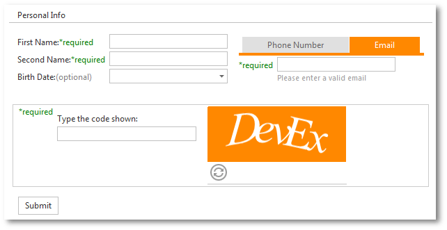
Create a Form Layout
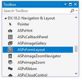
Design Time
The ASPxFormLayout control is available on the DX.19.1: Navigation & Layout toolbox tab in the Microsoft Visual Studio IDE.
Drag the control onto a form and customize control settings, or paste the control markup in the page’s source code.
<dx:ASPxFormLayout ID="ASPxFormLayout1" runat="server" Width="50%" Theme="Office365">
    <Items>
        <dx:LayoutGroup Caption="Group (ColCount=2)" ColCount="2" SettingsItemCaptions-Location="Top">
            <Items>
                <dx:LayoutItem Caption="TextBox1">
                    <ParentContainerStyle Paddings-PaddingRight="12"></ParentContainerStyle>
                    <LayoutItemNestedControlCollection>
                        <dx:LayoutItemNestedControlContainer>
                            <dx:ASPxTextBox runat="server" Width="100%" />
                        </dx:LayoutItemNestedControlContainer>
                    </LayoutItemNestedControlCollection>
                </dx:LayoutItem>
                <dx:LayoutItem Caption="TextBox2">
                    <ParentContainerStyle Paddings-PaddingLeft="0" Paddings-PaddingRight="12"></ParentContainerStyle>
                    <LayoutItemNestedControlCollection>
                        <dx:LayoutItemNestedControlContainer>
                            <dx:ASPxTextBox runat="server" Width="100%" />
                        </dx:LayoutItemNestedControlContainer>
                    </LayoutItemNestedControlCollection>
                </dx:LayoutItem>
                <dx:LayoutItem Caption="Memo" ColSpan="2" HelpText="ColSpan=2">
                    <LayoutItemNestedControlCollection>
                        <dx:LayoutItemNestedControlContainer runat="server">
                            <dx:ASPxMemo runat="server" Width="100%" Rows="4" />
                        </dx:LayoutItemNestedControlContainer>
                    </LayoutItemNestedControlCollection>
                </dx:LayoutItem>
            </Items>
        </dx:LayoutGroup>
    </Items>
</dx:ASPxFormLayout>
Run Time
using DevExpress.Web;
...
ASPxFormLayout fl = new ASPxFormLayout();
fl.ID = "ASPxFormLayout1";
Page.Form.Controls.Add(fl);

LayoutGroup lg = new LayoutGroup("Group");
lg.SettingsItemCaptions.Location = LayoutItemCaptionLocation.Top;
lg.ColumnCount = 2;
fl.Items.Add(lg);

LayoutItem li1 = new LayoutItem("TextBox1");
lg.Items.Add(li1);

ASPxTextBox tb1 = new ASPxTextBox();
li1.Controls.Add(tb1);

LayoutItem li2 = new LayoutItem("TextBox2");
lg.Items.Add(li2);

ASPxTextBox tb2 = new ASPxTextBox();
li2.Controls.Add(tb2);

LayoutItem li3 = new LayoutItem("TextBox3");
li3.ColumnSpan = 2;
lg.Items.Add(li3);

ASPxTextBox tb3 = new ASPxTextBox();
tb3.Width = Unit.Percentage(100);
li3.Controls.Add(tb3);
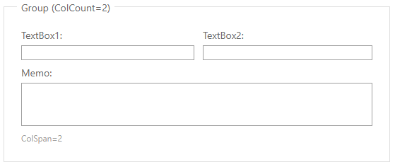
Result:
Client-Side API
The ASPxFormLayout‘s client-side API is implemented with JavaScript language and exposed by the ASPxClientFormLayout object.
Availability | Available by default. |
Class name | |
Access name | |
Events |
Features
Supported Item Types
The Form Layout supports the following item types:
- EmptyLayoutItem - a layout item that has no caption or nested control;
- LayoutItem - a layout item that can display a nested control;
- LayoutGroup - a group that can display other items, groups and tabbed groups;
- TabbedLayoutGroup - a tabbed group that can display layout items as tabs.
Use the ASPxFormLayout.Items property to access item collection.
Nested Controls
You can place any control inside a layout item.
Declaratively:
...
<dx:LayoutItem Caption="Memo" ColSpan="2" HelpText="ColSpan=2">
    <LayoutItemNestedControlCollection>
        <dx:LayoutItemNestedControlContainer runat="server">
            <dx:ASPxMemo runat="server" Width="100%" Rows="4" />
        </dx:LayoutItemNestedControlContainer>
    </LayoutItemNestedControlCollection>
</dx:LayoutItem>
...
In code:
...
LayoutGroup lg = new LayoutGroup("Group");
fl.Items.Add(lg);

LayoutItem li1 = new LayoutItem("TextBox1");
lg.Items.Add(li1);

ASPxTextBox tb1 = new ASPxTextBox();
li1.Controls.Add(tb1);
...
Data Binding
The form layout allows you to display and edit data source fields. Use the FieldName property to bind layout items to data source fields.
Editor Dialog
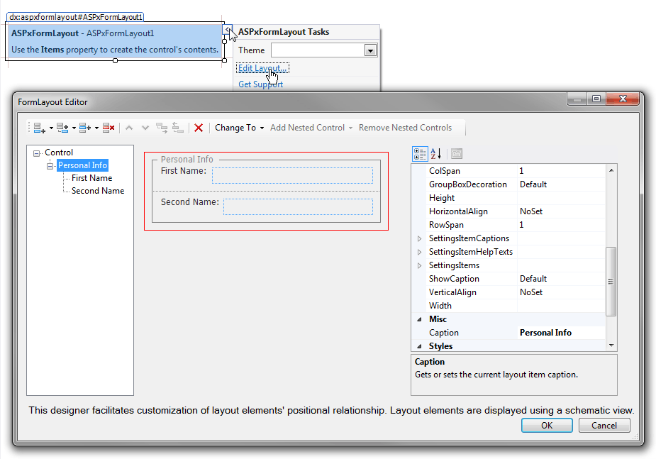
You can use the FormLayout Editor dialog to create ASPxFormLayout items at design time. To run the FormLayout Editor, invoke the control’s smart tag and click the “Edit Layout…” link.
The FormLayout Editor dialog allows you to add, delete and rearrange layout items and groups, and access and customize their settings.
Columns
The form layout allows you to divide group contents into table cells and position layout elements (items and groups) in cells that can span across several columns or rows.
<dx:ASPxFormLayout ID="ASPxFormLayout1" runat="server" Width="50%" Theme="Office365">
    <Items>
        <dx:LayoutGroup Caption="Group (ColCount=2)" ColCount="2" SettingsItemCaptions-Location="Top">
            <Items>
                ...
                <dx:LayoutItem Caption="Memo" ColSpan="2" HelpText="ColSpan=2">
                    <LayoutItemNestedControlCollection>
                        <dx:LayoutItemNestedControlContainer runat="server">
                            <dx:ASPxMemo runat="server" Width="100%" Rows="4" />
                        </dx:LayoutItemNestedControlContainer>
                    </LayoutItemNestedControlCollection>
                </dx:LayoutItem>
            </Items>
        </dx:LayoutGroup>
    </Items>
</dx:ASPxFormLayout>
Adaptivity
The form layout provides mobile-oriented adaptive modes that ensure layout consistency on different devices. You can use the SettingsAdaptivity property to access the control’s adaptivity settings.
The form layout supports the following adaptive modes:
- Responsive Layout (See demo) - Collapses the Form Layout’s content from multiple columns into a single column when the browser window’s inner width is less than or equal to the SwitchToSingleColumnAtWindowInnerWidth property’s value.
<dx:ASPxFormLayout runat="server" ID="formLayout" CssClass="formLayout">
    <SettingsAdaptivity AdaptivityMode="SingleColumnWindowLimit" SwitchToSingleColumnAtWindowInnerWidth="500" />
    <Items>
    ...
    </Items>
</dx:ASPxFormLayout>
- Adaptive Layout (See demo) - the Form Layout reorganizes its elements according to custom layout scenarios for different control widths. This allows you to create, for example, a two-column layout for narrow screens or a three-column layout for wider screens.
<dx:ASPxFormLayout runat="server" ...>
    <GridSettings StretchLastItem="true" WrapCaptionAtWidth="660">
    <Breakpoints>
        <dx:LayoutBreakpoint MaxWidth="300" ColumnCount="1" Name="Small" />
        <dx:LayoutBreakpoint MaxWidth="900" ColumnCount="2" Name="Medium" />
        <dx:LayoutBreakpoint MaxWidth="1500" ColumnCount="3" Name="Large" />
    </Breakpoints>
    </GridSettings>
    ...
  ` <dx:LayoutItem Caption="Item 1">
      <SpanRules>
          <dx:SpanRule ColumnSpan="1" RowSpan="1" BreakpointName="Small"></dx:SpanRule>
          <dx:SpanRule ColumnSpan="1" RowSpan="1" BreakpointName="Medium"></dx:SpanRule>
          <dx:SpanRule ColumnSpan="2" RowSpan="2" BreakpointName="Large"></dx:SpanRule>
      </SpanRules>
    ...
    </dx:LayoutItem>`
</dx:ASPxFormLayout>