ASPxPopupControl Class
A popup control.
Namespace: DevExpress.Web
Assembly: DevExpress.Web.v19.1.dll
Declaration
Related API Members
The following members return ASPxPopupControl objects:
| Library | Related API Members |
|---|---|
| ASP.NET Controls and MVC Extensions | ASPxSchedulerPrepareFormPopupContainerEventArgs.Popup |
| eXpressApp Framework | CustomizePopupControlEventArgs.PopupControl |
Remarks
The ASPxPopupControl allows you to create popup windows in your web application. Popup windows appear separately from an application’s main window and disappear after the specified user action.
Create a Popup Control
Design Time
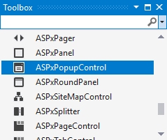
The ASPxPopupControl control is available on the DX.19.1: Navigation & Layout toolbox tab in the Microsoft Visual Studio IDE.
Drag the control onto a form and customize control settings, or paste the control markup in the page’s source code.
<dx:ASPxPopupControl ID="ASPxPopupControl1" runat="server" HeaderText="Header" PopupElementID="ASPxButton1">
    <ContentCollection>
        <dx:PopupControlContentControl runat="server">
            <dx:ASPxTextBox ID="ASPxTextBox1" runat="server" Text="Text box" Width="170px">
            </dx:ASPxTextBox>
        </dx:PopupControlContentControl>
    </ContentCollection>
</dx:ASPxPopupControl>

<dx:ASPxButton ID="ASPxButton1" runat="server" Text="Show Popup"></dx:ASPxButton>
Run Time
using DevExpress.Web;
...
protected void Page_Load(object sender, EventArgs e)
{
    Button btn = new Button();
    btn.ID = "ASPxButton1";
    btn.Text = "Show Popup";
    Page.Form.Controls.Add(btn);

    ASPxPopupControl pc = new ASPxPopupControl();
    pc.ID = "ASPxPopupControl1";
    Page.Form.Controls.Add(pc);
    pc.PopupElementID = "btn1";
    pc.HeaderText = "Header";
    pc.Controls.Add(CreateControl());
}
Control CreateControl()
{
    TextBox txt = new TextBox();
    txt.ID = "ASPxTextBox1";
    txt.Width = 200;
    txt.Text = "Text box";
    return txt;
}
Client-Side API
The ASPxPopupControl‘s client-side API is implemented with JavaScript language and exposed by the ASPxClientPopupControl object.
Availability | Available by default. |
Class name | |
Access name | |
Events |
Features
Windows Collection
The popup control stores its popup windows in the ASPxPopupControl.Windows collection. If this collection is empty, the control displays a single default popup window. In this case, you can define the default window’s appearance and behavior at the popup control level. If the ASPxPopupControl.Windows collection is not empty, use settings at an individual window level to customize each window.
Declaratively:
<dx:ASPxPopupControl runat="server" ID="Popup">
    <Windows>
        <dx:PopupWindow Name="AndrewFuller" ...></dx:PopupWindow>
        <dx:PopupWindow Name="JanetLeverling" ...></dx:PopupWindow>
        ...
    </Windows>
</dx:ASPxPopupControl>
In code:
protected void Popup_Init(object sender, EventArgs e) {
    List<PopupWindow> windowList = new List<PopupWindow>();
    foreach (Customer customer in CustomersList)
        windowList.Add(new PopupWindow() {
            HeaderText = customer.Name,
            FooterText = customer.Country,
            Text = customer.Details
        });
    Popup.Windows.Add(windowList[0]);
    Popup.Windows.Add(windowList[0], windowList[1]);
    Popup.Windows.AddRange(windowList);
}
Data Binding
The popup control allows you to populate window content from a data source (ASPxPopupControl.DataSource and ASPxDataWebControl.DataSourceID).
<dx:ASPxPopupControl ID="ASPxPopupControl1" runat="server" DataSourceID="XmlDataSource1" >
    ...
</dx:ASPxPopupControl>

<asp:XmlDataSource ID="XmlDataSource1" runat="server" DataFile="~/App_Data/Charts.xml"
    XPath="//Chart" />
Load Content
You can use the PopupControlContentControl object or the Controls property to specify a popup control’s content.
Note
A popup element cannot contain another popup element inside.
Specify the ASPxPopupControl height and width (accessible by the ASPxWebControl.Height and ASPxWebControl.Width properties) cannot be set as a percentage. Set the dimensions in pixels to correctly display the control in all browsers.
<dx:ASPxPopupControl ID="ASPxPopupControl1" runat="server" HeaderText="Header" PopupElementID="ASPxButton1">
    <ContentCollection>
        <dx:PopupControlContentControl runat="server">
            <dx:ASPxTextBox ID="ASPxTextBox1" runat="server" Text="Text box" Width="170px" />
        </dx:PopupControlContentControl>
    </ContentCollection>
</dx:ASPxPopupControl>
Use the ContentUrl property to load the specified web page content into the popup control.
<dx:ASPxPopupControl ID="ASPxPopupControl1" runat="server"
ContentUrl="~/PopupControl/ContentUrlFeedForm.aspx" >
    ...
</dx:ASPxPopupControl>
The popup control supports callbacks technology that allows you to load the control’s content on demand (LoadContentViaCallback).
<dx:ASPxPopupControl ID="PopupControl" runat="server" LoadContentViaCallback="OnFirstShow" >
    ...
</dx:ASPxPopupControl>
Popup Target Element and Position
You can assign the popup window to an HTML element(s) on a web page :
- popup control - ASPxPopupControl.PopupElementID
- popup window - PopupWindow.PopupElementID
<dx:ASPxPopupControl ID="ASPxPopupControl1" runat="server" HeaderText="Header" PopupElementID="ASPxButton1">
    ...
</dx:ASPxPopupControl>

<dx:ASPxButton ID="ASPxButton1" runat="server" Text="Show Popup"></dx:ASPxButton>
If you do not specify a target element for a popup window, you can use the ASPxPopupControlBase.ShowOnPageLoad property to display a popup window on the page load. The ASPxPopupControlBase.Left and ASPxPopupControlBase.Top properties specify the popup window position.
Use the following APIs to define the popup control’s position relatively to the target element:
- ASPxPopupControl.PopupHorizontalAlign / ASPxPopupControl.PopupHorizontalOffset
- ASPxPopupControl.PopupVerticalAlign / ASPxPopupControl.PopupVerticalOffset
<dx:ASPxPopupControl ID="ASPxPopupControl1" runat="server" PopupHorizontalAlign ="Center"
PopupVerticalAlign="Middle" PopupHorizontalOffset="5" PopupVerticalOffset="5" >
    ...
</dx:ASPxPopupControl>
Popup and Close Actions
Use the PopupAction and CloseAction properties to specify a user action that shows/closes a popup window.
<dx:ASPxPopupControl ID="ASPxPopupControl1" runat="server" PopupAction="MouseOver" CloseAction="CloseButton" >
    ...
</dx:ASPxPopupControl>
The CloseOnEscape and CloseOnEscape properties specify whether a popup control/window is closed when an end-user presses the ESC key.
Time Delay
Use the AppearAfter and DisappearAfter properties to specify the control’s display/hide delay (in milliseconds).
<dx:ASPxPopupControl ID="ASPxPopupControl1" runat="server"
AppearAfter="4000" DisappearAfter="4000" >
  ...
</dx:ASPxPopupControl>
Modal Mode
The popup control supports modal mode (Modal). In this mode, a modal popup window takes and holds input focus until a user closes the window.
<dx:ASPxPopupControl ID="window1" runat="server" Modal="true" ...>
    ...
</dx:ASPxPopupControl>
Templates
You can provide custom content for the popup control’s elements. The following templates are available:
- header - HeaderContentTemplate, HeaderTemplate
- footer - FooterContentTemplate, FooterTemplate
- window - WindowContentTemplate, WindowFooterContentTemplate, WindowFooterTemplate, WindowHeaderContentTemplate, WindowHeaderTemplate.
<dx:ASPxPopupControl ID="ASPxPopupControl1" runat="server" >
    <HeaderTemplate>
        <table style="width: 100%;">
            <tr>
                <td>
                    <img src="Images/Buttons/pcHelp.gif" .../>
                </td>
                ...
            </tr>
        </table>
    </HeaderTemplate>
    ...
</dx:ASPxPopupControl>
Background Transparency
The popup control allows you to make its background transparent to create custom-shaped popup windows. For this purpose, set the ASPxPopupControl.BackColor property to ‘Transparent’ and provide the appropriate background image.
Popup Animation
You can apply the animation effect to the popup window (ASPxPopupControlBase.EnableAnimation). Use the ASPxPopupControlBase.PopupAnimationType and the ASPxPopupControlBase.PopupAnimationType property to specify the animation type.
<dx:ASPxPopupControl ID="ASPxPopupControl1" runat="server" PopupAnimationType="Slide" CloseAnimationType="Fade" >
    ...
</dx:ASPxPopupControl>
Drag and Drop Support
Use the ASPxPopupControlBase.DragElement property to specify which element an end user should use to drag the popup window (the ASPxPopupControlBase.AllowDragging property is set to true).
<dx:ASPxPopupControl ID="ASPxPopupControl1" runat="server" AllowDragging="true" DragElement="Header" >
    ...
</dx:ASPxPopupControl>
Resize Windows
The popup control allows you to resize windows (ASPxPopupControlBase.AllowResize).
<dx:ASPxPopupControl ID="ASPxPopupControl1" runat="server" AllowResize="true" >
    ...
</dx:ASPxPopupControl>
Scrolling
Use the ScrollBars property to specify whether the popup provides scrollbars.
<dx:ASPxPopupControl ID="ASPxPopupControl1" runat="server" Scrollbars="Both" >
    ...
</dx:ASPxPopupControl>
Appearance Customization
The popup control allows you to customize its appearance and define style settings related to all its visual elements.
 <dx:ASPxPopupControl runat="server" ID="Popup" Theme="BlackGlass" ...>
    ...
    <HeaderStyle Font-Bold="true" Font-Italic="true" ForeColor="Red" />
    ...
</dx:ASPxPopupControl>
Adaptivity
The ASPxPopupControl control supports an adaptive mode that allows you to build page layouts that fit a browser window’s width. In adaptive mode, the popup control changes its size according to a user’s device type and page resolution.
<dx:ASPxPopupControl ID="PopupControl" runat="server" >
    <SettingsAdaptivity Mode="Always" VerticalAlign="WindowCenter" MaxWidth="700px" />
    ...
</dx:ASPxPopupControl>