ASPxCalendar Class
Represents the calendar control.
Namespace: DevExpress.Web
Assembly: DevExpress.Web.v18.2.dll
Declaration
Related API Members
The following members return ASPxCalendar objects:
| Library | Related API Members |
|---|---|
| ASP.NET Bootstrap Controls | BootstrapSchedulerViewNavigator.GotoDateCalendar |
| ASP.NET Web Forms Controls | ASPxViewNavigator.GotoDateCalendar |
Remarks
The ASPxCalendar class represents a calendar control that allows end-users to select dates, and navigate through months and years.
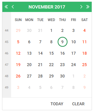
By default, the calendar control displays the days of the month, day headings for the days of the week, week numbers, a header (with the month name and year and links for moving to the next or previous month and year) and a footer (with buttons for setting the selected date to today or a null value). The appearance of the calendar control can be customized by setting the properties that control the style for different parts of the control. The following table lists the properties that specify the style for the different parts of the control.
| Property | Description |
|---|---|
| ASPxCalendar.ButtonStyle | Defines the style for the calendar’s button elements. |
| ASPxCalendar.DayHeaderStyle | Defines the style for the calendar’s section that displays the day of the week. |
| ASPxCalendar.DayOtherMonthStyle | Defines the style for the days that don’t belong to the displayed month. |
| ASPxCalendar.DaySelectedStyle | Defines the style for the calendar’s selected day. |
| ASPxCalendar.DayStyle | Defines the style for the days displayed in the calendar. |
| ASPxCalendar.DayWeekendStyle | Defines the style for the weekend dates in the calendar. |
| ASPxCalendar.FooterStyle | Defines the style for the calendar’s footer section. |
| ASPxCalendar.HeaderStyle | Defines the style for the calendar’s title heading. |
| ASPxCalendar.WeekNumberStyle | Defines the style for the week number markers in the calendar. |
Links, which reside within the calendar’s header and provide the month and year navigation capabilities, can be represented by custom images using the properties listed below.
| Property | Description |
|---|---|
| ASPxCalendar.NextMonthImage | Defines the image for the link navigating to the next month. |
| ASPxCalendar.NextYearImage | Defines the image for the link navigating to the next year. |
| ASPxCalendar.PrevMonthImage | Defines the image for the link navigating to the previous month. |
| ASPxCalendar.PrevYearImage | Defines the image for the link navigating to the previous year. |
Different parts of the calendar control can be shown or hidden. The following table lists the properties that control the visibility of the calendar’s elements.
Property | Description |
|---|---|
Specifies whether the Clear button is displayed within the calendar’s footer. | |
Specifies whether the heading for the days of the week is displayed. | |
Specifies whether the calendar’s title heading is displayed. | |
Specifies whether the Today button is displayed within the calendar’s footer. | |
Specifies whether the week number section is displayed within the calendar. (The calendar’s week numbers are represented as ISO week numbers.) |
You can disable end-user navigation through months or years by hiding the corresponding navigation buttons using the ASPxCalendar.EnableMonthNavigation or ASPxCalendar.EnableYearNavigation property.
The currently selected date within the calendar is specified by the ASPxCalendar.SelectedDate property. Changing this property raises the ASPxCalendar.SelectionChanged event. The ASPxCalendar.VisibleDate property specifies the calendar’s currently displayed month. The property being changed due to navigation through months and years causes the ASPxCalendar.VisibleMonthChanged to be fired.
Selection of multiple dates can be available for end-users via the ASPxCalendar.EnableMultiSelect property. Selected dates are contained within the ASPxCalendar.SelectedDates collection.
The ASPxCalendar editor is able to display multiple months simultaneously, organized in several rows and columns. This feature is controlled by a combination of the ASPxCalendar.Rows and ASPxCalendar.Columns property values.
Note
The client-side equivalent of this editor control is represented by the ASPxClientCalendar object. The editor’s client-side API is enabled if the ASPxEditBase.EnableClientSideAPI property is set to true, or any client event is handled. Available client events can be accessed via the ASPxCalendar.ClientSideEvents property.