Circular Gauges
- 4 minutes to read
This document gives detailed information on Circular Gauge types provided with the ASPxGaugeControl component, and details how they should be used in your application.
For details on other gauge types, refer to the corresponding topics of the Gauge Types section.
Circular Gauges Overview
Circular Gauge is a component that represents element values by visualizing them on a circular scale.
This control is appropriate for creating speedometers, tachometers, stopwatches, clocks, etc.
Circular Gauges all have scales in form of arcs. These gauges can be used separately in your application or together with other gauge types.
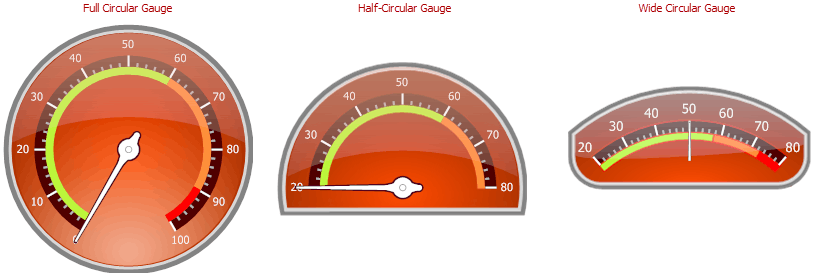
The following is a list of circular gauge shape types:
- full circular;
- half-circular;
- quarter-circular;
- three-fourth circular;
- wide circular.
The images below show some of these gauge types.
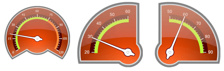
You can access these shapes in the gauge Preset Manager.
CircularGauge Class
Circular Gauge is represented by an instance of the CircularGauge class. This object can be accessed as an item of the GaugeCollectionWeb object returned by the ASPxGaugeControl.Gauges property of the ASPxGaugeControl object.
See the following code.
ASPxGaugeControl gaugeControl1 = new ASPxGaugeControl();
CircularGauge gauge1 =  gaugeControl1.Gauges[0] as CircularGauge;
You can create a Circular Gauge control either at design time within Visual Studio or programmatically at runtime. The following examples demonstrate how this can be done.
Circular Gauge Elements
This section provides a brief overview of base gauge elements, as well as lists their main properties.
A Circular Gauge is comprised of several elements, each of which is intended to perform a specific task.
The following image demonstrates a Circular Gauge containing a full set of its elements.
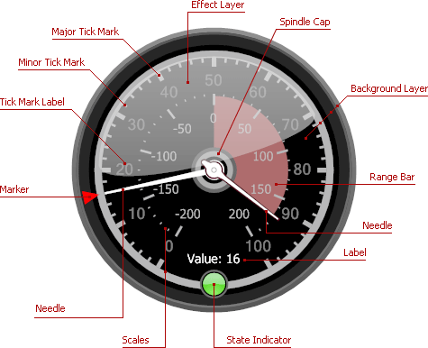
The first base element of a circular gauge is a scale. Typically, a circular gauge can display an unlimited number of scales with tickmarks and their labels.
A scale is represented by the ArcScale class.
To customize a gauge scale in your application, specify the following properties:
- ArcScale.MinValue and ArcScale.MaxValue - specify the scale’s minimum and maximum values;
- ArcScale.Value - specifies the scale’s current value;
- ArcScale.Center - specifies the center of the scale (typically the center of the gauge);
- ArcScale.StartAngle and ArcScale.EndAngle - specify the angles at which the scale starts and ends;
- ArcScale.MajorTickCount and ArcScale.MinorTickCount - specify the number of major and minor tickmarks;
- ArcScale.MajorTickmark and ArcScale.MinorTickmark - provide settings for controlling the display of major and minor tickmarks.
After customizing a gauge scale, you may need to specify gauge appearance. You can this by adding a background layer to a scale.
This layer specifies the background of the gauge. It is represented by the ArcScaleBackgroundLayer class.
The following is a list of background layer main properties:
- ArcScaleBackgroundLayer.ShapeType - allows you to choose the gauge style;
- ArcScaleBackgroundLayer.Size - specifies the width and height of the background layer;
- ArcScaleBackgroundLayer.ScaleCenterPos - specifies the position of the scale’s center relative to the background layer’s center.
Other gauge elements (needles, markers, range bars, etc.) are linked to a particular scale and rendered relative to this scale object.
For instance, a needle, linked to a specific scale, indicates the scale’s current value by spinning around the scale’s center (by default, the center of the gauge).
A needle is represented by the ArcScaleNeedleComponent class. It provides the following main properties:
- ArcScaleNeedle.StartOffset - specifies the offset of the needle’s starting point from the scale’s center;
- ArcScaleNeedle.EndOffset - specifies the offset of the needle’s ending point from the scale’s axis (a curve along which tickmarks are painted).
- ArcScaleNeedle.ShapeType - allows you to choose the needle’s painting style.
For more information on gauge elements, see the Circular Gauge (Visual Elements) section.