Linear Gauges
- 3 minutes to read
This document provides you with information on which Linear Gauge types exist in the ASPxGaugeControl component and explains how you can use these gauges in your application.
For details on other gauge types, refer to the corresponding topics of the Gauge Types section.
Linear Gauges Overview
Linear Gauge is a component that represents visual elements on a linear scale.
You can use this control in different applications for creating thermometers, indicators.
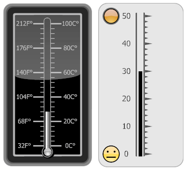
The ASPxGaugeControl provides Linear Gauges of two types: vertical and horizontal.
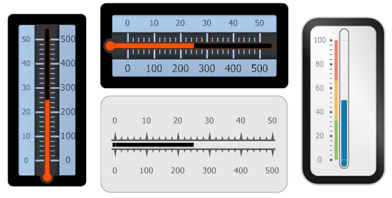
A full set of linear gauge shapes is available at design time in the gauge preset manager.
LinearGauge Class
Linear Gauge is represented by an instance of the LinearGauge class. This object can be accessed as an item of the GaugeCollectionWeb object returned by the ASPxGaugeControl.Gauges property of the ASPxGaugeControl object.
See the following code.
ASPxGaugeControl gaugeControl1 = new ASPxGaugeControl();
LinearGauge gauge1 =  gaugeControl1.Gauges[0] as LinearGauge;
You can create a Linear Gauge control either at design time within Visual Studio or programmatically at runtime. The following example demonstrates how it can be done.
Linear Gauge Elements
This section describes linear gauge elements, as well as gives a brief overview of their properties.
A Linear Gauge allows you to add numerous elements, each of which is intended to perform a specific task.
The following image demonstrates a Linear Gauge containing a full set of elements.
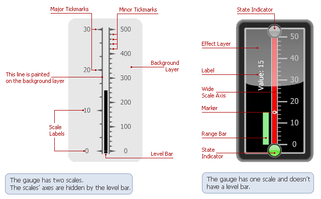
A Scale is the main element of a linear gauge, as scales define the axis along which other elements (level bar, background layer, marker, etc.) are arranged. A linear gauge can have one or more scales displaying tickmarks and labels.
A scale within linear gauges is represented by the LinearScaleComponent class. It provides the following main display options:
- LinearScale.MinValue - specifies the scale’s minimum value;
- LinearScale.MaxValue - specifies the scale’s maximum value;
- LinearScale.Value - specifies the scale’s current value indicated along the scale by a level bar, markers and state indicators;
- LinearScale.StartPoint and LinearScale.EndPoint - specify the starting and ending point of the scale in relative coordinates;
- LinearScale.MajorTickCount and LinearScale.MinorTickCount - specify the number of major and minor tickmarks;
- LinearScale.MajorTickmark and LinearScale.MinorTickmark - provide various options for controlling the display of major and minor tickmarks.
The Level Bar indicates the current value by filling a bar along the scale’s axis. Typically, there is only one level bar in a linear gauge, and it indicates the current value. The level bar must be associated with a particular scale. Once it has been associated with a scale, it automatically fills a bar along that scale, starting at the scale’s minimum value and extending to the scale’s current value.
A level bar is represented by the LinearScaleLevelComponent class. It provides the following main display options:
- LinearScaleLevel.ShapeType - allows you to choose the level bar’s painting style.
A Background Layer represents the background of a gauge. It is represented by the LinearScaleBackgroundLayerComponent class. This visual element provides the following main options:
- LinearScaleBackgroundLayer.ScaleStartPos and LinearScaleBackgroundLayer.ScaleEndPos - specify the position of the scale’s axis relative to the background layer;
- LinearScaleBackgroundLayer.ShapeType - allows you to choose the background layer’s painting style.
For more information on gauge elements, see the Linear Gauge (Visual Elements) section.