ASPxGridListEditor Class
Represents the List Editor used by default in XAF ASP.NET Web Forms applications to display List Views in a UI.
Namespace: DevExpress.ExpressApp.Web.Editors.ASPx
Assembly: DevExpress.ExpressApp.Web.v24.1.dll
NuGet Package: DevExpress.ExpressApp.Web
Declaration
public class ASPxGridListEditor :
    ComplexWebListEditor,
    IControlOrderProvider,
    IOrderProvider,
    ITestable,
    ITestableContainer,
    IDetailFramesContainer,
    ISupportModelSaving,
    ISupportNewItemRowPosition,
    ISupportCallbackStartupScriptRegistering,
    IDataItemTemplateInfoProvider,
    ISupportSelectionOperations,
    IExportable,
    ICustomRenderUpdatePanel,
    ISupportFooter,
    ISupportFilter,
    ISupportPager,
    ISupportAppearanceCustomization,
    ISupportEnabledCustomization,
    IDataAwareExportableCsv,
    IDataAwareExportable,
    IDataAwareExportableXls,
    IDataAwareExportableXlsx,
    IGridBatchOperationProvider,
    IGridObjectSpaceCreator,
    ISupportClientValidation,
    IFastCallbackHandlerSupported,
    IBatchClientDataProvider,
IGridEditingLifeCycleRemarks
List Editors are used by List Views to display object collections in a UI. The ASPxGridListEditor provides the most common data representation in the form of a two-dimensional table:
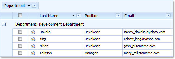
To display object collections, the ASPxGridListEditor uses an instance of the ASPxGridView class.
The ASPxGridListEditor supports a wide range of features out of the box:
Implements the ISupportAppearanceCustomization interface - supports conditional appearance:

Implements the IControlOrderProvider interface - supports the RecordsNavigationController‘s PreviousObject and NextObject Actions:

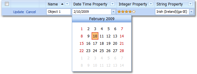
Supports the in-place editing feature. It allows the ASPxGridListEditor to represent its cells via various Property Editors:
Has the page size chooser:
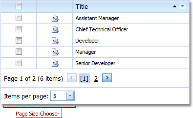
The page size chooser contains a list of predefined values that allow you to limit the number of records displayed by the ASPxGridListEditor.
Has the column chooser:
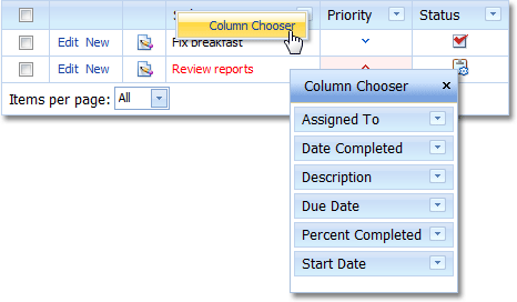
The column chooser allows you to add and remove columns from the ASPxGridListEditor at runtime, using drag & drop.
Implements the ISupportNewItemRowPosition interface - has a new item row. It allows end-users to create a new object directly in a List View:
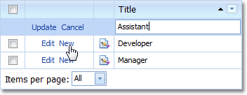
The new item row option is available when a List View is displayed in edit mode. To set the row’s location, use the DefaultListViewOptions attribute in code. Alternatively, use the IModelListViewNewItemRow.NewItemRowPosition property of the appropriate Views | List View node. By default, the row is not displayed.
Supports the preview section. It is a non-editable region in a data row that displays a particular column’s content across all the List Editor’s columns:
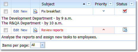
The column whose content is displayed in the preview section is specified by the IModelListViewPreviewColumn.PreviewColumnName property of the Application Model’s Views | <ListView> node.
Supports filtering, sorting and grouping:
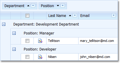
You can specify a group interval, so that groups are not created for each unique value, but for specific value ranges. To do this, use the IModelColumn.GroupInterval property of the Application Model’s Views | <ListView> | Columns | <Column> node.
Supports the filter panel. It allows you to quickly filter the grid:
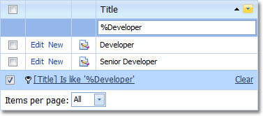
The filter panel can be activated using the IModelListViewShowAutoFilterRow.ShowAutoFilterRow property of the Application Model’s Views | <ListView> node.
Has the “Select All” check box. Using this check box, you can select all records in the grid:
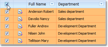
Displays Actions that can be applied to the current row’s object in a separate column:

To place a custom Action to this column, set the ActionBase.Category to “RecordEdit” and ActionBase.SelectionDependencyType to SelectionDependencyType.RequireSingleObject.
simpleAction1.Category = "RecordEdit"; simpleAction1.SelectionDependencyType = DevExpress.ExpressApp.Actions.SelectionDependencyType.RequireSingleObject;Tip
Actions added using the ActionAttribute have the “RecordEdit” category, by default. For details, see How to: Create an Action Using the Action Attribute.
Supports Bands.
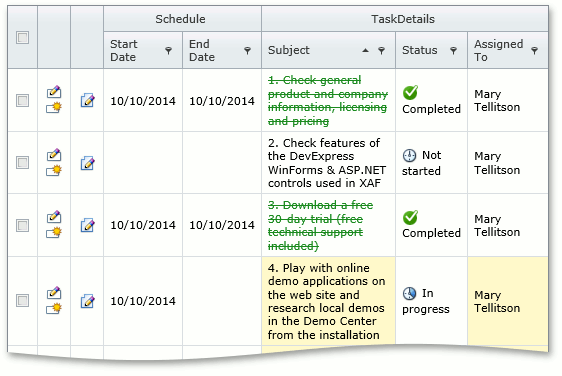
For details, refer to the List View Bands Layout and How to: Configure Bands in a Grid List Editor (WinForms and ASP.NET Web Forms) topics.
Supports the master-detail data presentation.
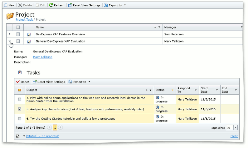
For details, refer to the IModelListViewWeb.DetailRowMode and IModelListViewWeb.DetailRowView topics.
Implements the IExportable interface - can be exported with the ExportController:
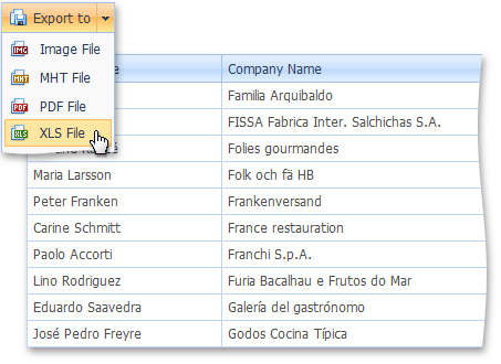
- Implements the IDataAwareExportable interface - the data-aware export type (ExportType) is used by default when exporting to Excel formats.
- Supports Client, Server, and DataView modes. These modes can be activated using the IModelListView.DataAccessMode property of the appropriate Views | List View node.
Supports data-specific column types for data cells. If there is no appropriate data-specific column type, data cell values are displayed using the ITemplate templates specified via the GridViewDataColumn.DataItemTemplate property. Edit cells use templates specified using the GridViewDataColumn.EditItemTemplate providing rich editing capabilities using the editors that are also used in Detail Views.
Tip
You can easily adjust the default columns settings or create completely custom columns using events of the ASPxGridListEditor class:
Important
Data-specific columns are enabled when the ASPxGridListEditor.UseASPxGridViewDataSpecificColumns property is set to true. Please note the following limitations of data-specific columns: * You cannot navigate to a referenced object by clicking a cell that displays a reference property. * The “N/A” text is not displayed for null reference values.
The ASPxGridListEditor is used by default in XAF ASP.NET Web Forms applications. So generally, there is no need to instantiate it in your code.
To see an example on how to access the ASPxGridListEditor from a View Controller, refer to the following article: How to: Access the Grid Component in a List View.