Editing Themes
- 3 minutes to read
Note
The WPF Theme Editor does not support the DevExpress WPF Controls 18.2 or later. Use the WPF Theme Designer tool instead.
This topic helps you learn how to locate a particular visual element in a theme and edit it via the XAML Editor.
A typical scenario of editing a theme consists of the following steps.
- Selecting a target product
- Locating the desired visual element in a markup
- Editing this visual element
- Saving changes
Product Selection
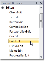
Use the Product Browser to select a product whose visual representation you need to change. If this product is presented in several views, select a view that displays the visual elements you wish to edit.
The Theme Navigator will display the selected product view.
For more information, see Product Browser.
Navigating Through Theme Visual Elements
The Theme Editor provides multiple ways with which you can navigate through theme visual elements.
- Using Theme Navigator
- Traversing through the Visual Tree
- Exploring the Template Hierarchy
- Navigating via the XAML Editor
Using the Theme Navigator
The Theme Navigator enables you to locate particular UI elements in a markup by simply clicking them. Hold down the Shift key when clicking an element to locate it and open the appropriate file in the XAML Editor.

For more information, see the Theme Navigator.
Traversing through the Visual Tree
The Visual Tree Browser displays a visual tree of the sample layout displayed in the Theme Navigator panel.
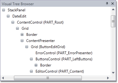
To locate a visual tree element in a markup, click the corresponding node, and the XAML Editor will open the appropriate file and navigate to the desired element. For more information, see the Visual Tree Browser.
Exploring the Template Hierarchy
The Template Hierarchy panel allows you to navigate through various theme elements: templates, styles and brushes.

Click an element to locate it in a markup and open the appropriate file in the XAML Editor. For more information, see the Template Hierarchy.
Navigating via the XAML Editor
The XAML Editor renders different types of bindings (like StaticResource, DynamicResource, TemplateBinding and Binding) as hyperlinks.
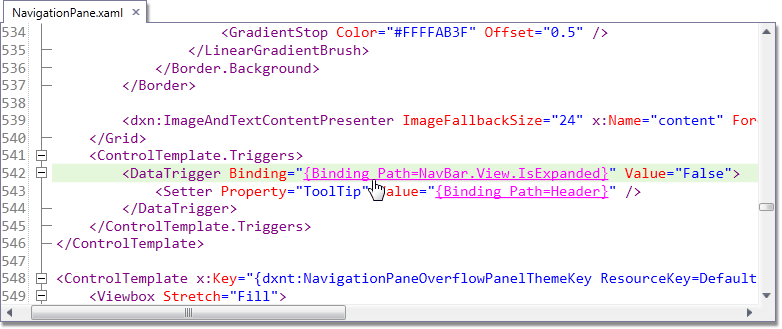
Click a link to navigate to the referenced element. For more information, see the XAML Editor.
Edit Visual Elements
After you have located a visual element in the markup, you can edit it in the XAML Editor.
Note that if the opened markup file is generic (shared across all themes), the line where the caret is located is highlighted in yellow. Be careful when modifying generic markup files. If the opened file only affects the currently edited theme, the line is highlighted in green.
In addition to the built-in XAML Editor, the Theme Editor allows you to edit control templates in Microsoft Expression Blend. To learn more, see Blend Integration.
Save Changes and Preview Results
After you have made all the necessary changes to the theme, open the Build menu and click Build Theme (or press F5).

Note
Theme assembly is saved to the %ThemeSolutionDirectory%\Bin directory.
When the build is finished, the modified theme is applied to the product view displayed in the Theme Navigator, so that you can immediately see the effect.
You can also preview the modified theme as it looks while applied to a specific layout that contains multiple DevExpress controls displayed in a single window.

To invoke this window, open the View menu and click Preview (or press F7).

To learn how to apply a newly created theme to a WPF application, see Applying Themes.