StepProgressBar Class
Visualizes a linear process and highlights its current stage.
Namespace: DevExpress.XtraEditors
Assembly: DevExpress.XtraEditors.v22.1.dll
NuGet Package: DevExpress.Win.Navigation
Declaration
public class StepProgressBar :
    BaseStyleControl,
    IStepProgressBarDirectXOwner,
    ISupportXtraAnimation,
    ISupportInitialize,
    IStepProgressBarAppearanceOwner,
    ITouchScrollBarOwner,
    IMouseWheelSupport,
    IStepProgressBarCustomDraw,
    IStepProgressBarItemOptionsOwner,
IImageListOwnerRemarks
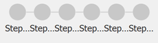
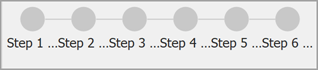
Step Progress Bar is a sequence of connected items. Each item has two states (active and inactive) with different appearance settings.
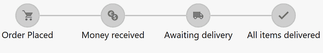
The control supports both vertical and horizontal orientations. A horizontal Step Progress Bar arranges its items from left to right, vertical - from top to bottom. Enable the InversedProgressDirection property to flip the orientation.
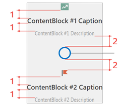
Step Progress Bar items are objects of the StepProgressBarItem class stored in the StepProgressBar.Items collection. Each item has an indicator (central circle) and two identical content blocks.
Item Indicator
An indicator consists of an outline (1), a central area that can be filled with the outline color (2), and an optional image in the middle (3).
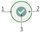
1. Outline settings
StepProgressBar.IndicatorLineThickness - specifies line thickness.
StepProgressBar.Appearances.CommonActiveColorandStepProgressBar.Appearances.CommonInactiveColor- specify active/inactive outline state colors for all items owned by the control. These settings also affect connectors (lines that link neighboring items).StepProgressBarItem.Appearance.ActiveIndicatorColorandStepProgressBarItem.Appearance.InactiveIndicatorColor- allow you to override common active/inactive state colors for individual items.StepProgressBarIndicatorOptions.Width - the outline diameter. You can access this setting at two levels:
- use
StepProgressBar.ItemOptions.Indicator.Widthto change the indicator size for all Progress Bar Items;- use
StepProgressBarItem.Options.Indicator.Widthto set up individual item width.
- Draw mode - see the Indicator Draw Modes section.
2. Central area settings
- Color - matches the item’s outline color.
- Draw mode - see the Indicator Draw Modes section.
3. Image settings
Use ActiveStateImageOptions and InactiveStateImageOptions properties to assign vector or raster images for active and inactive item states. These properties are accessible at two levels:
StepProgressBar.ItemOptions.Indicator.- allows you to assign two global images: an image used by all inactive items, and an image all active items display.StepProgressBarItem.Options.Indicator.- allows you to override global active/inactive state images for individual items.
stepProgressBar1.ItemOptions.Indicator.ActiveStateImageOptions.SvgImage = svgImageCollection1[0];
stepProgressBarItem1.Options.Indicator.ActiveStateImageOptions.SvgImage = svgImageCollection[1];
Indicator Draw Modes
Our StepProgressBarIndicatorOptions.ActiveStateDrawMode and StepProgressBarIndicatorOptions.InactiveStateDrawMode properties allow you to choose from the following indicator styles:
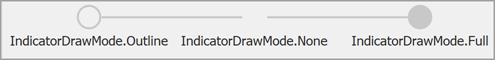
- Full or Default - an indicator outline is visible and the central indicator area is filled with the outline color.
- Outline - an indicator outline is visible and the central indicator area is empty.
- None - neither indicator outline nor central area are visible. If assigned, an indicator icon is the only element visible in this mode.
Similar to other indicator options, you can access these settings at both control and individual items’ levels.
stepProgressBar1.ItemOptions.Indicator.ActiveStateDrawMode = IndicatorDrawMode.Full;
stepProgressBarItem1.Options.Indicator.ActiveStateDrawMode = IndicatorDrawMode.Outline;
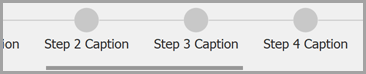
Content Blocks
Content blocks are objects of the StepProgressBarItemContentBlock class displayed on both sides of indicators.
Content blocks can display:
- a caption (the StepProgressBarItemContentBlock.Caption property)
- a description (the StepProgressBarItemContentBlock.Description property)
- different images for active and inactive item states (StepProgressBarItemContentBlock.ActiveStateImageOptions and StepProgressBarItemContentBlock.InactiveStateImageOptions properties).
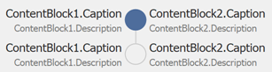
To access these settings, use StepProgressBarItem.ContentBlock1 and StepProgressBarItem.ContentBlock2 properties.
stepProgressBarItem.ContentBlock1.Caption = "Set up notifications";
stepProgressBarItem.ContentBlock2.Description = "Done";
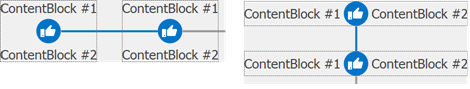
To change the content block spacing, use StepProgressBar.DistanceBetweenContentBlockElements (1) and StepProgressBar.IndicatorToContentBlockDistance (2) properties.
The control provides multiple options to change caption and description fonts and colors.
- Specify caption and description settings for all control items. (Active and inactive states have identical appearances.)
stepProgressBar1.Appearances.FirstContentBlockAppearance.Caption.ForeColor = Color.FromArgb(40, 40, 40);
stepProgressBar1.Appearances.SecondContentBlockAppearance.Description.ForeColor = Color.FromArgb(80, 80, 80);
- Specify caption and description settings for each item state separately. (Affects all control items.)
stepProgressBar1.Appearances.FirstContentBlockAppearance.CaptionActive.ForeColor = Color.FromArgb(40, 40, 40);
stepProgressBar1.Appearances.FirstContentBlockAppearance.CaptionInactive.ForeColor = Color.Gray;
stepProgressBar1.Appearances.SecondContentBlockAppearance.DescriptionActive.ForeColor = Color.DimGray;
stepProgressBar1.Appearances.SecondContentBlockAppearance.DescriptionInactive.ForeColor = Color.LightGray;
- Set up caption and description appearances for all items states. (Affects both content blocks within a specific item.)
stepProgressBarItem1.Appearance.ContentBlockAppearance.Caption.ForeColor = Color.FromArgb(40, 40, 40);
stepProgressBarItem1.Appearance.ContentBlockAppearance.Description.ForeColor = Color.Gray;
- Set up different caption and description appearances for active and inactive item states. (Affects both content blocks within a specific item.)
stepProgressBarItem1.Appearance.ContentBlockAppearance.CaptionActive.ForeColor = Color.FromArgb(40, 40, 40);
stepProgressBarItem1.Appearance.ContentBlockAppearance.CaptionInactive.ForeColor = Color.Gray;
stepProgressBarItem1.Appearance.ContentBlockAppearance.DescriptionActive.ForeColor = Color.DimGray;
stepProgressBarItem1.Appearance.ContentBlockAppearance.DescriptionInactive.ForeColor = Color.LightGray;
- Specify item state appearance settings for an individual content block.
stepProgressBarItem1.ContentBlock1.Appearance.Caption.ForeColor = Color.FromArgb(40, 40, 40);
stepProgressBarItem1.ContentBlock2.Appearance.Description.ForeColor = Color.FromArgb(60, 60, 60);
- Specify separate active/inactive item state appearances for a specific content block.
stepProgressBarItem1.ContentBlock1.Appearance.CaptionActive.ForeColor = Color.FromArgb(40, 40, 40);
stepProgressBarItem1.ContentBlock1.Appearance.CaptionInactive.ForeColor = Color.FromArgb(60, 60, 60);
stepProgressBarItem1.ContentBlock1.Appearance.DescriptionActive.ForeColor = Color.Gray;
stepProgressBarItem1.ContentBlock1.Appearance.DescriptionInactive.ForeColor = Color.LightGray;
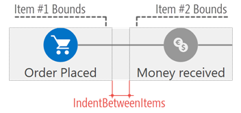
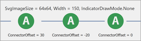
Connectors
Connectors are lines that link neighboring items. See the following list of main connector settings:
- Availability - StepProgressBar.DrawConnectors
- Line width - StepProgressBar.ConnectorLineThickness
- Color -
StepProgressBar.Appearances.CommonActiveColorandStepProgressBar.Appearances.CommonInactiveColor. These properties also set indicator outline colors. - Length - depends on IndentBetweenItems and LayoutMode properties. Note that IndentBetweenItems specifies the distance between items, not item indicators.
- Gap between connector and indicator - the ConnectorOffset property, available at both control (
StepProgressBar.ItemOptions.ConnectorOffset) and item (StepProgressBarItem.Options.ConnectorOffset) levels.
Layout Modes
The LayoutMode property specifies how the control distributes its items across the client area.
Compact (Default) Layout Mode
If the control has more space than required, the distance between items equals the IndentBetweenItems property value. Items are placed according to the StepProgressBar.ContentAlignment property.

When a control’s size is reduced, connectors shorten and content blocks are clipped. No scroll bar is available.
Fixed Layout Mode
In this mode, the distance between items is always equal to the IndentBetweenItems property value.

Items and connectors remain when a control’s size is reduced. If there is not enough space to show all items, a scroll bar appears. Use the StepProgressBar.ScrollMode to select the scrollbar style.
Call the StepProgressBar.ScrollToItem(StepProgressBarItem) method to jump to the specified item.
FullSize Layout Mode
In “FullSize” mode, the control aligns its first item to the left edge, last item to the right edge, and evenly distributes the remaining items.

A similar alignment pattern applies when a control cannot display all of its items. Connectors shorten, content blocks are clipped, and a scroll bar is not displayed.
Select Items
When you select an item, the control selects all previous items. To select items, use any of the following API.
Select a specific item
- Switch the item State to “Active”.
- Pass the Items collection index to the SelectedItemIndex property.
- Call the SelectItem(StepProgressBarItem) method.
Partial item selection
- Set an item’s StepProgressBarItem.Progress property to an integer value between 0 and 100 to draw partially filled item connector.

Deactivate all items
- Set the SelectedItemIndex property to -1.
- Call the UnselectAll() method.
Select (activate) all items
- Call the SelectAll() method.
Activate the next or previous item
- Call SelectNext() to select the next item.
- Call SelectPrevious() to select the previous item.
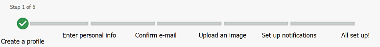
When another item is selected, the StepProgressBar.SelectedItemChanged event raises. The sample below illustrates how to use this event to dynamically change item and connector settings.
using DevExpress.XtraEditors;

// ...

spBar1.ConnectorLineThickness = 15;
spBar1.IndentBetweenItems = 50;
spBar1.IndicatorLineThickness = 4;
spBar1.ItemOptions.ConnectorOffset = -20;
spBar1.ItemOptions.Indicator.ActiveStateDrawMode = IndicatorDrawMode.None;
spBar1.ItemOptions.Indicator.InactiveStateDrawMode = IndicatorDrawMode.None;
spBar1.ItemOptions.Indicator.Width = 50;

void spBar1_SelectedItemChanged(object sender, StepProgressBarSelectedItemChangedEventArgs e) {
    StepProgressBar bar = sender as StepProgressBar;
    foreach (StepProgressBarItem item in bar.Items) {
        item.Options.Indicator.ActiveStateImageOptions.SvgImage = null;
        item.Options.Indicator.Width = 50;
        item.Options.ConnectorOffset = -20;
        item.ContentBlock1.Description = null;
    }

    var currentItem = e.SelectedItems.Last();

    if (currentItem != null) {
        currentItem.Options.Indicator.ActiveStateImageOptions.SvgImage = svgImageCollection1[0];
        currentItem.Options.Indicator.Width = 100;
        currentItem.ContentBlock1.Description = "Step " + (bar.SelectedItemIndex + 1).ToString() + " of 6";
        currentItem.Options.ConnectorOffset = 0;
        if (bar.SelectedItemIndex < 3)
            bar.Appearances.CommonActiveColor = Color.IndianRed;
        if (bar.SelectedItemIndex >= 3 && bar.SelectedItemIndex < 5)
            bar.Appearances.CommonActiveColor = Color.Goldenrod;
        if (bar.SelectedItemIndex >= 5)
            bar.Appearances.CommonActiveColor = Color.Green;
    }
}
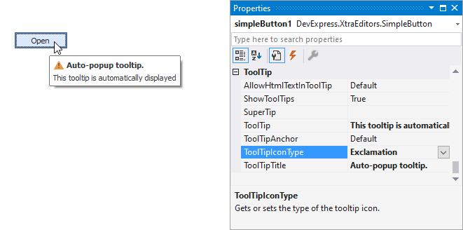
Tooltips
DevExpress controls support regular and super tooltips. If the ShowToolTips option is enabled, tooltips are shown when the mouse pointer hovers over the control.
Use the following properties to specify a regular tooltip’s content:
- ToolTip — A regular tooltip’s text. If the text is not specified, the tooltip is not displayed even if the title is specified. You can use line breaks in regular tooltips. Use the AllowHtmlTextInToolTip property to specify whether to parse HTML tags in the text. HTML tags allow you to format the text: size, style, hyperlinks, etc.
- ToolTipTitle — A regular tooltip’s title. If the title is not specified, it is not displayed.
ToolTipIconType — A regular tooltip’s predefined icon. Use the controller’s IconSize property to specify the image size.
To display a custom image in all regular tooltips, use the controller’s ImageList and ImageIndex properties.
To display a custom image in a specific regular tooltip, handle the BeforeShow event. Use the ImageOptions event argument to assign a raster or vector image to the processed tooltip.
Use the SuperTip property to assign a super tooltip to a control. Enable the AllowHtmlText property to use HTML tags in the super tooltip.
To replace regular tooltips with super tooltips, set the ToolTipController.ToolTipType property to SuperTip. The controller automatically converts regular tooltips to super tooltips. To access this property, you can use the DefaultToolTipController component or a custom controller assigned to the ToolTipController property. See the following topic for more information: Hints and Tooltips.