RatingControl Class
The control to rate specific content.
Namespace: DevExpress.XtraEditors
Assembly: DevExpress.XtraEditors.v22.1.dll
NuGet Package: DevExpress.Win.Navigation
Declaration
Remarks
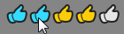
The RatingControl control displays images with three possible states - normal, hovered, and checked. End users can click an image to check all images starting from the first, up to the clicked image. The RatingControl displays five stars that allow your user to rate content based on the number of selected icons.
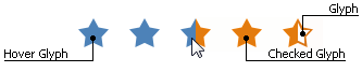
You can use your own custom icons assigned to the RepositoryItemRatingControl.Glyph, RepositoryItemRatingControl.HoverGlyph, and RepositoryItemRatingControl.CheckedGlyph properties. The figure below illustrates a RatingControl with custom images.
The RepositoryItemRatingControl.FillPrecision property allows you to specify whether partially checked glyphs are enabled. This property is initially set to Full (the default setting), which means that clicking anywhere within an icon will select the entire icon. The Half value specifies that icons can be half-selected. Finally, the Exact value allows your users to select an item up to the exact position where it was clicked. For instance, the following figure illustrates a RatingControl that displays 3.68 stars.

To set the number of icons within the RatingControl, use the RepositoryItemRatingControl.ItemCount property. The number of icons checked initially can be set by using the RatingControl.Rating property (or by setting the editor’s edit value using the BaseEdit.EditValue property). These properties can take fractional values if the RepositoryItemRatingControl.FillPrecision property allows this behavior.
You can also use the RepositoryItemRatingControl.ShowText property to display text assigned to the RatingControl.Text property. To arrange this text, use the RepositoryItemRatingControl.TextToRatingIndent and RepositoryItemRatingControl.RatingAlignment properties.
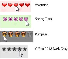
The figure below illustrates a RatingControl in different Skins, including bonus skins.
Tooltips
The RatingControl supports regular and super tooltips. If the ShowToolTips option is enabled, tooltips are shown when the mouse pointer hovers the control.
Use the following properties to specify regular tooltip content:
- ToolTip — regular tooltip text. If the text is not specified, the tooltip is not displayed even if the title is specified. You can use line breaks in regular tooltips. Use the AllowHtmlTextInToolTip property to specify whether to parse HTML tags in the text. HTML tags allow you to format text: size, style, hyperlinks, etc.
- ToolTipTitle — a regular tooltip title. If the title is not specified, it is not displayed.
ToolTipIconType — a regular tooltip predefined icon. Use the controller’s IconSize property to specify the image size.
To display a custom image in all regular tooltips, use the controller’s ImageList and ImageIndex properties.
To display a custom image in a particular regular tooltip, handle the BeforeShow event. Use the ImageOptions event argument to assign a raster or vector image to the processed tooltip.
To assign a super tooltip to a control, use the SuperTip property. Enable the AllowHtmlText property to use HTML tags in the super tooltip.
To replace regular tooltips with super tooltips, set the ToolTipController.ToolTipType property to SuperTip. The controller automatically converts regular tooltips to super tooltips. To access this property, you can use the DefaultToolTipController component or a custom controller assigned to the ToolTipController property. See Hints and Tooltips for more information.
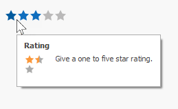
If you do not specify a regular or super tooltip, the control displays default tooltips that contain rating scale values. You can handle the control’s BeforeShowToolTip event to display a custom tooltip for each rating value.
The control’s BeforeShowToolTip and its repository item’s BeforeShowToolTip events are equivalent.
Note
These events do not fire if the control’s ToolTip property is set to a specific value.