NavigatorBase Class
Serves as a base for DataNavigator and ControlNavigator classes.
Namespace: DevExpress.XtraEditors
Assembly: DevExpress.XtraEditors.v22.1.dll
NuGet Package: DevExpress.Win.Navigation
Declaration
Remarks
The NavigatorBase class is abstract and cannot be used directly. It serves as a base for (db and non-db) navigators used to move through the records in a dataset and perform operations against the data.
The NavigatorBase.TabStop property allows you to specify whether the navigator can be focused using the TAB key. The navigator button’s look is specified by the NavigatorBase.ButtonStyle property.
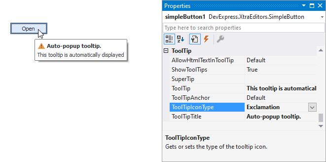
Tooltips
DevExpress controls support regular and super tooltips. If the ShowToolTips option is enabled, tooltips are shown when the mouse pointer hovers over the control.
Use the following properties to specify a regular tooltip’s content:
- ToolTip — A regular tooltip’s text. If the text is not specified, the tooltip is not displayed even if the title is specified. You can use line breaks in regular tooltips. Use the AllowHtmlTextInToolTip property to specify whether to parse HTML tags in the text. HTML tags allow you to format the text: size, style, hyperlinks, etc.
- ToolTipTitle — A regular tooltip’s title. If the title is not specified, it is not displayed.
ToolTipIconType — A regular tooltip’s predefined icon. Use the controller’s IconSize property to specify the image size.
To display a custom image in all regular tooltips, use the controller’s ImageList and ImageIndex properties.
To display a custom image in a specific regular tooltip, handle the BeforeShow event. Use the ImageOptions event argument to assign a raster or vector image to the processed tooltip.
Use the SuperTip property to assign a super tooltip to a control. Enable the AllowHtmlText property to use HTML tags in the super tooltip.
To replace regular tooltips with super tooltips, set the ToolTipController.ToolTipType property to SuperTip. The controller automatically converts regular tooltips to super tooltips. To access this property, you can use the DefaultToolTipController component or a custom controller assigned to the ToolTipController property. See the following topic for more information: Hints and Tooltips.
Example
The following code shows how to create a new DataNavigator control, bind it to a data source and specify custom images for the control’s buttons at runtime. The custom images are stored in an ImageCollection object.
using DevExpress.XtraEditors;

private void CreateDataNavigator() {
    // Create a new DataNavigator control
    DataNavigator dataNavigator = new DataNavigator();
    Controls.Add(dataNavigator);
    dataNavigator.Height = 40;
    dataNavigator.Dock = DockStyle.Bottom;
    // Bind to a data source
    dataNavigator.DataSource = productsBindingSource;
    // Specify the ImageCollection that stores custom images for the DataNavigator's buttons
    dataNavigator.Buttons.ImageList = imageCollection1;
    for (int i = 0; i < dataNavigator.Buttons.ButtonCollection.Count; i++) {
        dataNavigator.Buttons.ButtonCollection[i].ImageIndex = i;
    }
    dataNavigator.ShowToolTips = true;
}