HyperlinkLabelControl Class
The label that supports displaying text or its portion as a hyperlink. Allows you to use HTML tags to format text.
Namespace: DevExpress.XtraEditors
Assembly: DevExpress.XtraEditors.v22.1.dll
NuGet Package: DevExpress.Win.Navigation
Declaration
Remarks
The HyperlinkLabelControl allows displaying all its text or part of it as a hyperlink.
If you specify the control’s Text property as an ordinary string, the entire text is considered and displayed as a hyperlink.
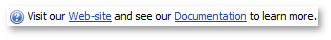
To show a part of text as a hyperlink, format this substring with the <href></href> tag. You can also add multiple hyperlinks to the control’s text using this tag.
hyperlinkLabelControl2.Text = "Visit our <href=www.devexpress.com>Web-site</href> and see our <href=www.devexpress.com/Support/Documentation/>Documentation</href> to learn more.";
Note
In the HyperlinkLabelControl, HTML formatting is always allowed. So, you can use other HTML tags (for instance, <color>, <b>, <size>, <br>, etc.) to format the control’s text. See the HTML Text Formatting document for more information.
By default, no actions are performed when an end-user clicks hyperlinks. To process a specific hyperlink or perform other desired actions, handle the HyperlinkLabelControl’s LabelControl.HyperlinkClick event.
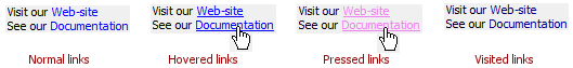
The following table lists the available states of hyperlinks, and properties affecting the link appearance in corresponding states.
| Link State | Appearance Property | Comments |
|---|---|---|
| Normal | HyperlinkLabelControlAppearanceObject.LinkColor | - |
| Pressed | HyperlinkLabelControlAppearanceObject.PressedColor | - |
| Hovered | - | Use the HyperlinkLabelControl.LinkBehavior property to specify when links should be underlined (always, never, when the mouse is hovered over links, etc.). |
| Visited | HyperlinkLabelControlAppearanceObject.VisitedColor | By default, the control does not mark links as visited links when an end-user clicks them. However, you can manually mark all links as visited links by setting the HyperlinkLabelControl.LinkVisited property to true (for instance, in the HyperlinkClick event handler). Visited links will be highlighted in the corresponding color. |
| Disabled | HyperlinkLabelControlAppearanceObject.DisabledColor | Hyperlinks are in the disabled state if the control’s Enabled property is set to false. |
Since the HyperlinkLabelControl class is derived from the LabelControl class, it inherits all the label control’s features, such as the capability to display regular and animated images, the alignment of images relative to the control’s text, a horizontal line within the control’s empty space, etc. See the LabelControl class description to learn more.
To format text using HTML syntax in cells in container controls (e.g., Data Grid, Tree List, etc.), use the RepositoryItemHypertextLabel in-place editor.
Tooltips
DevExpress controls support regular and super tooltips. If the ShowToolTips option is enabled, tooltips are shown when the mouse pointer hovers over the control.
Use the following properties to specify a regular tooltip’s content:
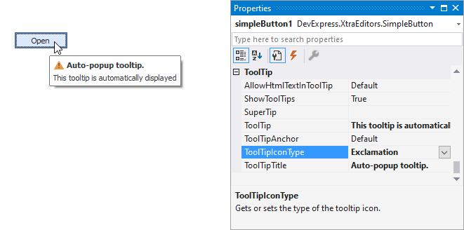
- ToolTip — A regular tooltip’s text. If the text is not specified, the tooltip is not displayed even if the title is specified. You can use line breaks in regular tooltips. Use the AllowHtmlTextInToolTip property to specify whether to parse HTML tags in the text. HTML tags allow you to format the text: size, style, hyperlinks, etc.
- ToolTipTitle — A regular tooltip’s title. If the title is not specified, it is not displayed.
ToolTipIconType — A regular tooltip’s predefined icon. Use the controller’s IconSize property to specify the image size.
To display a custom image in all regular tooltips, use the controller’s ImageList and ImageIndex properties.
To display a custom image in a specific regular tooltip, handle the BeforeShow event. Use the ImageOptions event argument to assign a raster or vector image to the processed tooltip.
Use the SuperTip property to assign a super tooltip to a control. Enable the AllowHtmlText property to use HTML tags in the super tooltip.
To replace regular tooltips with super tooltips, set the ToolTipController.ToolTipType property to SuperTip. The controller automatically converts regular tooltips to super tooltips. To access this property, you can use the DefaultToolTipController component or a custom controller assigned to the ToolTipController property. See the following topic for more information: Hints and Tooltips.
Example
The following code demonstrates how to use the HyperlinkLabelControl class.
This example creates a HyperlinkLabelControl displaying two hyperlinks. Hyperlinks are inserted to the control’s text (Text property) using the <href></href> tag. The HyperlinkClick event handler opens the clicked link in the Web browser, and marks all links as visited links.
To underline links only when the mouse is hovered over them, the HyperlinkLabelControl.LinkBehavior property is set to HoverUnderline. The HyperlinkLabelControlAppearanceObject.LinkColor, HyperlinkLabelControlAppearanceObject.PressedColor and HyperlinkLabelControlAppearanceObject.VisitedColor properties specify the colors used to paint hyperlinks in various states.
using DevExpress.XtraEditors;

//...

private HyperlinkLabelControl hyperlinkLabelControl;

private void Form1_Load(object sender, EventArgs e) {
    hyperlinkLabelControl = new HyperlinkLabelControl();
    this.Controls.Add(hyperlinkLabelControl);

    // Specify the control's name and location.
    hyperlinkLabelControl.Name = "hyperlinkLabelControl";
    hyperlinkLabelControl.Location = new System.Drawing.Point(5, 5);
    // Specify the control's text with two hyperlinks. Format the text using the <href></href> and <br> HTML tags.
    hyperlinkLabelControl.Text = "Visit our <href=www.devexpress.com>Web-site</href><br>" +
        "See our <href=www.devexpress.com/Support/Documentation/>Documentation</href>";
    // Allow the control's text to be wrapped.
    hyperlinkLabelControl.Appearance.TextOptions.WordWrap = DevExpress.Utils.WordWrap.Wrap;
    // Set the behavior of the links. They will display underline text only when the mouse is hovered over the links.
    hyperlinkLabelControl.LinkBehavior = LinkBehavior.HoverUnderline;
    // Specify the appearance settings of the links.
    hyperlinkLabelControl.Appearance.LinkColor = System.Drawing.Color.Blue;
    hyperlinkLabelControl.Appearance.VisitedColor = System.Drawing.Color.Navy;
    hyperlinkLabelControl.Appearance.PressedColor = System.Drawing.Color.Violet;
    // Add an event handler to do specific actions when a specific link is clicked.
    hyperlinkLabelControl.HyperlinkClick += new DevExpress.Utils.HyperlinkClickEventHandler(hyperlinkLabelControl_HyperlinkClick);
}

private void hyperlinkLabelControl_HyperlinkClick(object sender, DevExpress.Utils.HyperlinkClickEventArgs e) {
    // Mark the links as visited links.
    hyperlinkLabelControl.LinkVisited = true;
    System.Diagnostics.Process.Start(e.Link);
}