SuperToolTip Class
Represents a tooltip that supports multiple text and image regions.
Namespace: DevExpress.Utils
Assembly: DevExpress.Utils.v18.2.dll
Declaration
Related API Members
The following members return SuperToolTip objects:
Remarks
A SuperToolTip consists of tooltip items, which display specific information. The following tooltip items can be used to construct a SuperToolTip:
- A regular tooltip item (ToolTipItem) allows text and image to be displayed. The image can be positioned at the left or right edge of the item’s text.
- A title tooltip item (DevExpress.Utils.ToolTipTitleItem) is designed to represent headers and footers within a tooltip window. This item is similar to a regular tooltip item. The only difference is in the default appearance and indentation settings used to paint the item.
- A separator tooltip item (DevExpress.Utils.ToolTipSeparatorItem) represents a separator line.
The following image shows a sample SuperToolTip consisting of four tooltip items:

To create a SuperToolTip, create the required tooltip items and add them to the SuperToolTip.Items collection. Tooltip items will be displayed according to their order in this collection.
The SuperToolTip.Setup method allows you to quickly initialize a SuperToolTip with three tooltip items representing a tooltip’s header, contents and footer.
A SuperToolTip allows its text to be formatted using a subset of HTML tags. To enable HTML formatting, use the SuperToolTip.AllowHtmlText property. See HTML Text Formatting to learn more.
Example
The following example demonstrates a way of creating a SuperToolTip object with two tooltip items. The first item will display the “Edit Popup Menu” string. The second item will contain an image and the “Show the Edit popup menu” text.

The example shows two ways of adding tooltip items to a SuperToolTip object.
- explicitly adding items to the SuperToolTip.Items collection;
- using the SuperToolTip.Setup method.
using DevExpress.Utils;

// The component used to load images from a form's resources.
System.ComponentModel.ComponentResourceManager resources =
  new System.ComponentModel.ComponentResourceManager(typeof(Form1));
// The image to display within a SuperTooltip.
Image resImage = ((System.Drawing.Image)(resources.GetObject("resource.Image1")));

// Method 1
SuperToolTip sTooltip1 = new SuperToolTip();
// Create a tooltip item that represents a header.
ToolTipTitleItem titleItem1 = new ToolTipTitleItem();
titleItem1.Text = "Edit Popup Menu";
// Create a tooltip item that represents the SuperTooltip's contents.
ToolTipItem item1 = new ToolTipItem();
item1.Image = resImage;
item1.Text = "Show the Edit popup menu";
// Add the tooltip items to the SuperTooltip.
sTooltip1.Items.Add(titleItem1);
sTooltip1.Items.Add(item1);

// Assign the created SuperToolTip to a BarItem.
barItem1.SuperTip = sTooltip1;

// Method 2
SuperToolTip sTooltip2 = new SuperToolTip();
// Create an object to initialize the SuperToolTip.
SuperToolTipSetupArgs args = new SuperToolTipSetupArgs();
args.Title.Text = "Edit Popup Menu";
args.Contents.Text = "Show the Edit popup menu";
args.Contents.Image = resImage;
sTooltip2.Setup(args);

// Assign the created SuperToolTip to a BarItem.
barItem2.SuperTip = sTooltip2;
Example
This example shows how to create a SuperToolTip containing a hyperlink for a SimpleButton.
The SimpleButton control provides the BaseControl.SuperTip inherited property that allows you to set a tooltip. To enable use of the <href> tag and other HTML text formatting tags in tooltips, activate the HTML Text Formatting feature (for instance, via the SuperToolTip.AllowHtmlText property). To respond to clicking a hyperlink, handle the ToolTipController.HyperlinkClick event.
The code that creates a SuperToolTip for a button is shown at the end of this section. At design time, you can create a SuperToolTip for a button as shown below. In this case, you still need to implement the HyperlinkClick event in code.
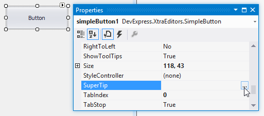
At design time, select the SimpleButton control and click the ellipses button within the SuperTip row in the Properties window:
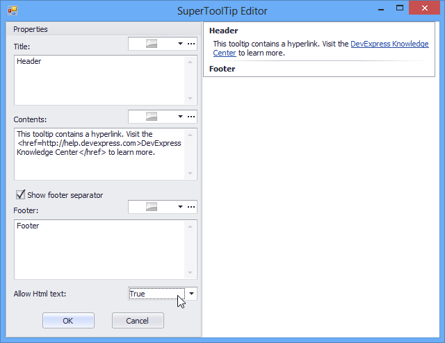
This invokes the SuperToolTip Editor, which allows you to set the tooltip content and activate the HTML formatting feature:
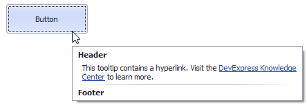
When you run the application, the result will be as follows:
using DevExpress.Utils;
using System.Diagnostics;

private void Form1_Load(object sender, EventArgs e) {
    // Access the controller that manages tooltips for all controls:
    ToolTipController defaultTooltipController = DevExpress.Utils.ToolTipController.DefaultController;

    // Create and customize a SuperToolTip:
    SuperToolTip sTooltip = new SuperToolTip();
    SuperToolTipSetupArgs args = new SuperToolTipSetupArgs();
    args.Title.Text = "Header";
    args.Contents.Text = "This tooltip contains a hyperlink. Visit the <href=http://help.devexpress.com>DevExpress Knowledge Center</href> to learn more.";
    args.ShowFooterSeparator = true;
    args.Footer.Text = "Footer";
    sTooltip.Setup(args);
    // Enable HTML Text Formatting for the created SuperToolTip:
    sTooltip.AllowHtmlText = DefaultBoolean.True;
    //..or enable this feature for all tooltips:
    //defaultTooltipController.AllowHtmlText = true;

    // Respond to clicking hyperlinks in tooltips:
    defaultTooltipController.HyperlinkClick += defaultTooltipController_HyperlinkClick;

    // Assign a SuperToolTip to the button:
    simpleButton1.SuperTip = sTooltip;
}

void defaultTooltipController_HyperlinkClick(object sender, HyperlinkClickEventArgs e) {
    Process process = new Process();
    process.StartInfo.FileName = (e.Link);
    process.StartInfo.Verb = "open";
    process.StartInfo.WindowStyle = ProcessWindowStyle.Normal;
    try {
        process.Start();
    }
    catch { }
}