SimpleButton Class
The button that can display text along with a custom image and can be clicked at runtime without receiving focus.
Namespace: DevExpress.XtraEditors
Assembly: DevExpress.XtraEditors.v18.2.dll
Declaration
[ToolboxBitmap(typeof(ToolboxIconsRootNS), "SimpleButton")]
public class SimpleButton :
    BaseButton,
    IAnimatedItem,
    ISupportXtraAnimation,
    IDXImageUriClient,
    ISupportImageDragDrop,
IImageDropInfoRelated API Members
The following members return SimpleButton objects:
| Library | Related API Members |
|---|---|
| Cross-Platform Class Library | WizardViewBase.ActiveButton |
| WinForms Controls | WizardViewBase.ActiveButton |
Remarks
Use the SimpleButton control to create a button in your application. Buttons are used to initiate actions from forms and dialog boxes. The button’s associated action can be invoked by clicking the button using the mouse or pressing the ENTER or SPACE BAR key if the button has focus. The button’s action should be implemented in the Click event handler.
The SimpleButton control is derived from the BaseButton class that implements the basic functionality for text buttons. The descendant additionally allows you to display images within the button. Use the SimpleButton.Image property to specify the image to be displayed. The SimpleButton.ImageLocation property specifies image alignment. Note that this property enables you to specify whether the image should be displayed together with the specified button’s caption or alone. Use the SimpleButton.Text property to specify the text to be displayed.
The SimpleButton.AllowFocus property can be set to false to prevent the button from being focused.
Example
The following sample code declares a CreateSimpleButton method that creates and initializes a new SimpleButton control. The method has two parameters specifying the coordinates of the button’s top left corner. The BaseButton.CalcBestFit method is used to calculate the size of the button’s contents (an image and text) in order to set a proper button size.
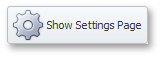
The result of the sample code execution is displayed below.
using DevExpress.XtraEditors;
// ...
private void CreateSimpleButton(int left, int top){
   // Creating and initializing a new SimpleButton control
   SimpleButton simpleButton = new SimpleButton();
   Controls.Add(simpleButton);
   simpleButton.Text = "Show Settings Page";
   simpleButton.ImageList = imageList1;
   simpleButton.ImageIndex = 0;
   simpleButton.Size = simpleButton.CalcBestFit(simpleButton.CreateGraphics());
   simpleButton.Location = new Point(left, top);
}
// Creating SimpleButton control at the specific location
CreateSimpleButton(30, 30);
Example
This example shows how to create a SuperToolTip containing a hyperlink for a SimpleButton.
The SimpleButton control provides the BaseControl.SuperTip inherited property that allows you to set a tooltip. To enable use of the <href> tag and other HTML text formatting tags in tooltips, activate the HTML Text Formatting feature (for instance, via the SuperToolTip.AllowHtmlText property). To respond to clicking a hyperlink, handle the ToolTipController.HyperlinkClick event.
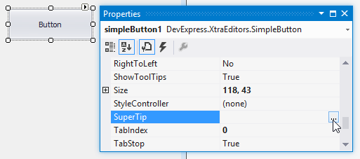
The code that creates a SuperToolTip for a button is shown at the end of this section. At design time, you can create a SuperToolTip for a button as shown below. In this case, you still need to implement the HyperlinkClick event in code.
At design time, select the SimpleButton control and click the ellipses button within the SuperTip row in the Properties window:
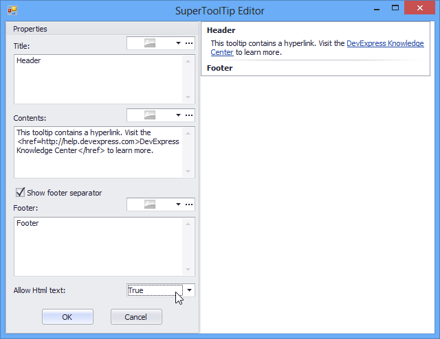
This invokes the SuperToolTip Editor, which allows you to set the tooltip content and activate the HTML formatting feature:
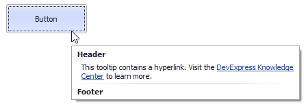
When you run the application, the result will be as follows:
using DevExpress.Utils;
using System.Diagnostics;

private void Form1_Load(object sender, EventArgs e) {
    // Access the controller that manages tooltips for all controls:
    ToolTipController defaultTooltipController = DevExpress.Utils.ToolTipController.DefaultController;

    // Create and customize a SuperToolTip:
    SuperToolTip sTooltip = new SuperToolTip();
    SuperToolTipSetupArgs args = new SuperToolTipSetupArgs();
    args.Title.Text = "Header";
    args.Contents.Text = "This tooltip contains a hyperlink. Visit the <href=http://help.devexpress.com>DevExpress Knowledge Center</href> to learn more.";
    args.ShowFooterSeparator = true;
    args.Footer.Text = "Footer";
    sTooltip.Setup(args);
    // Enable HTML Text Formatting for the created SuperToolTip:
    sTooltip.AllowHtmlText = DefaultBoolean.True;
    //..or enable this feature for all tooltips:
    //defaultTooltipController.AllowHtmlText = true;

    // Respond to clicking hyperlinks in tooltips:
    defaultTooltipController.HyperlinkClick += defaultTooltipController_HyperlinkClick;

    // Assign a SuperToolTip to the button:
    simpleButton1.SuperTip = sTooltip;
}

void defaultTooltipController_HyperlinkClick(object sender, HyperlinkClickEventArgs e) {
    Process process = new Process();
    process.StartInfo.FileName = (e.Link);
    process.StartInfo.Verb = "open";
    process.StartInfo.WindowStyle = ProcessWindowStyle.Normal;
    try {
        process.Start();
    }
    catch { }
}
Related GitHub Examples
The following code snippets (auto-collected from DevExpress Examples) contain references to the SimpleButton class.
Note
The algorithm used to collect these code examples remains a work in progress. Accordingly, the links and snippets below may produce inaccurate results. If you encounter an issue with code examples below, please use the feedback form on this page to report the issue.