ContextItem Class
The base class for the context buttons.
Namespace: DevExpress.Utils
Assembly: DevExpress.Utils.v18.2.dll
Declaration
Related API Members
The following members return ContextItem objects:
Remarks
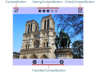
The ContextItem class serves as a base class for the context buttons, which are represented by the ContextButton, CheckContextButton, RatingContextButton and TrackBarContextButton classes. The context buttons can be displayed in the owner control to provide end-users with custom functionality. In the figure below, you can see the PictureEdit control that displays all the available types of context buttons.
The context buttons can be displayed in the following controls:
- AccordionControl (see the AccordionControl.GroupContextButtons, AccordionControl.ItemContextButtons and AccordionControlElementBase.ContextButtons collections);
- CameraControl (see CameraControl.ContextButtons);
- CalendarControl (see CalendarControlBase.ContextButtons);
- CheckedComboBoxEdit (see RepositoryItemCheckedComboBoxEdit.ContextButtons);
- ComboBoxEdit (see RepositoryItemComboBox.ContextButtons);
- GalleryControl (see StandaloneGallery.ContextButtons);
- ImageSlider (see ImageSlider.ContextButtons);
- LayoutControl (see LayoutControlItem.ContextButtons);
- ListBoxControl, ImageListBoxControl, CheckedListBoxControl (see BaseListBoxControl.ContextButtons);
- PictureEdit (see RepositoryItemPictureEdit.ContextButtons);
- TileControl (see TileControl.ContextButtons);
- TileView (see TileView.ContextButtons);
- WinExplorerView (see WinExplorerView.ContextButtons).
By default, if a context button is added to the ContextButtons collection of the owner control, it is automatically displayed when an end-user hovers over the owner control with the mouse cursor. You can override this behavior and specify that a particular context button is always visible or hidden using the ContextItem.Visibility property. Also, the context button can be displayed in the enabled or disabled state. The disabled button is displayed in a light hue and does not respond to end-user interaction. To specify whether a button is enabled or disabled, use the ContextItem.Enabled property.
The ContextItem.AppearanceNormal and ContextItem.AppearanceHover properties allow you to customize the button appearance in the normal and hovered states, respectively. The glyphs displayed by the context button in these states can be specified by the ContextItem.Glyph and ContextItem.HoverGlyph properties. For the RatingContextButton objects, these properties specify the grading scale point glyphs in the corresponding states.
The ContextItem.Alignment property allows you to align the context button relative to the owner control. Note that the alignment affects the orientation of the button — it can be oriented vertically or horizontally. If the alignment relative to the owner control does not meet your needs, you can align the context button relative to another button — anchor element (see ContextItem.AnchorAlignment).
The owner control exposes the ContextButtonClick event that fires when a context button is clicked. This event allows you to respond to clicks on context buttons in a centralized way. You can also handle the ContextItem.Click event to respond to a click on a particular button.
Also, the owner control exposes the ContextButtonOptions property that provides access to the settings applied to the context buttons displayed in the control, and the panels containing these buttons. Using this property you can specify the following settings:
- back color of each panel (top, bottom, etc.) that contains the context buttons, and the amount of empty space around the buttons;
- animation type used to show the panels and the animation duration time;
- glyph skinning feature for all context buttons. This setting can be overridden for a particular button using the ContextItem.AllowGlyphSkinning property;
- button opacity in the normal, hovered and disabled states;
- indent between the buttons;
- HTML formatting feature for button captions and tool tips.